Spotlight

[vc_row css_animation="" row_type="row" use_row_as_full_screen_section="no" type="full_width" angled_section="no" text_align="left" background_image_as_pattern="without_pattern" el_class="blog-new-hagan" z_index=""][vc_column width="1/4"][/vc_column][vc_column width="1/2"][vc_column_text]A pioneer of constructive graphic design, Anton Stankowski was a designer throughout the 20th century whose work still has high visibility today. And it's wonderful.

[vc_row css_animation="" row_type="row" use_row_as_full_screen_section="no" type="full_width" angled_section="no" text_align="left" background_image_as_pattern="without_pattern" z_index="" el_class="blog-new-hagan"][vc_column width="1/4"][/vc_column][vc_column width="1/2"][vc_column_text]My first experience of Armin Hofmann was staring agog at this poster for the ballet Giselle. Created in 1959, this may be his most celebrated work.

[vc_row css_animation="" row_type="row" use_row_as_full_screen_section="no" type="full_width" angled_section="no" text_align="left" background_image_as_pattern="without_pattern" z_index="" el_class="blog-new-hagan"][vc_column width="1/4"][/vc_column][vc_column width="1/2"][vc_column_text] 
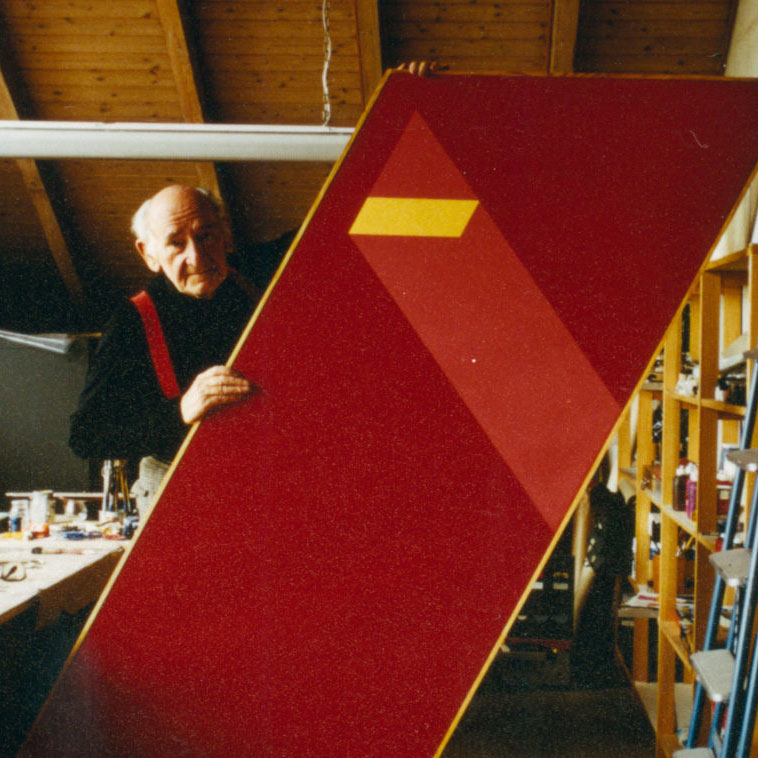
Early this year, in hopes of strengthening my weakness for colour, I went to the highly influential book 'Interactions of Color' by artist and educator Josef Albers.   The book, despite its heady and annoying unnecessary academic tone (which I disdain so much), instils a child-like curiosity to experiment, play, and all in all, have fun with colours.   The main takeaway from the book is how colour, much like musical notes, has a perceptible change with their combinations, like how one note on a piano would not be considered music, but play two notes, and it's a different world entirely.

[vc_row css_animation="" row_type="row" use_row_as_full_screen_section="no" type="full_width" angled_section="no" text_align="left" background_image_as_pattern="without_pattern" el_class="blog-new-hagan" z_index=""][vc_column width="1/4"][/vc_column][vc_column width="1/2"][vc_column_text]I'll admit it, at first, I rejected the grid. The idea of putting what seemed like restrictions on an exciting new idea made me feel as though it would disrupt the fluidity to any creative process and could comprimise any such workflow.   Now, I realise, I was just plain wrong. Today I yodel praise from mountaintops of the grid and its forefathers of Swiss design – Perhaps there's some latent Swiss in my genealogy, I don't know, but I'm a believer.

[vc_row css_animation="" row_type="row" use_row_as_full_screen_section="no" type="full_width" angled_section="no" text_align="left" background_image_as_pattern="without_pattern" el_class="blog-new-hagan" z_index=""][vc_column width="1/4"][/vc_column][vc_column width="1/2"][vc_column_text]Wide open white spaces and turning dynamic figures that dance off the page, Alexey Brodovich was known as a bold innovator and a giant in the world of editorial design; helping bring a European edge of art and design into American media which we can still see the influence of today on not just print publications but on websites also.   His most public and influencing work came from 1934 to 1958 working as art director for Harper's Bazaar.

[vc_row css_animation="" row_type="row" use_row_as_full_screen_section="no" type="full_width" angled_section="no" text_align="left" background_image_as_pattern="without_pattern" el_class="blog-new-hagan" z_index=""][vc_column width="1/4"][/vc_column][vc_column width="1/2"][vc_column_text]Ivan Chermayeff, known for his graphic work and enduring logo identities is one of the premier designers of modern design.   Partner of Chermayeff & Geismar & Haviv, a design firm which helped pave the way into the more modern sleeker corporate logos we see today, Ivan Chermayeff played a pivotal role in how logo identities are communicated.