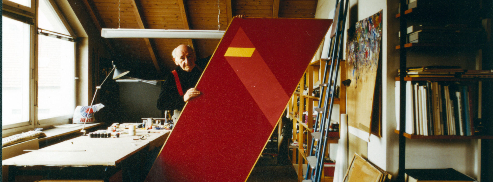
Spotlight: Anton Stankowski
A pioneer of constructive graphic design, Anton Stankowski was a designer throughout the 20th century whose work still has high visibility today. And it’s wonderful.

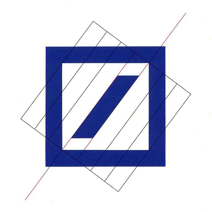
Deutsche Bank Logo Identity
“The Deutsche Bank square is neat visual shorthand for the type of values you might want in a bank, security (the square) and growth (the oblique line)”
— Patrick Burgoyne (Editor of Creative Review)
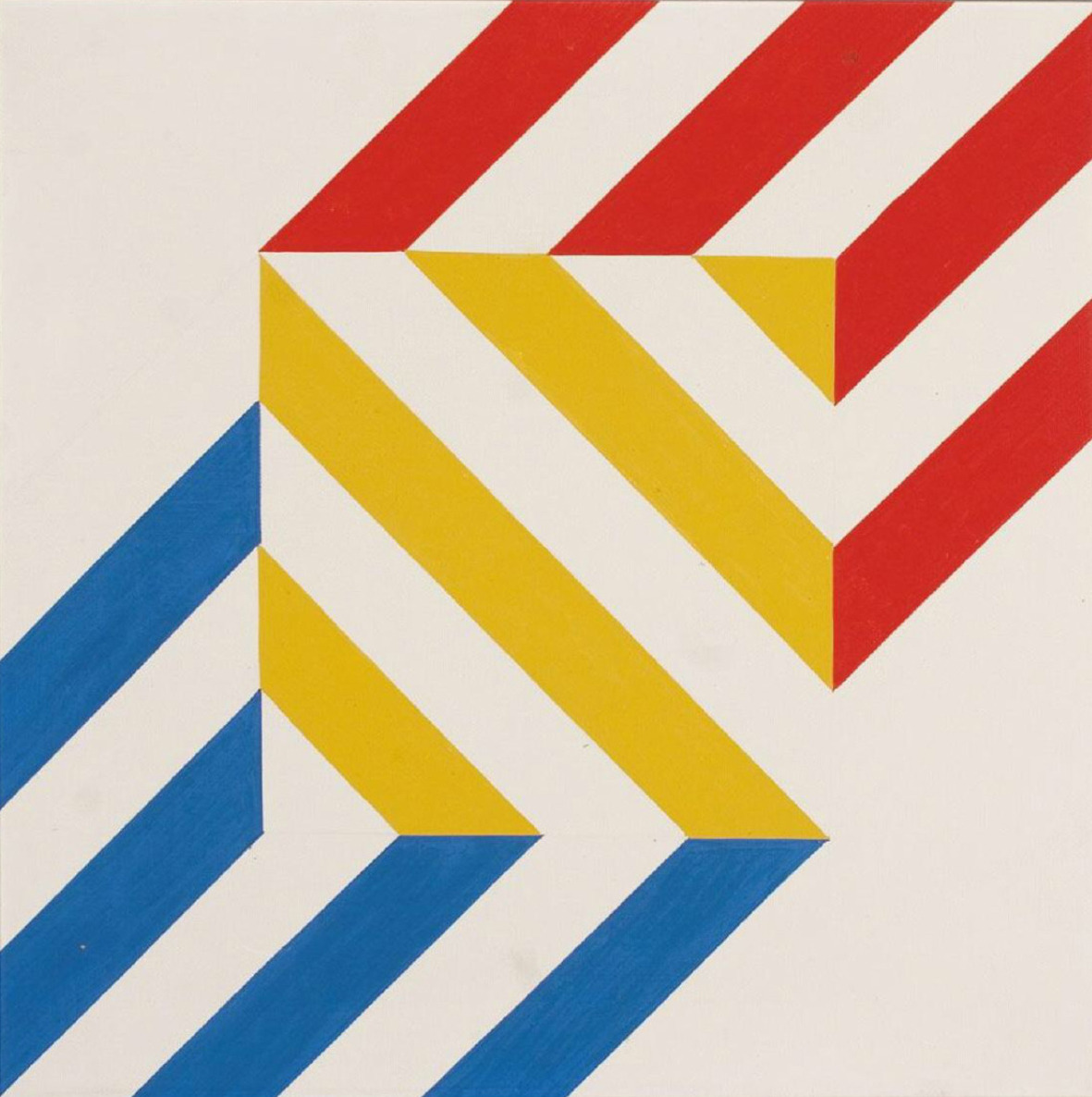
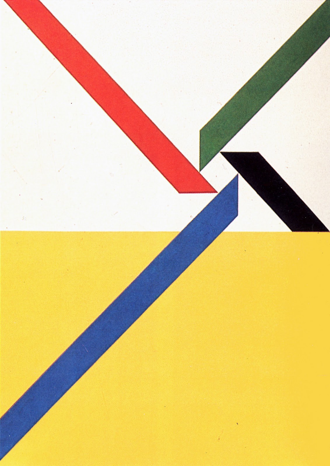
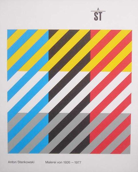
A master of the grid and known for his fascination with the application of diagonal stips or “slopes”, Stankowski’s work can dazzle the eye with simple geometric forms balancing structure with colour.

As a characteristic of Modernism, other designers of that time were also heavy on structure and modular design systems but Stankowski’s work emotes more movement and dynamism. Stankowski uses colour to bring this dynamism out ever more, the work is energetic but remains solid and steadied by the structure of the simple units of the grids used.
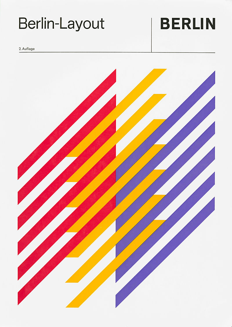
It’s hypnotising, your eyes move around the compositions trying to get a footing; making sense of the intersecting lines and finding the edges of what could be more than simple slopes. It has a similar direction to optical illusions but without the smug intention to fool you. The rows of slants create a dizzying tension of what is the foreground and background, making it appear as one.

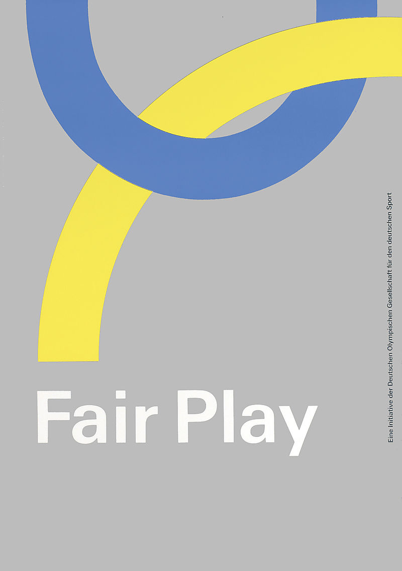
Not just a one trick pony, Anton Stankowski also championed graphic identity as the chairman of the Committee for Visual Design at the 1972 Munich Olympics, designed the visual identity for Berlin and other businesses of the time.
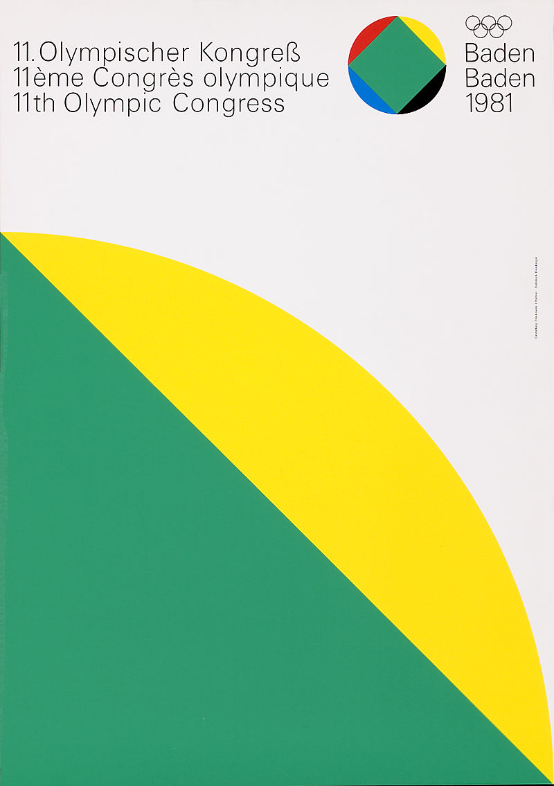
1972 Munich Olympics Visual Identity
Heavily influenced by De Stijl and the works of Kandinsky and Malevich, Anton Stankowski believed that the future of design would be a true collaboration of science and fine arts (similar to the Bauhaus philosophy of the fine arts meeting crafts). His work speaks this methodology with its sense of structure secured in grided modules but rich in expressive merit.