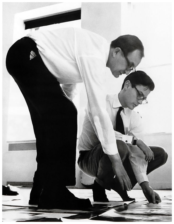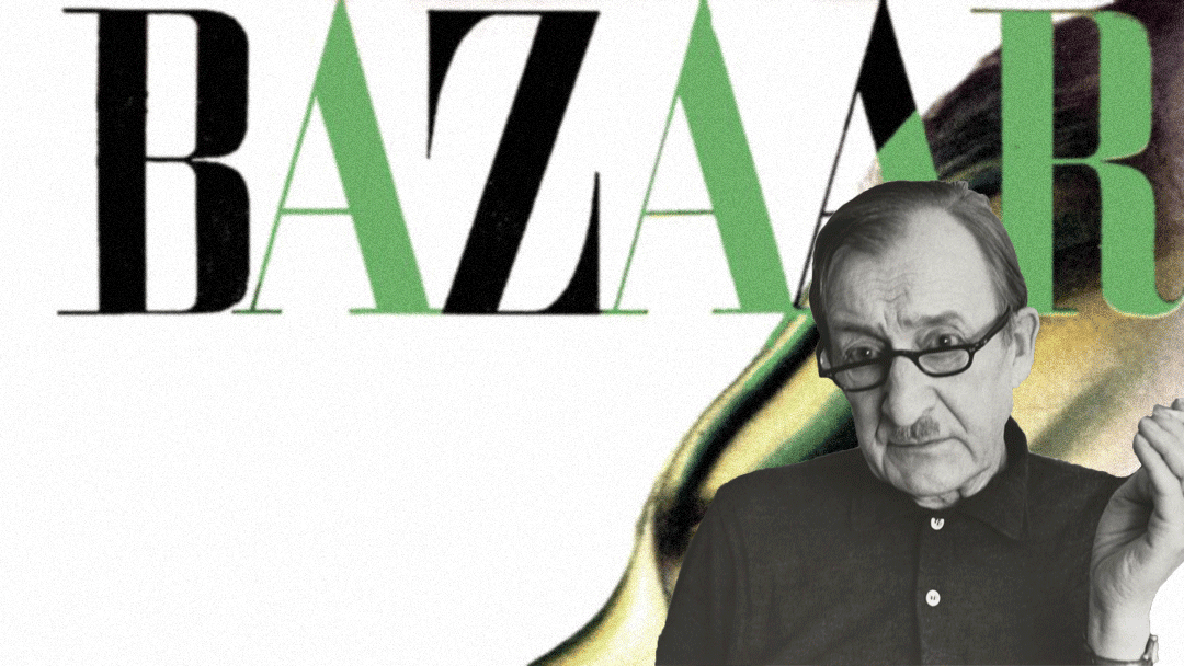
Spotlight: Alexey Brodovitch
Wide open white spaces and turning dynamic figures that dance off the page, Alexey Brodovich was known as a bold innovator and a giant in the world of editorial design; helping bring a European edge of art and design into American media which we can still see the influence of today on not just print publications but on websites also.
His most public and influencing work came from 1934 to 1958 working as art director for Harper’s Bazaar.
Previous to Alexey Brodovitch American editorial featured illustration led work. Erté, known as the Art Deco king was predominant in fashion magazines at that time and according to Brodovitch was becoming hopelessly outdated.
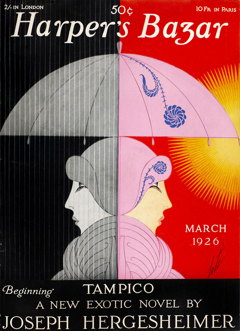
To Alexey Brodovitch it was clear that he wanted to bring styles learnt from his time in the cosmopolitan city of Paris; surrounded by artists working in everything from Dada in Zurich and Berlin, Suprematism from Moscow, the German Bauhaus school, Italian Futurism, De Stijl from the Netherlands, to more obvious French movements of Cubism, Fauvism, Surrealism and Purism.
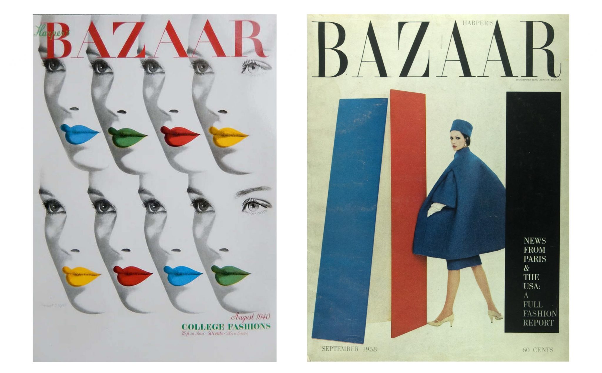
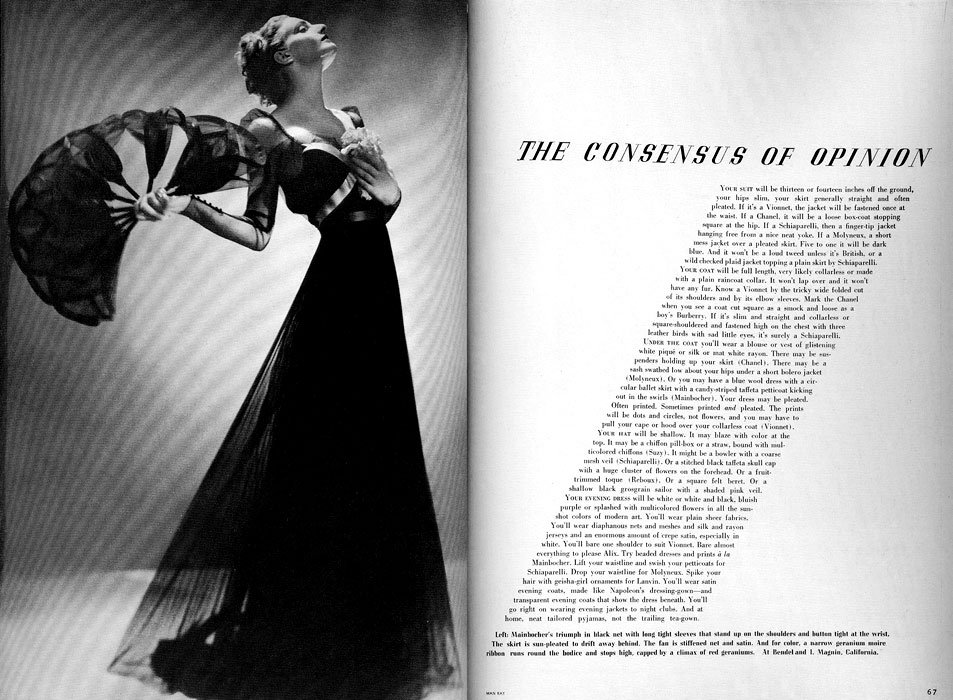
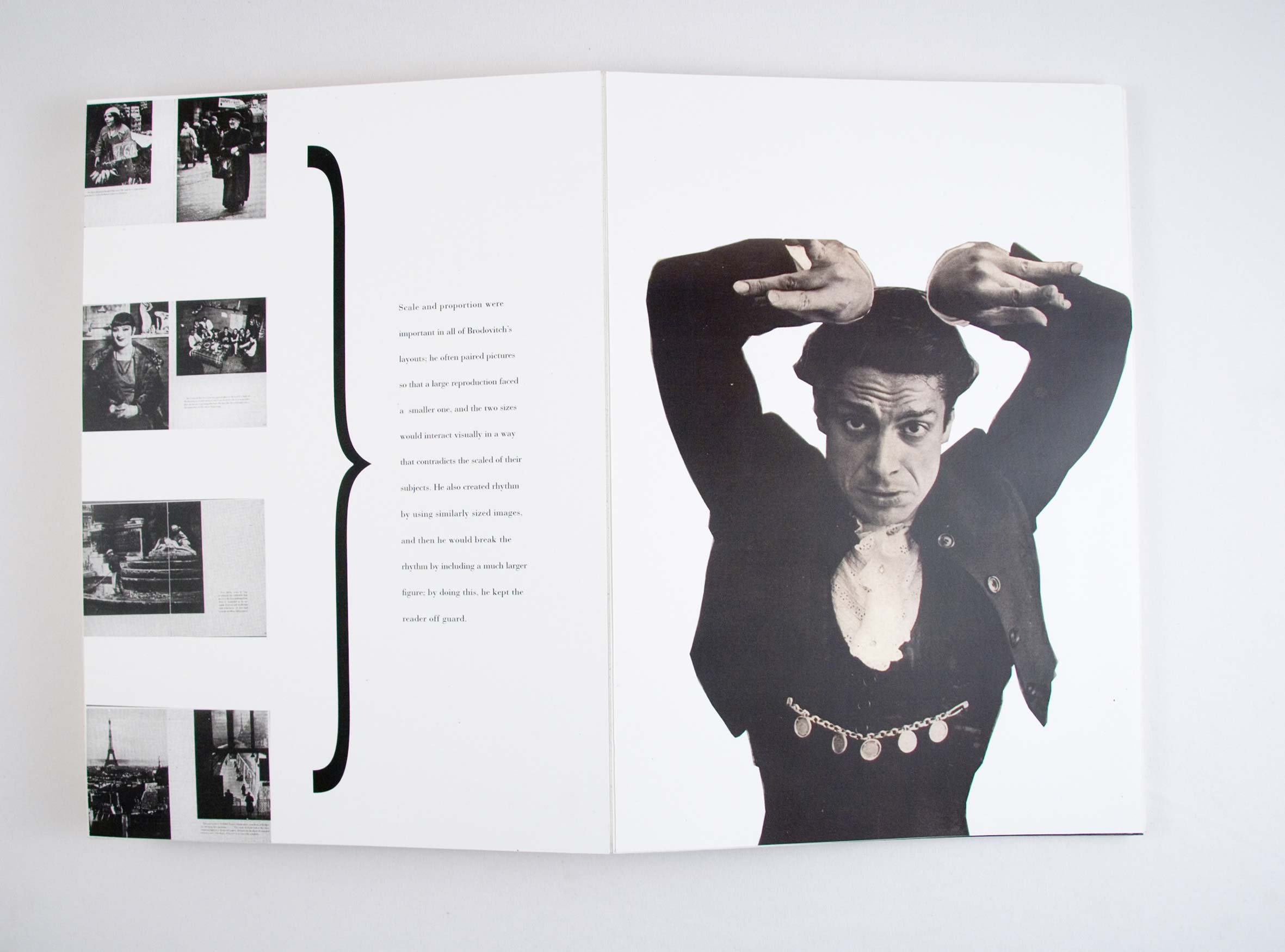
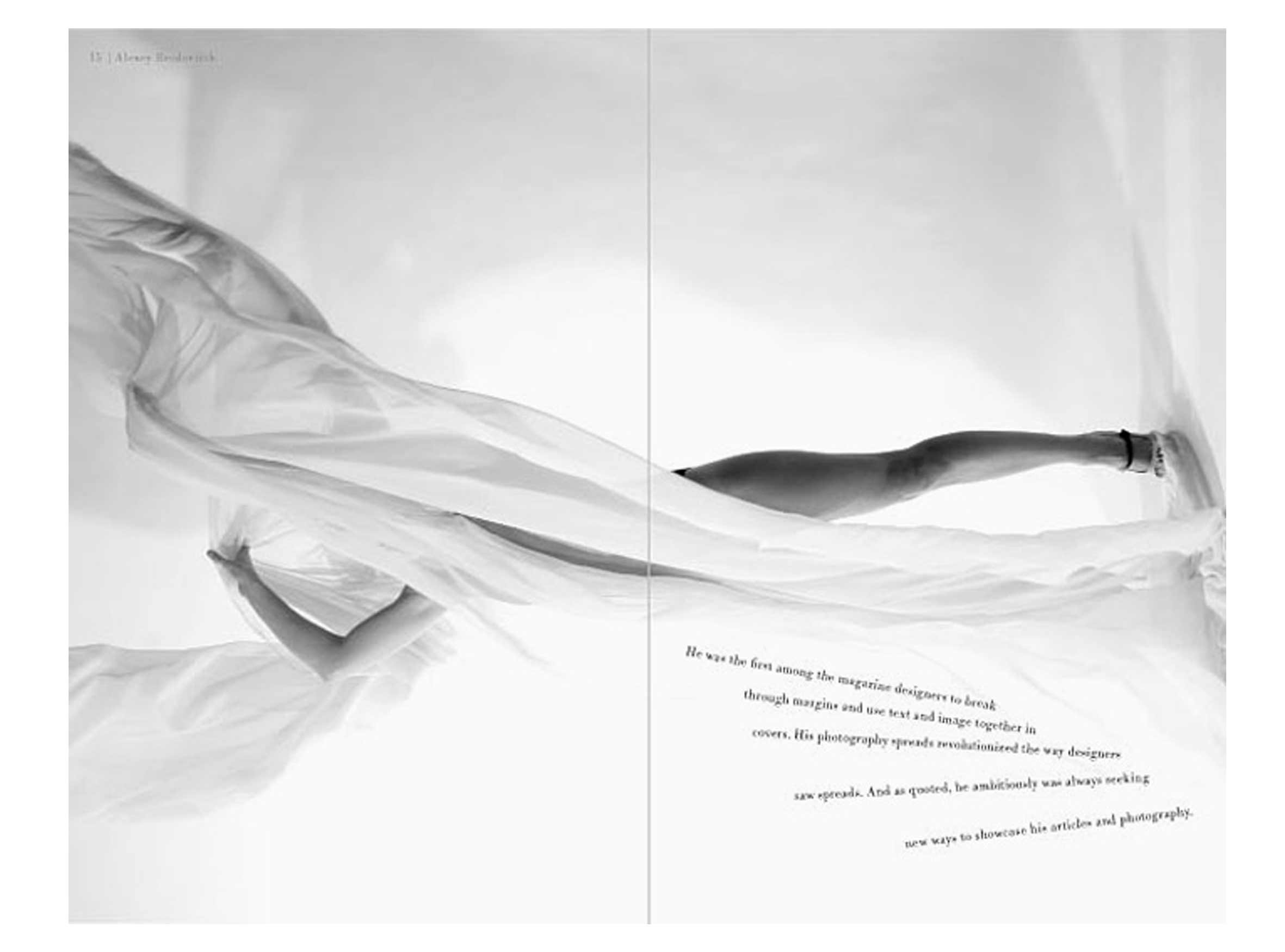
Alexey’s approach was fearlessly different, superimposing different photos on top of each other, using highly dynamic moving images, generous uses of white space, high contrasts of black and white all giving Harper’s Bazaar that effortless elegance and theme of perfection.
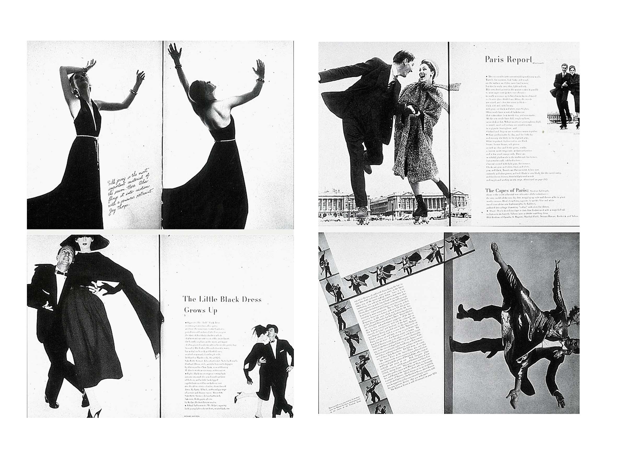 Brodovitch saw photographs in sequences as if they were frames in a film, he was one of the first to integrated text into the photography, before that, American magazines used text and images totally separate, splitting them apart with wide margins.
Utterly dynamic, Alexey Brodovitch became known for his almost abstractly cropped photos which were often placed off centre; bringing a new dynamism to magazine layouts.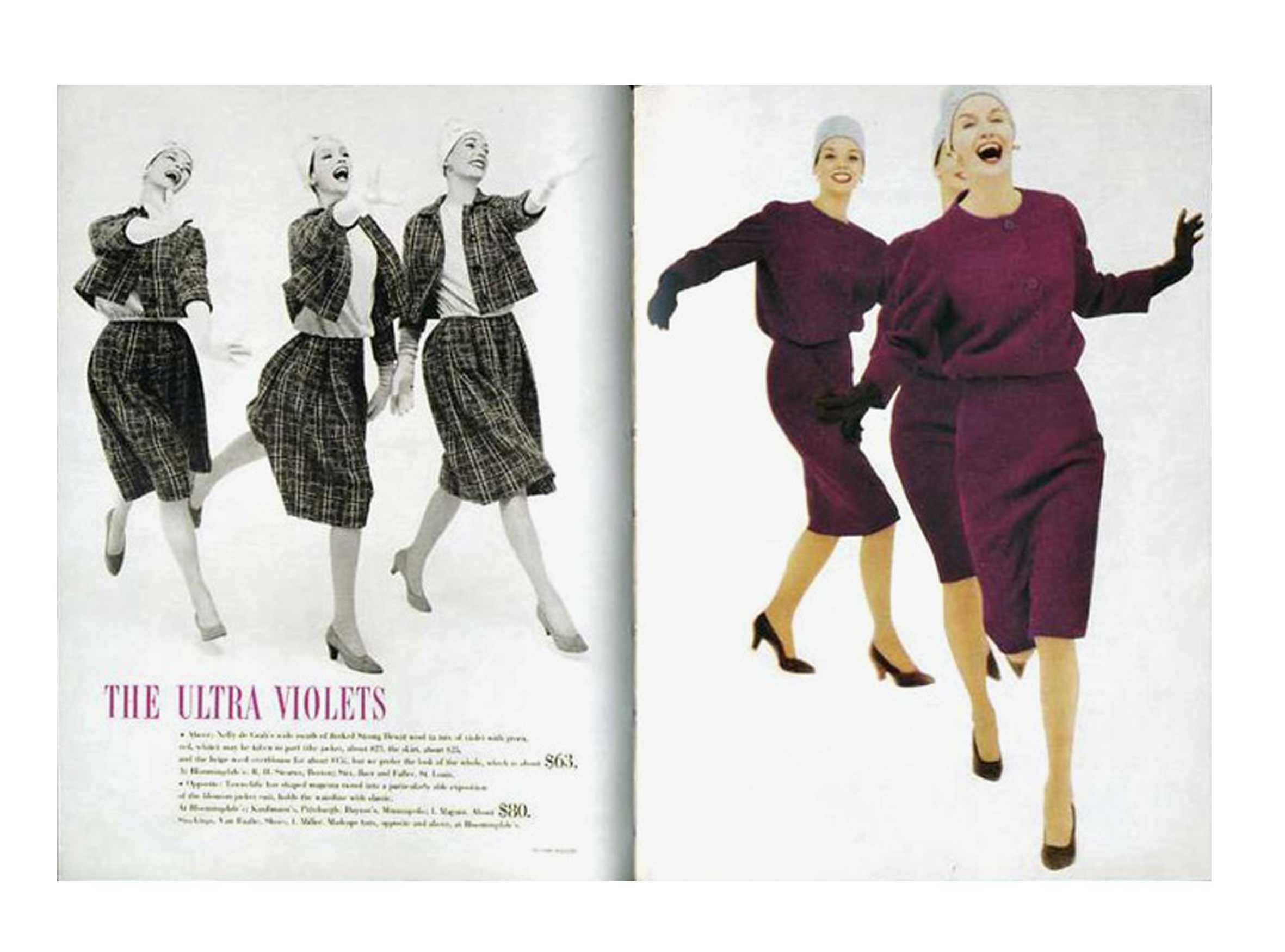
For some issues, Alexey Brodovitch would invite some of his past acquaintances such as Man Ray, Jean Cocteau or A. M. Cassandre to work on issues of Harper’s Bazaar for some startling creations.
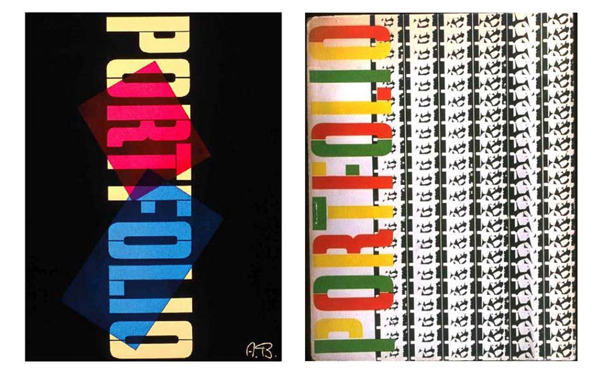
Brodovitch also collaborated with Frank Zachary on a magazine called Portfolio (1950) which featured covers using only fonts – an unusual sight for American publication at that time. The magazine only ran for three issues before folding due to Frank and Alexey’s conviction that there should be no advertising what so ever – purely focused on the artists and designer they thought important.
Not only was Alexey Brodovitch a huge influence on editorial, but his photographic style changed the way photographers took photos; teaching photographers to be an eyewitness rather than a judge who would rate and dictate each shot. Alexey Brodovitch would emphasise the personality being evident naturally with each click of the shutter; opening up the possibilities for real warmth and excitement to leap out from the pages.
Looking back on Alexey Brodovitch’s career, people have said it was his curiosity into absolutely everything which made him such a creative figure. You could also say his early life being surrounded by such influencing artists gave him the inspiration for such compellingly different work. Massimo Vignelli said in a way it was, in fact, easier back then to be an influential designer in America as it was so empty of compelling work, so you could also bring timing into the mix…
Whatever it was, you can’t argue with the fearlessness he brought to the table; bringing a new style of editorial design which in turn opened the doors for many others to learn from and additionally be ‘allowed’ to work just as fearlessly. It has been said that whether they know it or not, every graphic designer today is a student of Brodovitch – I think that’s probably right.