Spotlight: Josef Albers (Interactions of Color)
Early this year, in hopes of strengthening my weakness for colour, I went to the highly influential book ‘Interactions of Color’ by artist and educator Josef Albers.
The book, despite its heady and annoying unnecessary academic tone (which I disdain so much), instils a child-like curiosity to experiment, play, and all in all, have fun with colours.
The main takeaway from the book is how colour, much like musical notes, has a perceptible change with their combinations, like how one note on a piano would not be considered music, but play two notes, and it’s a different world entirely.
The same happens with colours. In fact, Albers states, unlike music, we rarely see colour in total isolation and is almost always next to another colour; influencing; changing; moving the other colour and vibrating the boundaries of form. This is Albers’ hypothesis, “colour is the most relative medium in art”. And the classes he taught at Bauhaus, Black Mountain, and Yale led to the development of this book as a way to establish this idea of colour as a deceptive phenomenon.
Instead of writing at length about the influence of Albers’ work or a review of this already well-coveted book, I will simply display some of my own play with colours from the examples Albers directs in the book.
This first group is to show how a colour’s identity will change depending on their relationships; showing one colour which can be perceived as two different tones.
This example below shows that forms and the Law of Closure overrides our colour recognition; us initially perceiving on first glance the form to conclude at the top and the bottom even though the tones have completely changed.
 Below displays a curious effect when applying clean forms over gradients; creating an illusion of gradient on the forms themselves, though none are present (I swear)


 Here I set out to make three colours appear as two. Covering the link over to the two ground colours, it can be perceived that there are only two colours present, each swapping the ground for the form – but in all examples, there exists three.




 The next proved most difficult, and that was to make two colours appear as one using the grounds to influence each of the staged colours. It’s good to note that the ‘key’ to each colour appears on each example, so even if the colours don’t appear exact, you can see how far from each other they actually are, once place on a different grounds.
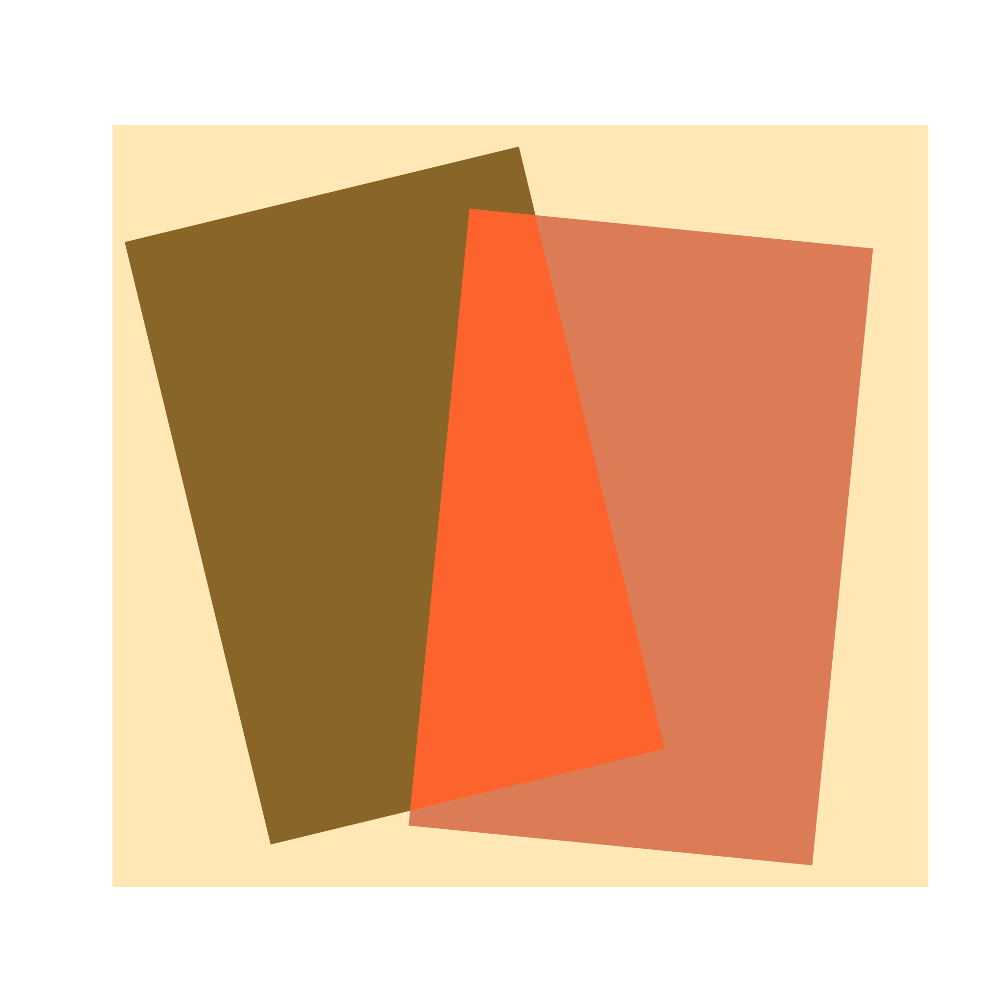
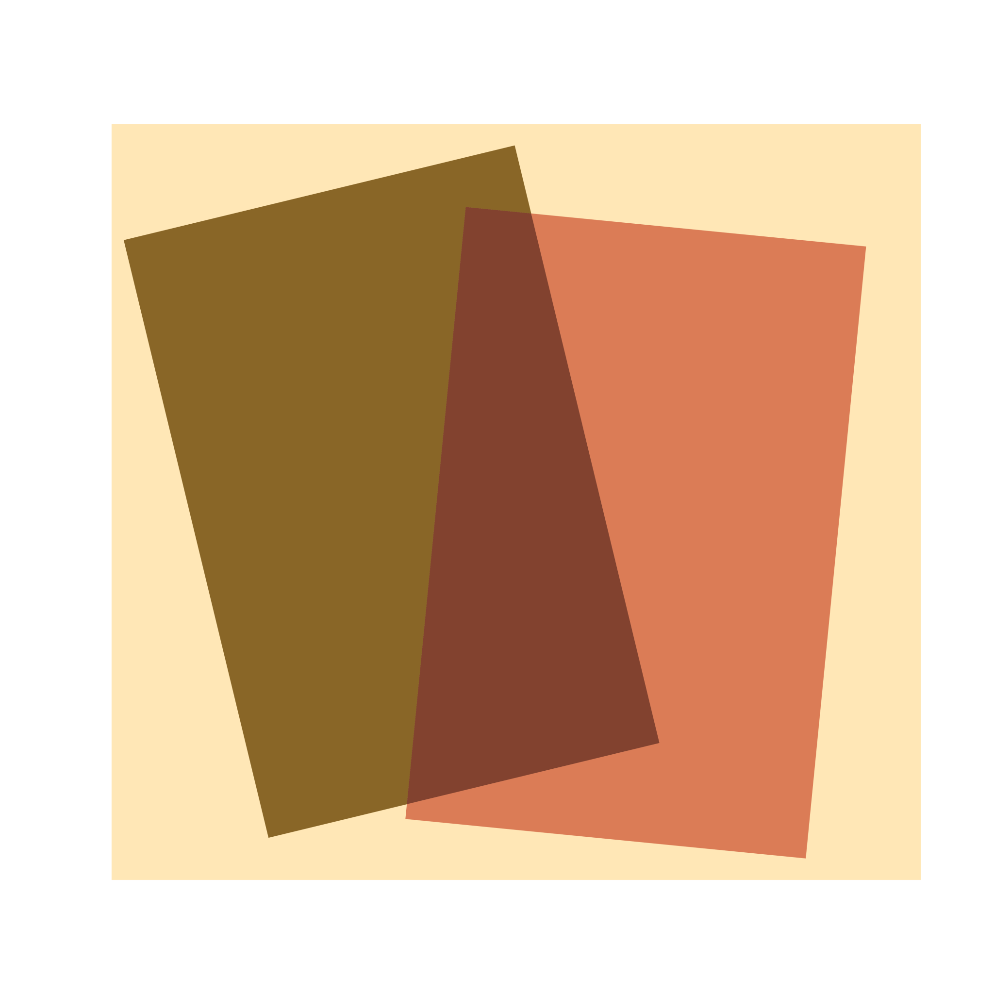
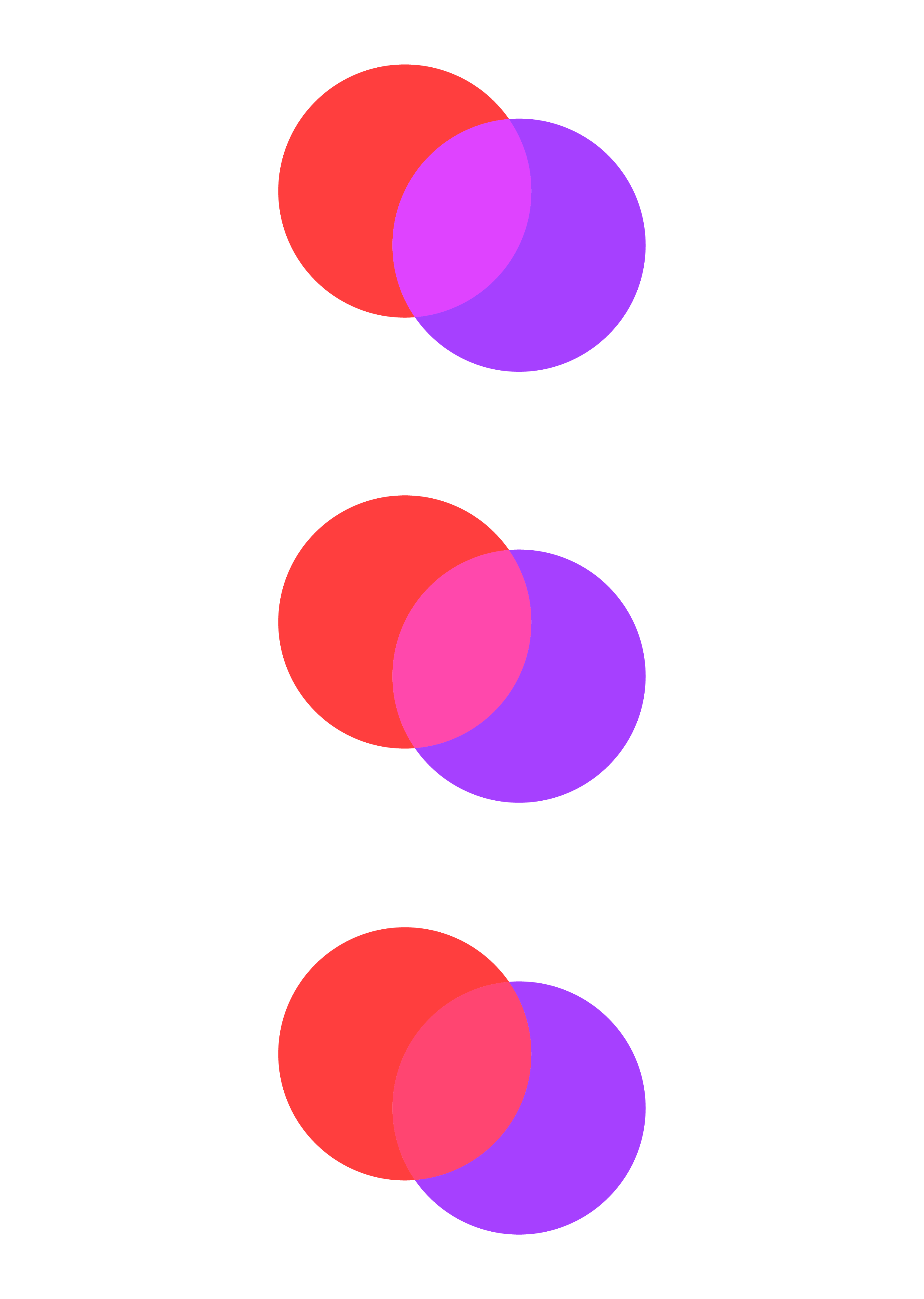
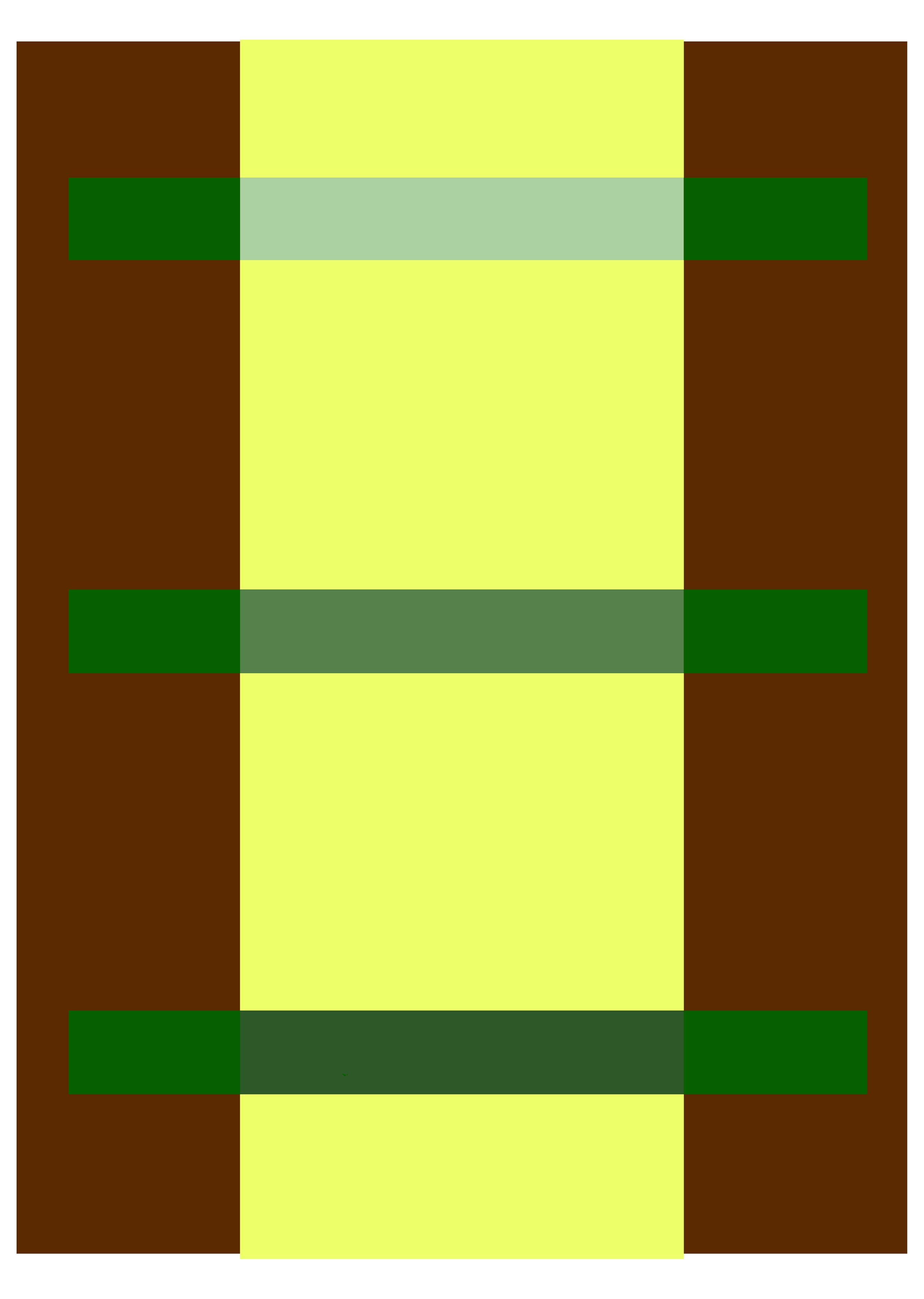
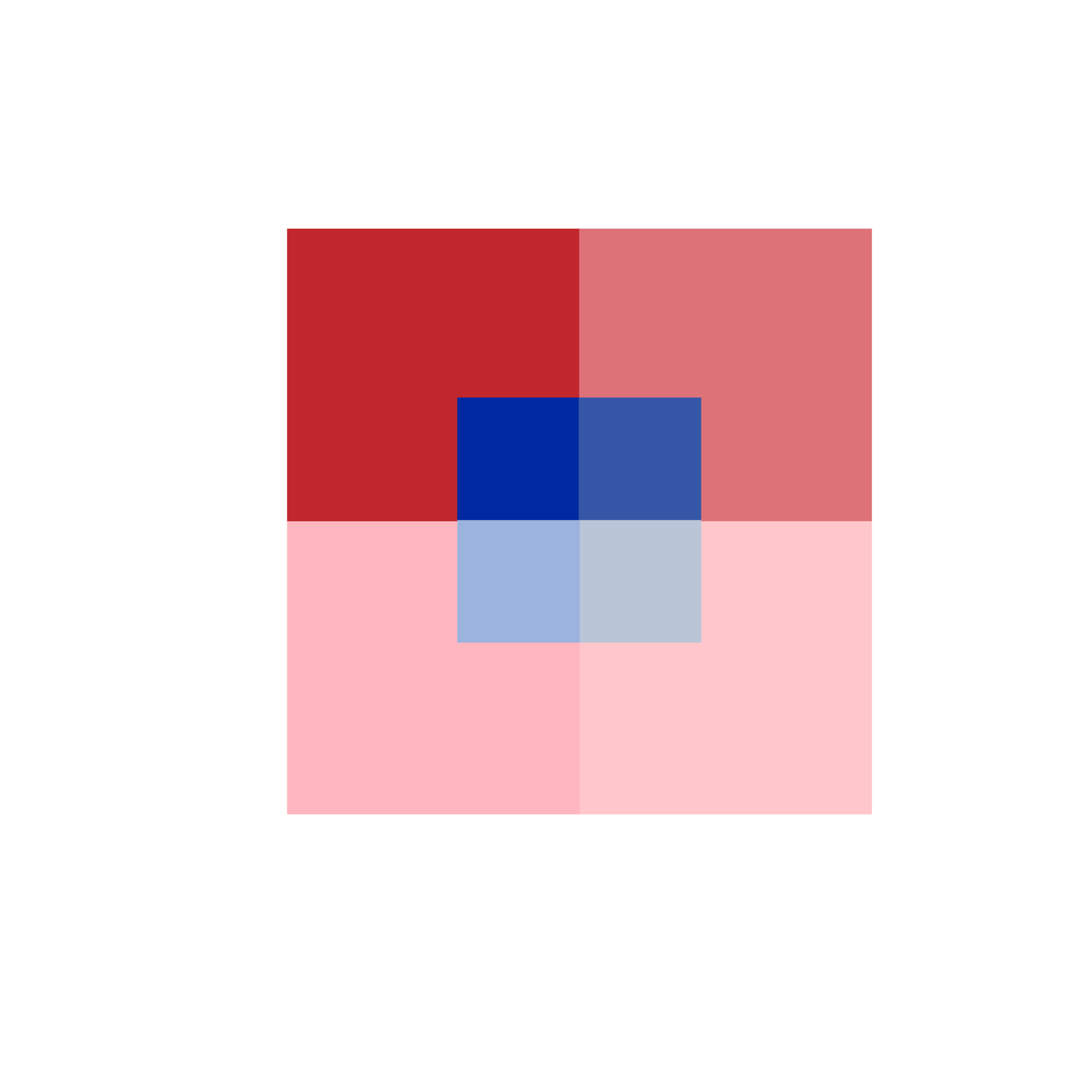
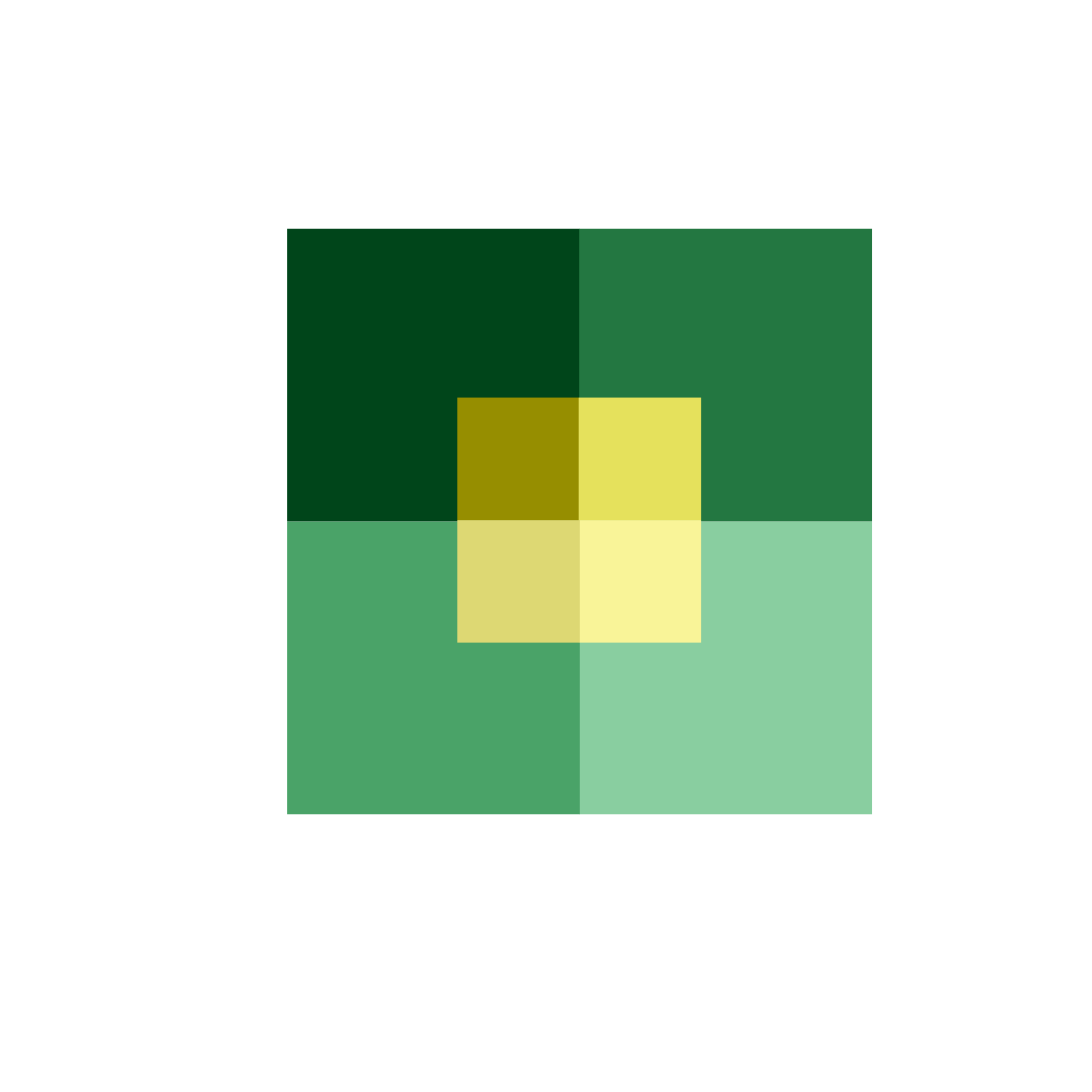
Here shows how a transparency illusion takes place when we play with the colour of intersecting boundaries. Note that all of these are opaque forms and the intersecting boundary has been recoloured to create the illusion. The experiment is to test what appears on top and what appears underneath and why…
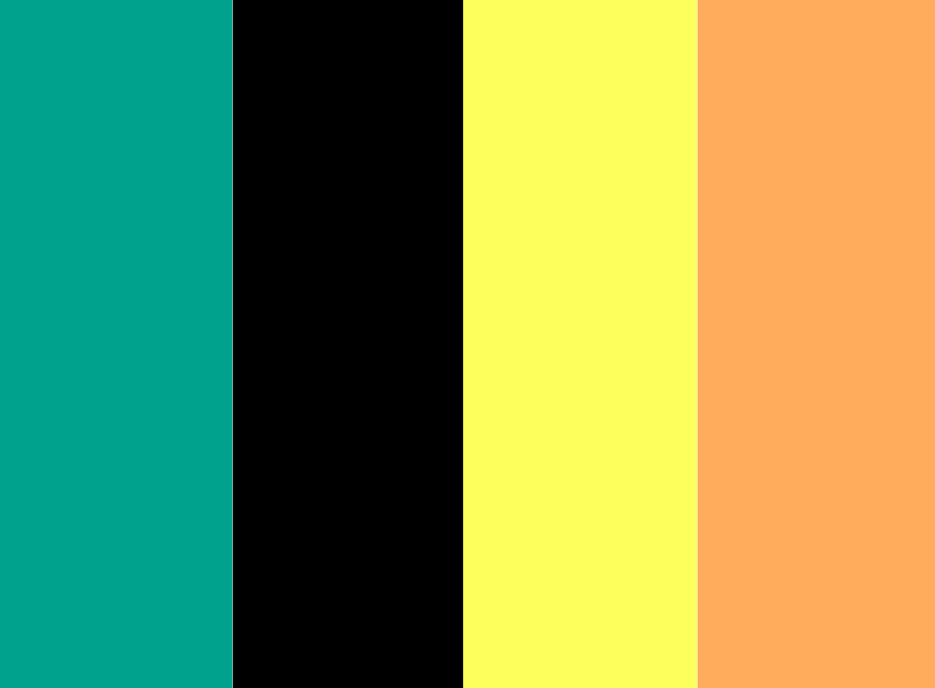
This grouping beneath displays colour intervals; an experiment to see if we can create convincing colour intervals in relation to each other – the same way we can create a chord between multiple instruments in the realm of music.
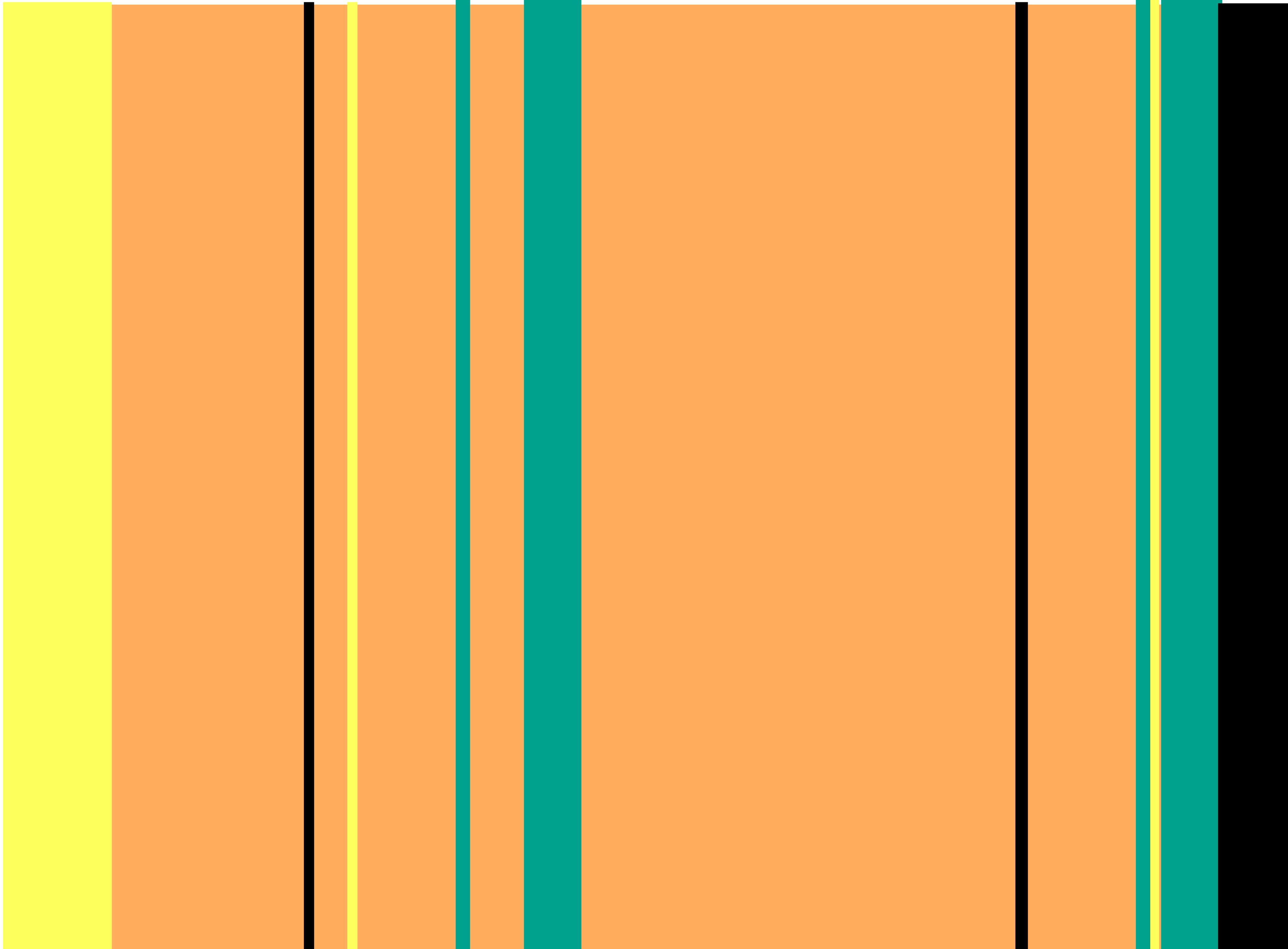
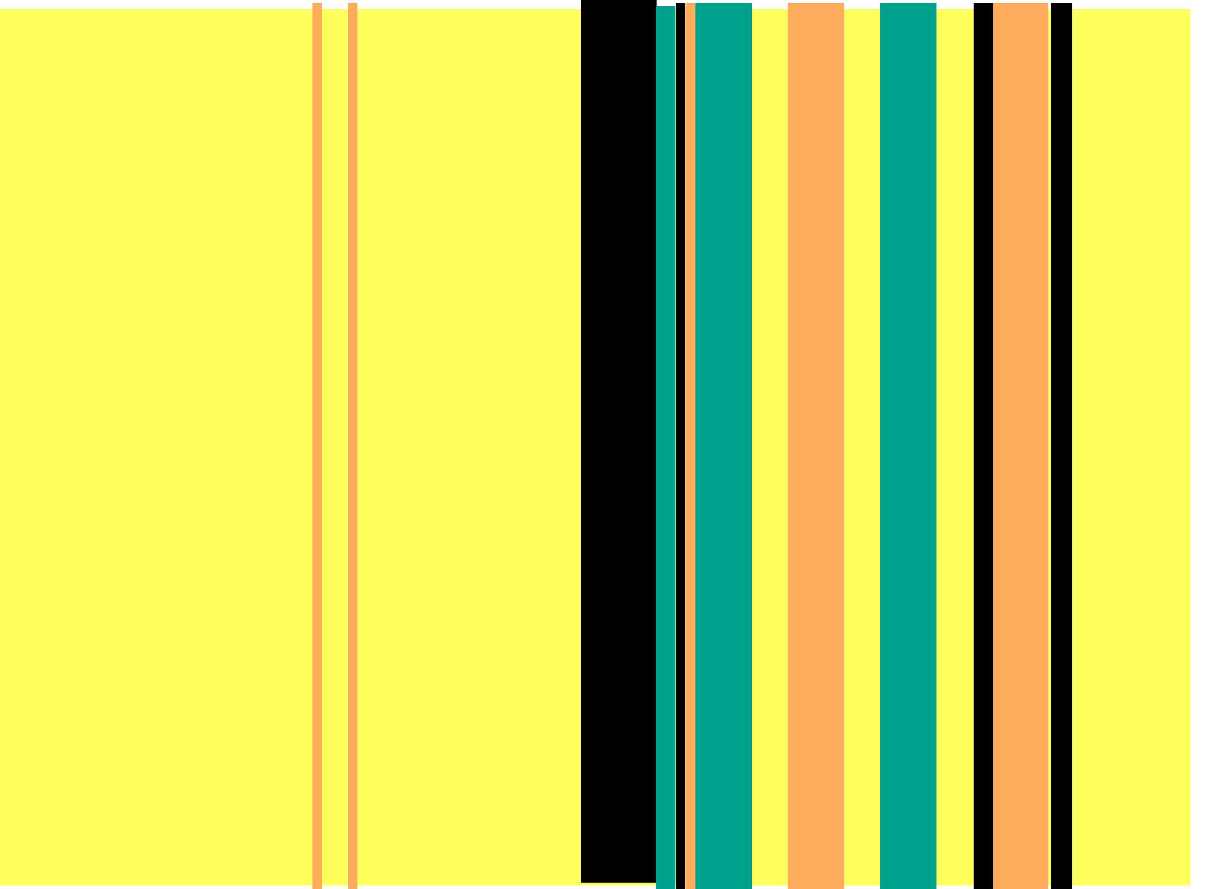
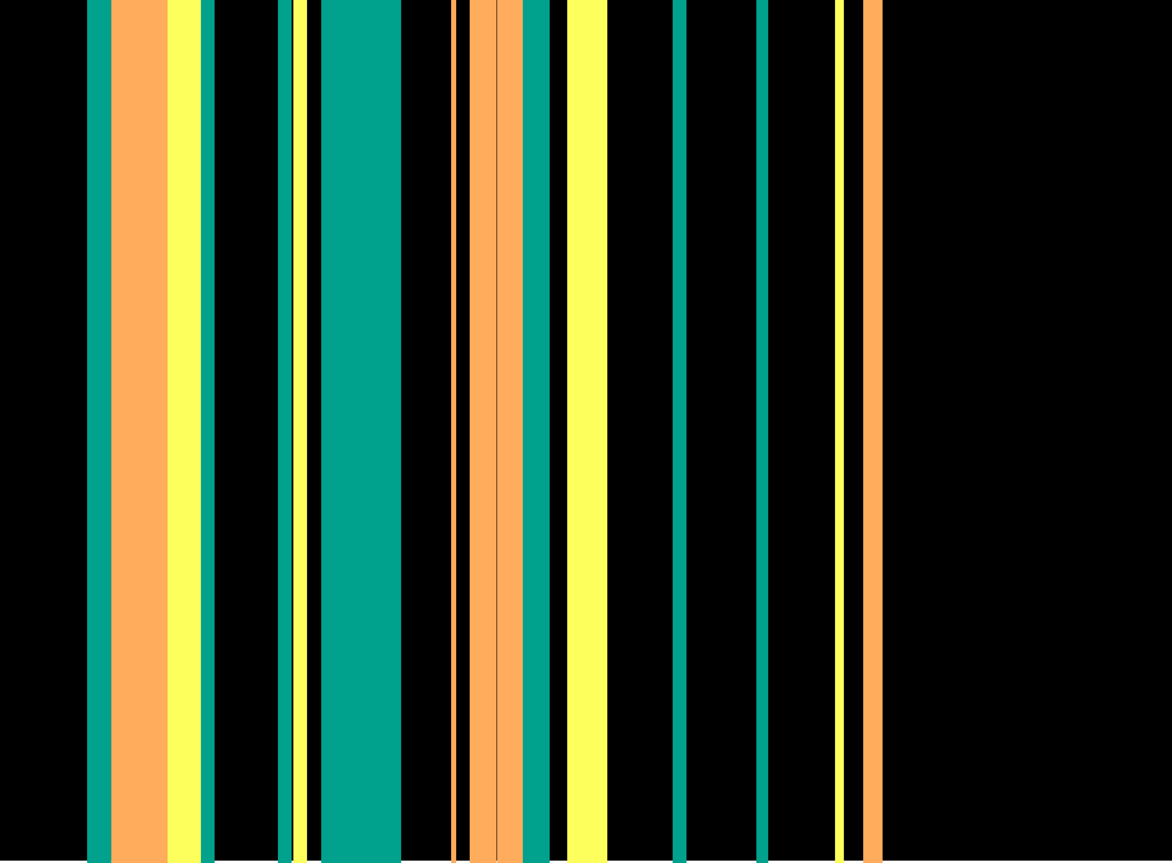
The fourth here demonstrates how the quantity of colour changes the perceived placement; moving figures from the foreground to the background, from the background to the foreground.
What starts out as equal quantities of colours, it displays each colour competing for dominance by its frequency alone, but as the quantity changes it is found that the higher the quantity of colour it dictates what is the fore and what is the ground – or why don’t the larger quantities of colour appear as stripes like the smaller quantities?
This fifth group shows the Weber-Fechner Law in action. On the left is a Red increasing in black evenly at a progression of 1 – 2 – 3 – 4. On the right is a Red increasing in black exponentially at a progression of 1 – 2 – 4 – 8. The result is that the left study, although black is evenly added it is perceived to stop or slow in progression after about the third step. The right, however, is perceived to step a lot more evenly into the black.
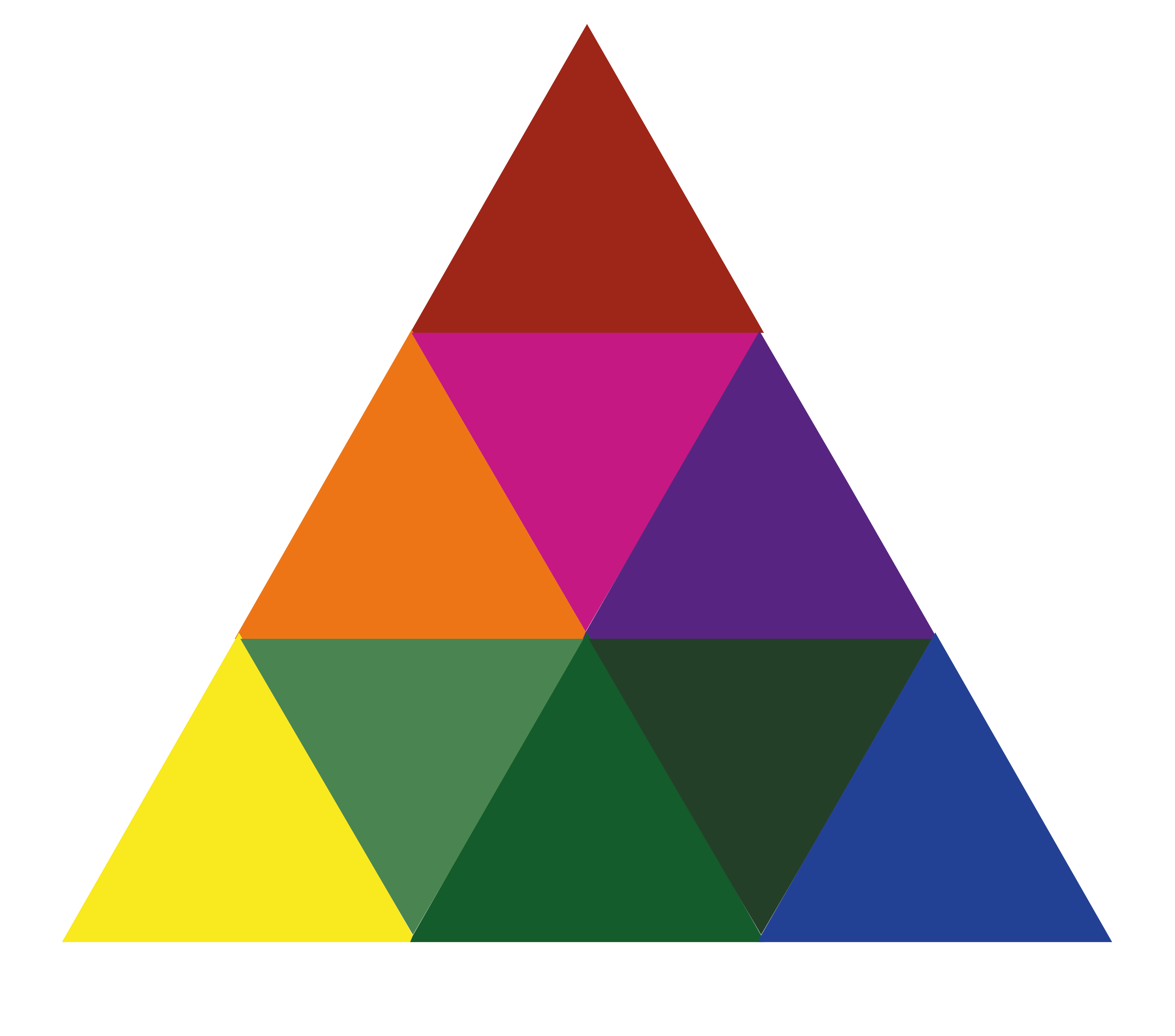
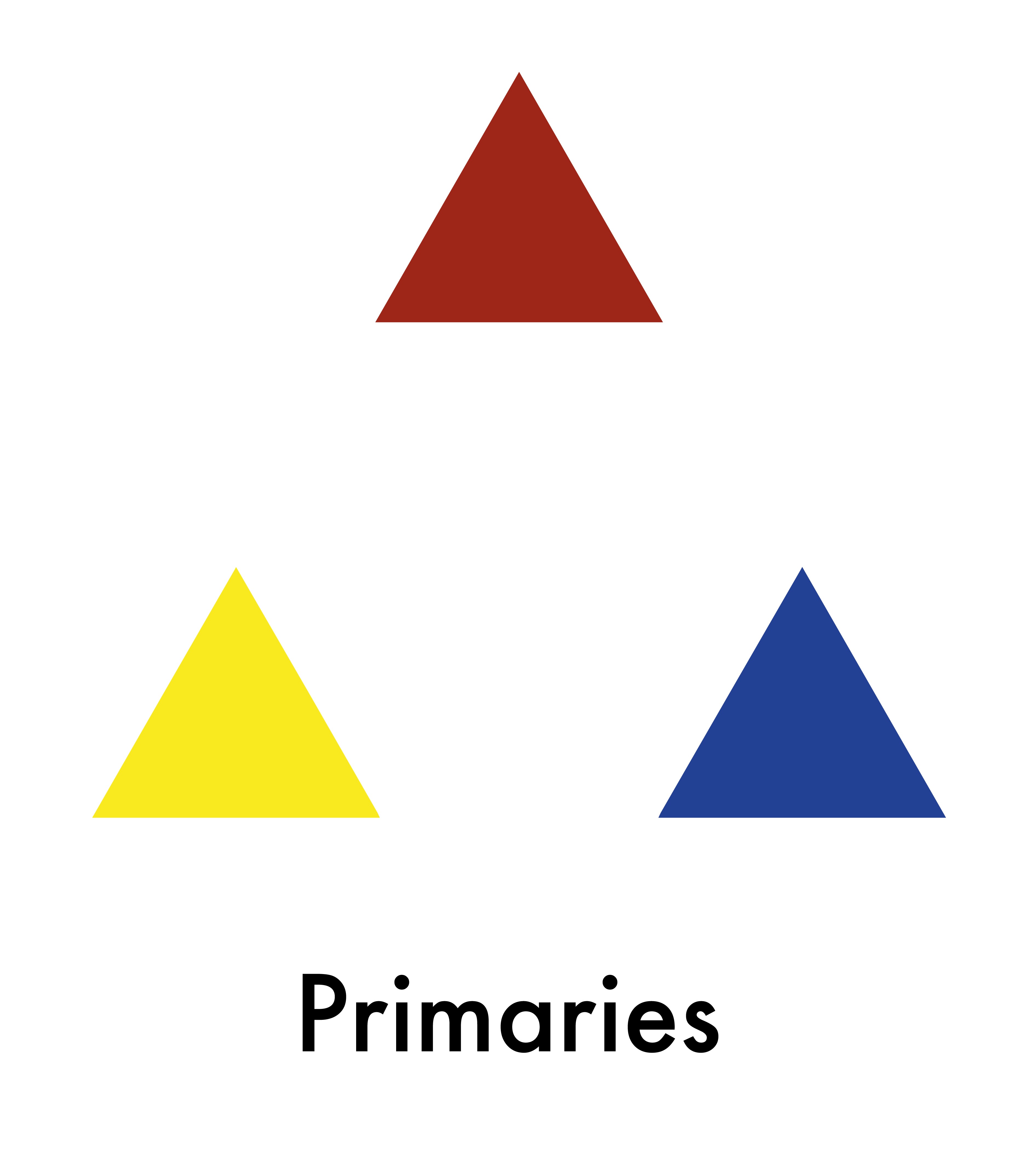
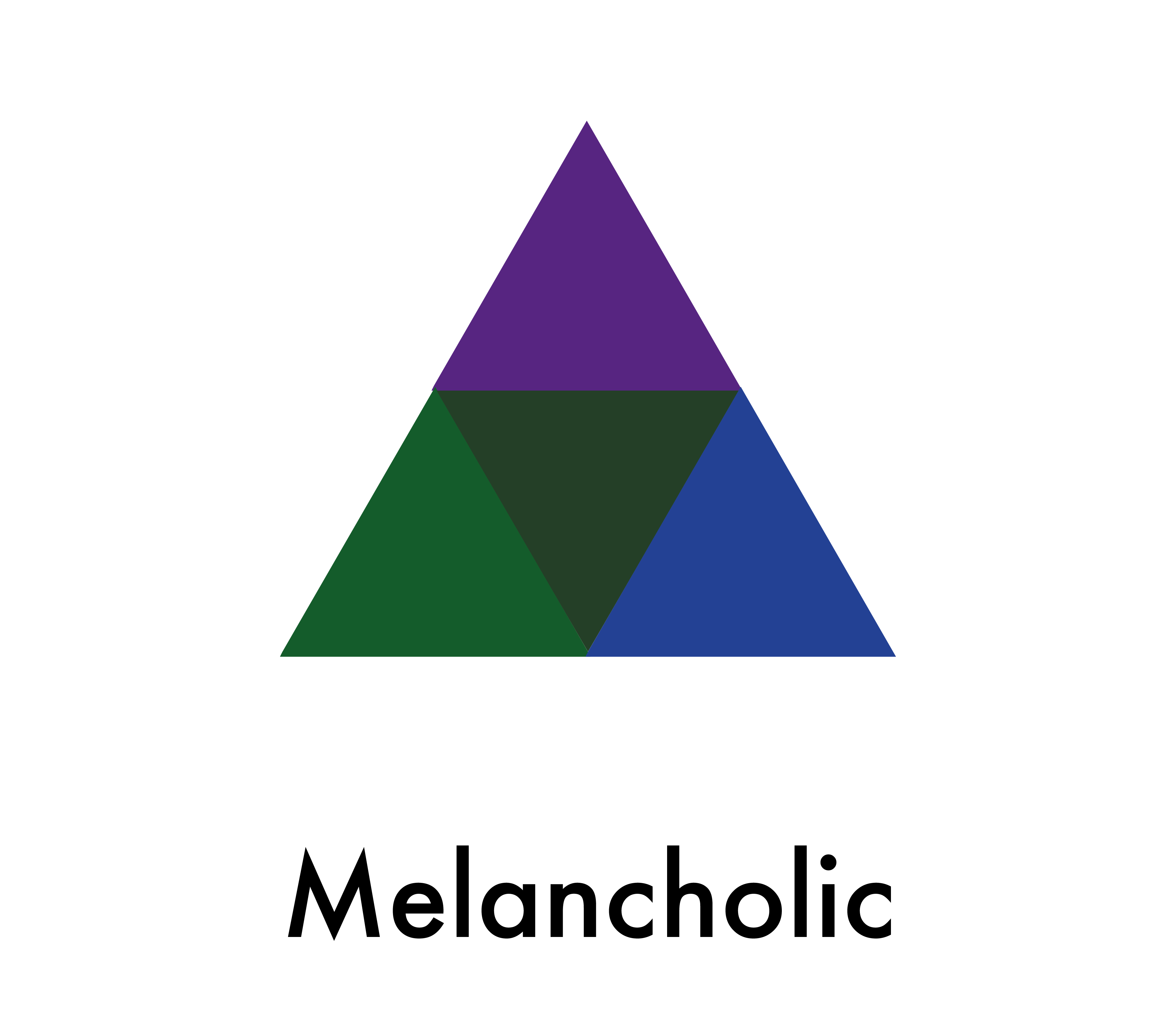
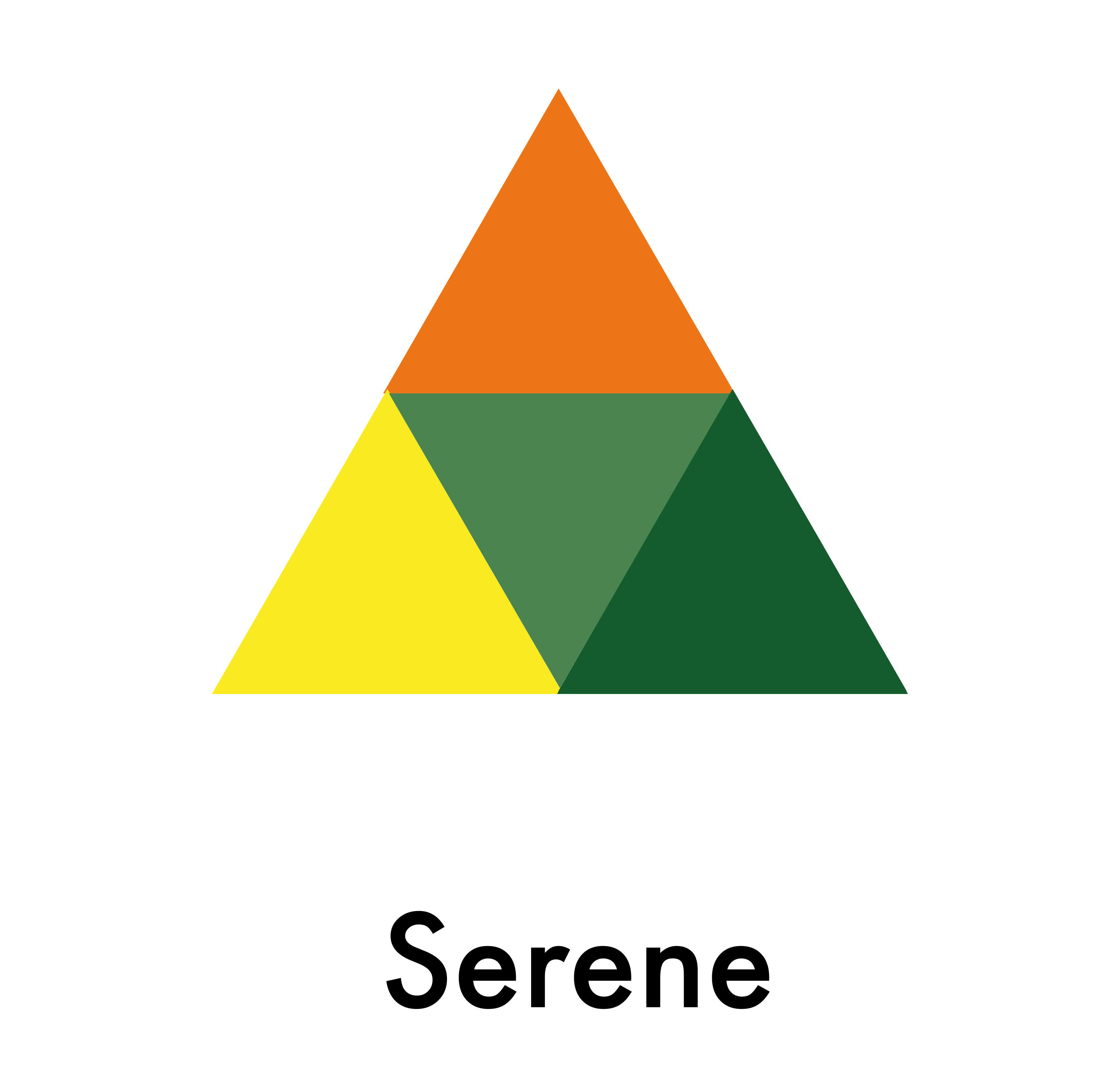
The last thing in this book is a finalising look at colour theory; displaying a colour triangle which looks like it could be of use… but I’m not sure yet.
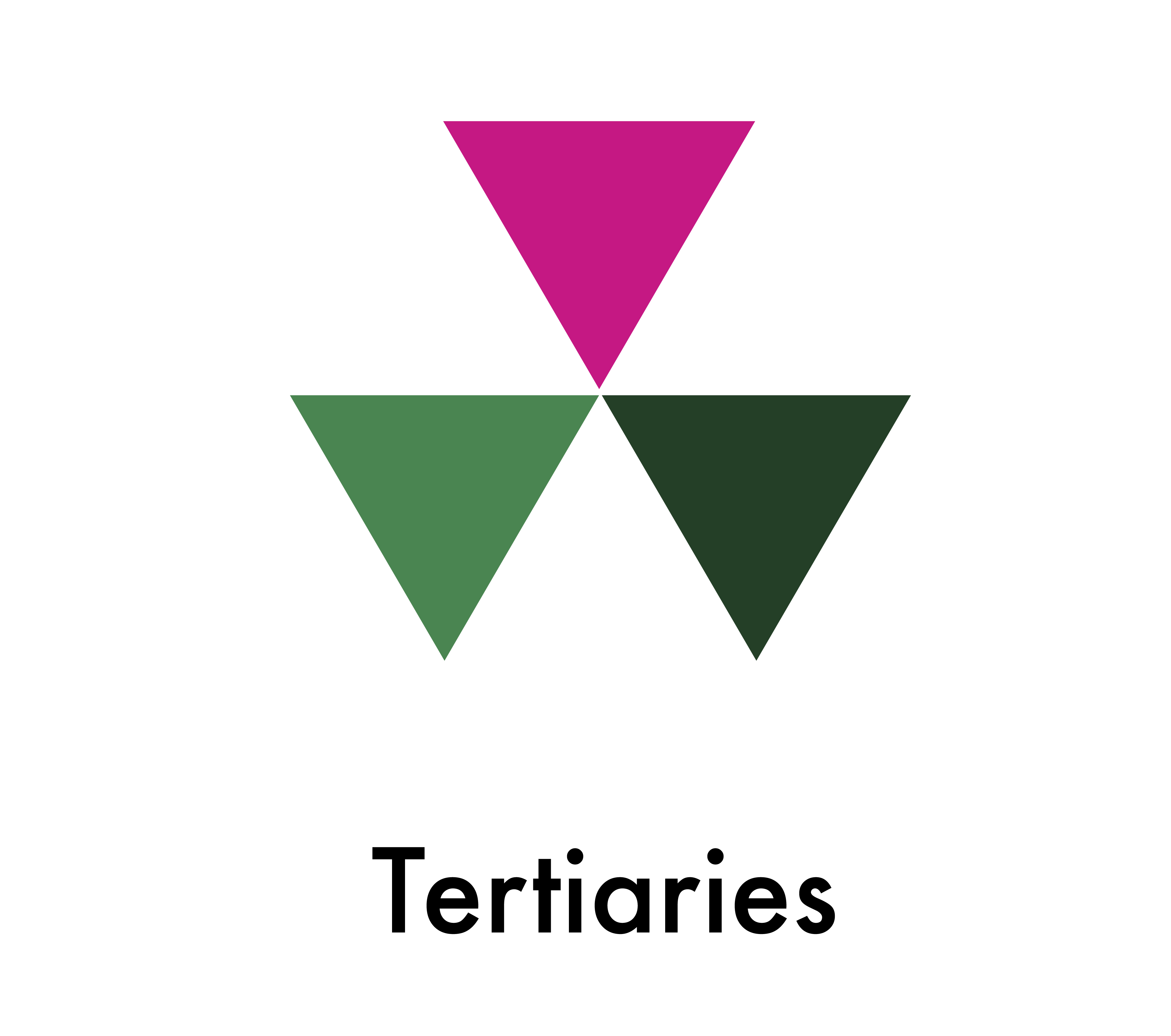
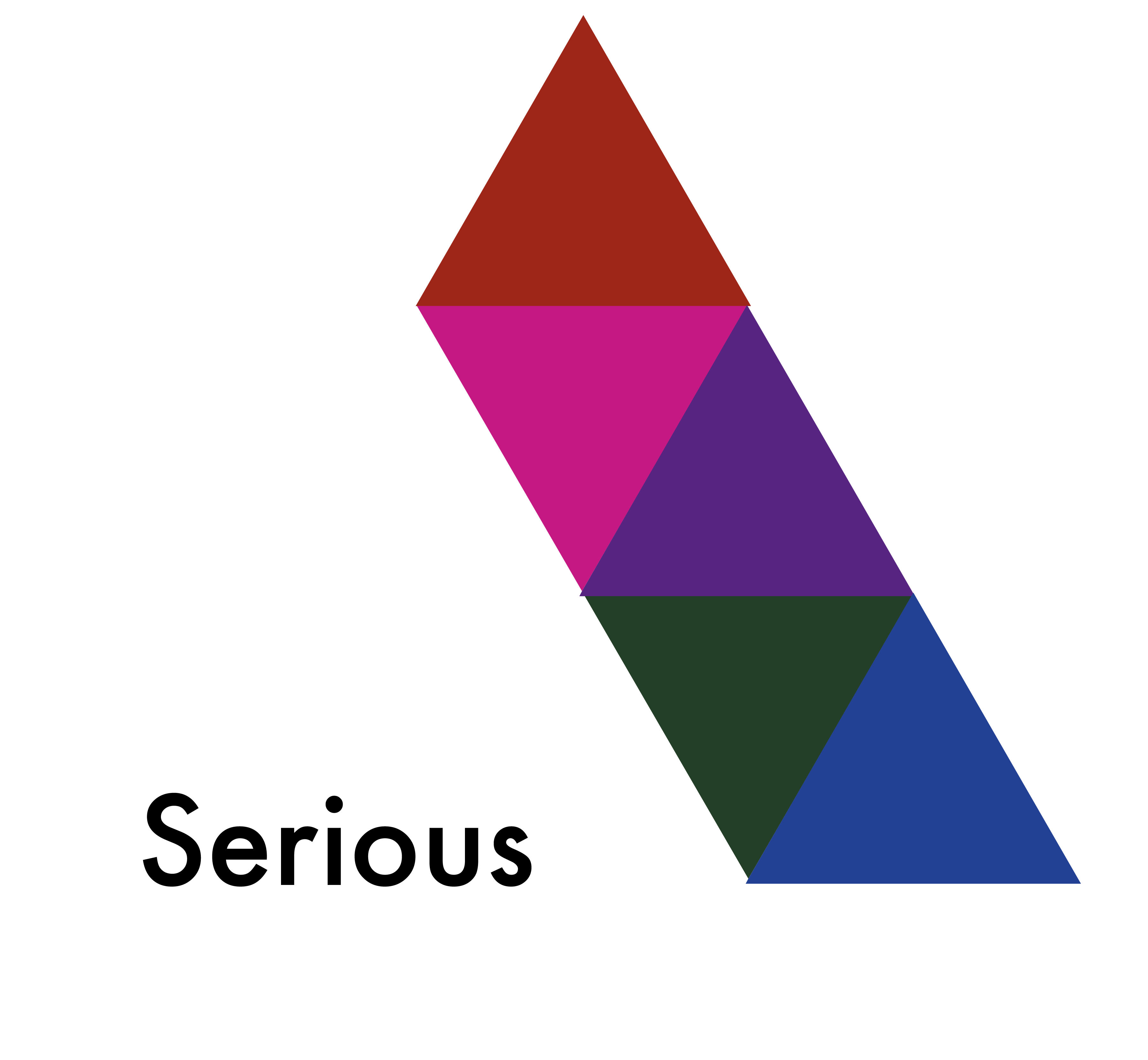
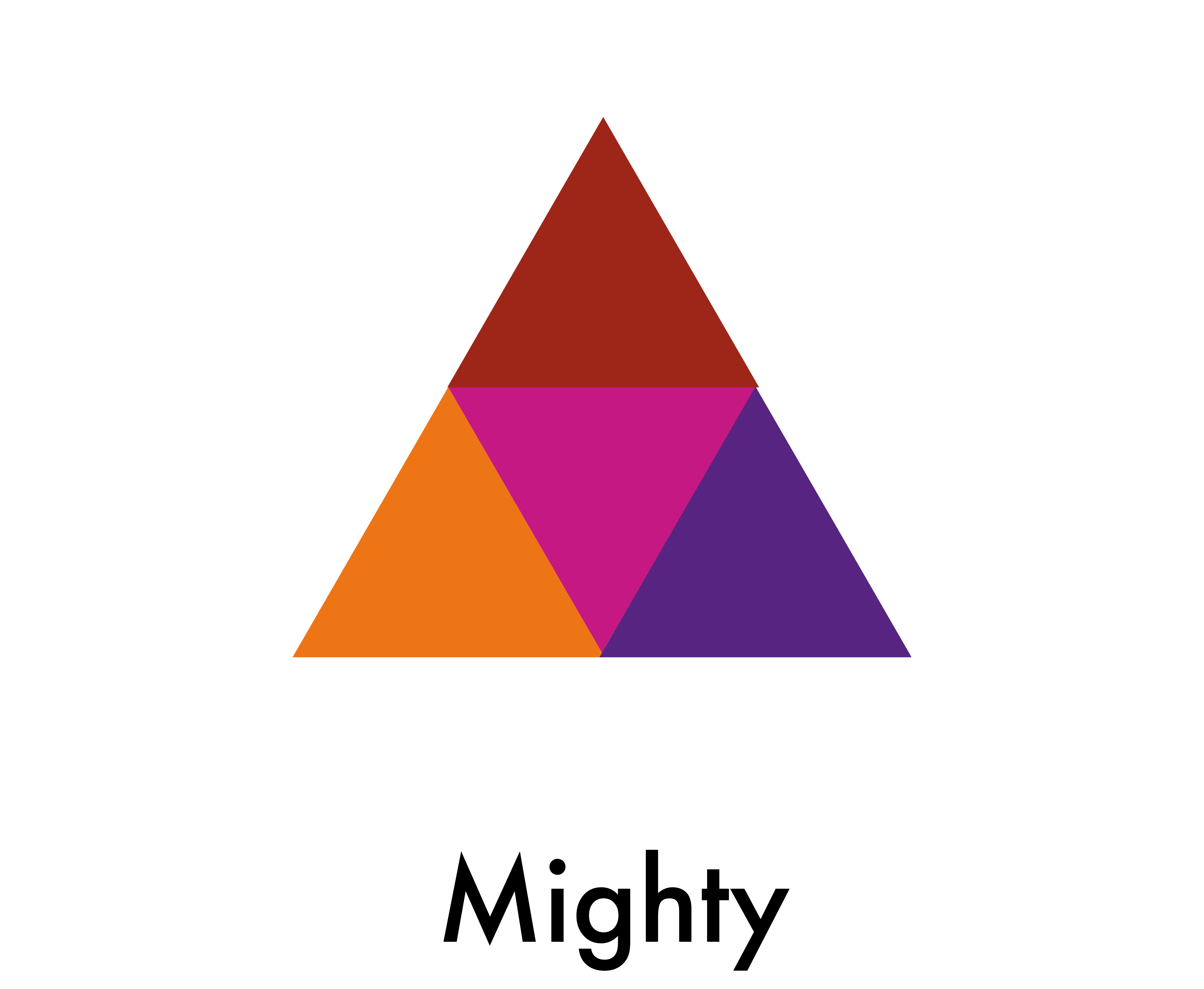
This triangle can then be broken up into…
And then be segmented and put into more ’emotional’ categories, which I suppose could be subjective.
As said before, overall ‘Interactions of Color’ calls upon you to play with the colours yourself as no ‘answers’ are really given, just directions as to discover your own conclusions and feelings on the ideas laid in the pages – which is nice!
It’s actually jammed with tons of interesting information for you to go out and do some research on, but, to me at least, the information is raveled up in such long and unnecessary language you find yourself reading the same short paragraphs ten times and feel as though your trying to squeeze blood out of a stone. It needs to be “humanised” quite a bit… and that’s not to dumb it down, it’s to make the information faster and more exciting, which I know it ultimately is.
