Spotlight: Josef Müller-Brockmann
I’ll admit it, at first, I rejected the grid. The idea of putting what seemed like restrictions on an exciting new idea made me feel as though it would disrupt the fluidity to any creative process and could comprimise any such workflow.
Now, I realise, I was just plain wrong. Today I yodel praise from mountaintops of the grid and its forefathers of Swiss design – Perhaps there’s some latent Swiss in my genealogy, I don’t know, but I’m a believer.
What set me free and on the path to beautifully segmented yet flowing designs, was knowing that using a grid should not be restrictive at all. Using a grid should provide structure and unity while allowing for compositional variation and smooth continuity from page to page. Contrary to what I first thought, using grids allowed me to be more inspired when creating and ultimately more expressive.
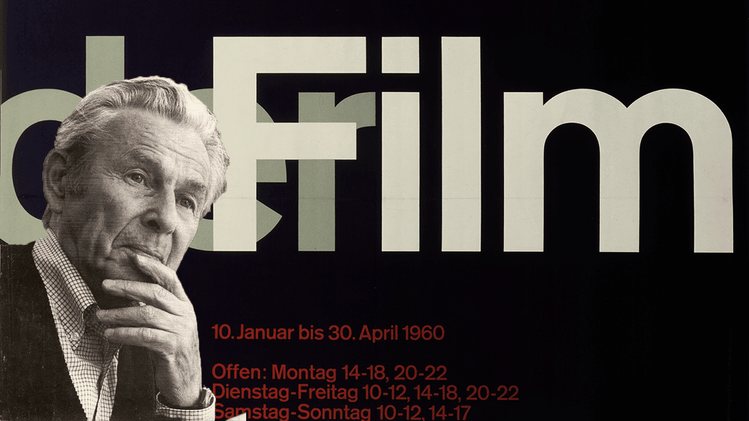
Considered a king of The Grid and one of the leading figures in Swiss design, Josef Müller-Brockmann has some of the cleanest swiss-style graphics. A style which has greatly influenced my recent output, Josef Müller-Brockmann, not only had a noticeable style but had a philosophy which he taught extensively at the Kunstgewerbeschule (design and art school) in Zurich from 1957 to 1960 and wrote various books teaching to a broader audience on his philosophy of design.
“The grid system is an aid, not a guarantee”
– Josef Müller-Brockmann
Clearly influenced by the Bauhaus School and De Stijl, Josef Müller-Brockmann had a clean compositional style while his use of forms were simplified down to their most basic while being evocative enough in their contrast to pull the viewer in.
The graphic elements used always seemed to tower in comparison to the content but never swallowed the content. He lets the content breathe in a way it simply comes to life for the viewer’s close inspection.
This widely ripped off poster for the Zurich Town Hall promoting a Beethoven concert is yet another great example of contrast and composition…

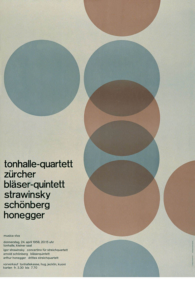
As well as an excellent use of contrast and proximity, his forms employed fantastic movement. Perhaps slightly reminiscent of a spinning vinyl, this communication is set simply in motion with a system of colours and placements…
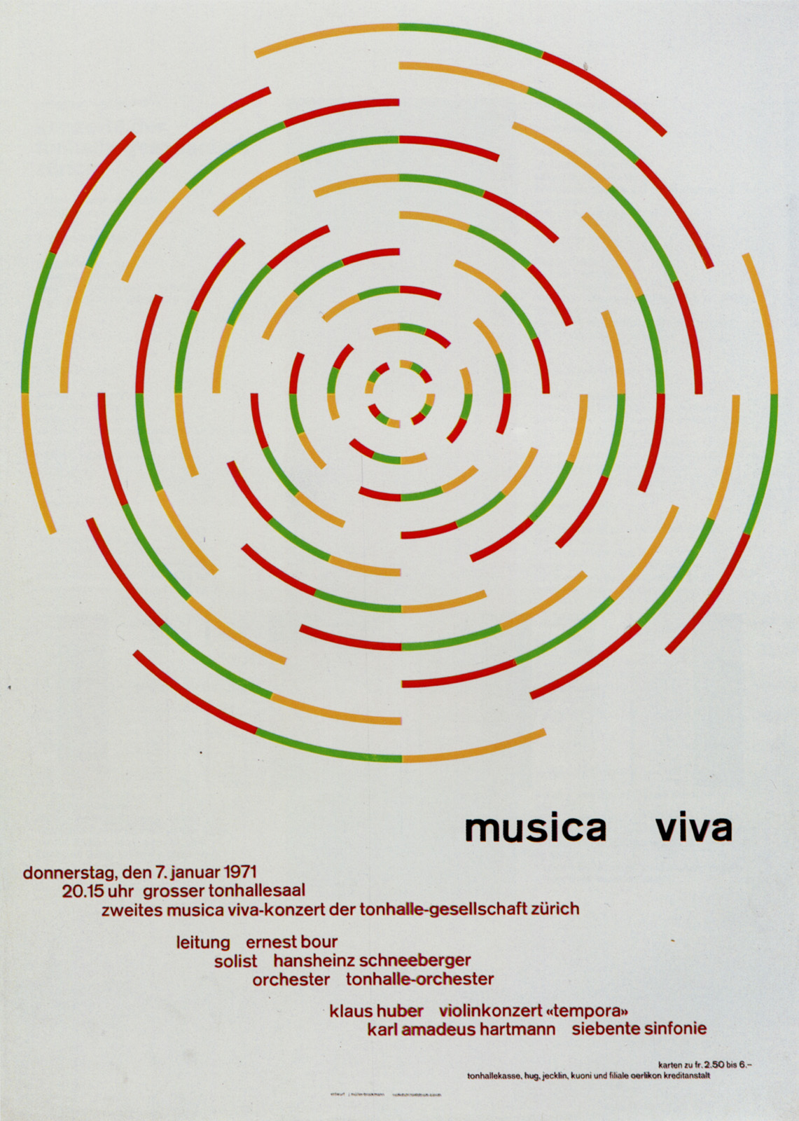
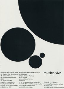
Or this other poster for Music Viva using what seems like simplified piano keys angled with movement; focusing on the classic grouping of black and white keys on a piano…

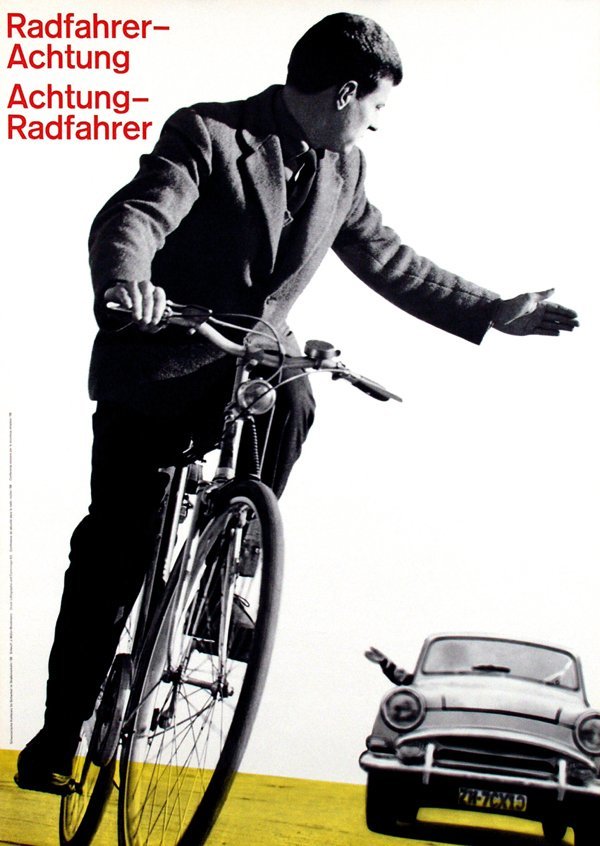
Josef Müller-Brockmann was no stranger to using evocative photography to bring a striking message across. This road warning poster for cyclists and motorists employs a subtle tilting to put you in the precarious balance of the cyclist, whereas the warning message in red mirroring the hand gesture of the cyclist gives the viewer, what I feel, an anchor of stability to the overall composition.
This other famous example “less Noise”, uses angle and placement to heavily incorporate a photo into the text with tension. The arms and head cross with the text, the expression of anguish separating the words creating something uncomfortable but magnetising in its contrast.

One thing to learn from Josef Müller-Brockmann is not only his elegant use of the grid but his use of huge contrasts; trusting that people will be intrigued enough to read and discover the content once they lock into a stimulating piece. The text doesn’t have to be in huge capitals to get attention let alone front capped, and the use of images and forms doesn’t need to walk you through every detail; merely gesture to emotion and response; trusting that if you or your collaborators get it, your audience most likely will too.