Blog

[vc_row css_animation="" row_type="row" use_row_as_full_screen_section="no" type="full_width" angled_section="no" text_align="left" background_image_as_pattern="without_pattern" el_class="blog-new-hagan" z_index=""][vc_column width="1/4"][/vc_column][vc_column width="1/2"][vc_column_text]We are by nature, pattern recognition machines.


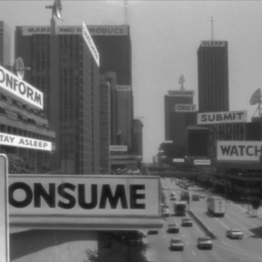
Sometimes all we need is colour and composition and we can tell exactly what something is saying.


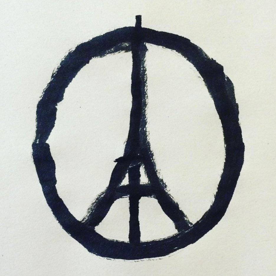
A friend recently sent me this with no words, no introduction, just this, an image sitting there in my message box with no explanation. But none were needed.


Here, all we need is three colours and a general composition and we understand in an instant what it's telling us. By presenting us an abstraction, our brains naturally try to 'solve' it, this makes us invest time and feel accomplished when we figure it out. It's similar to the success of Milton Glaser's 'I Love New York' graphic. By presenting you a letter, a symbol, and an abbreviation our brains decide it's a puzzle and a puzzle that's solved in an instant. It's satisfying.

[vc_row css_animation="" row_type="row" use_row_as_full_screen_section="no" type="full_width" angled_section="no" text_align="left" background_image_as_pattern="without_pattern" el_class="blog-new-hagan" z_index=""][vc_column width="1/4"][/vc_column][vc_column width="1/2"][vc_column_text]

The Pillars of the Parthenon aren't actually straight…


The NeXTcube wasn't a perfect cube…


And the letters I type aren't all dead flat to the baseline…

    Every day, perceptive illusions are built around us because sometimes when something is constructed 'perfectly' it doesn't look perfect. If the Parthenon's columns where perfectly straight, it would not look straight. If the NeXTcube was a perfect cube, it wouldn't look like a like perfect cube. And if 'o's, 'e's, and 'a's, etc, were all aligned perfectly to the baseline, it would feel like the letters weren't even.

[vc_row css_animation="" row_type="row" use_row_as_full_screen_section="no" type="full_width" angled_section="no" text_align="left" background_image_as_pattern="without_pattern" el_class="blog-new-hagan" z_index=""][vc_column width="1/4"][/vc_column][vc_column width="1/2"][vc_column_text]We've all seen them, maybe you're one of them. One of the thousands extending their arms, phones in hand, and snapping pictures of themselves at every turn, sometimes in the most precarious of places. If I'm honest, in the past it's annoyed me. Going to a gallery and seeing my attention shift from the artwork and toward people moving from piece to piece, fluffing their hair and posing the obligatory pout before snapping away; barely even looking at the artwork, as though the gallery experience was nothing more than a marketing opportunity for the cult of themselves.

[vc_row css_animation="" row_type="row" use_row_as_full_screen_section="no" type="full_width" angled_section="no" text_align="left" background_image_as_pattern="without_pattern" el_class="blog-new-hagan" z_index=""][vc_column width="1/4"][/vc_column][vc_column width="1/2"][vc_column_text] A sudden deadline, your train delayed, an earthquake, a financial panic, sleeping through your alarm. Any unpredictable situation, life-threatening or not, will give you spark of energy which can go in any number of directions. We all know the worst ways but often find ourselves panicked, abusive, depressed or simply non-active. In my life, the principles of Stoicism have become a constant to resolve the certainty of the uncertain world around us. A guide to living a better, more productive and conscientious life, Stoicism is a philosophy, an operating system, a process which ebbs and manages the tide of the uncertain world, a philosophy with principles, practices, and actions which work for the applications of today.

[vc_row css_animation="" row_type="row" use_row_as_full_screen_section="no" type="full_width" angled_section="no" text_align="left" background_image_as_pattern="without_pattern" el_class="blog-new-hagan" z_index=""][vc_column width="1/4"][/vc_column][vc_column width="1/2"][vc_column_text]Often underestimated is our sensitivity to the visual world around us. We can often underpin when something is exciting or awe-inspiring – from a gun-wielding maniac (fear) to a mountain backed by a starry sky (awe), though it's our subtlest emotional responses from the seemingly small which affect us at every moment, making up the majority of our days and the bulk of our common interactions…

[vc_row css_animation="" row_type="row" use_row_as_full_screen_section="no" type="full_width" angled_section="no" text_align="left" background_image_as_pattern="without_pattern" z_index="" el_class="blog-new-hagan"][vc_column width="1/4"][/vc_column][vc_column width="1/2"][vc_column_text] Early this year, in hopes of strengthening my weakness for colour, I went to the highly influential book 'Interactions of Color' by artist and educator Josef Albers.   The book, despite its heady and annoying unnecessary academic tone (which I disdain so much), instils a child-like curiosity to experiment, play, and all in all, have fun with colours.   The main takeaway from the book is how colour, much like musical notes, has a perceptible change with their combinations, like how one note on a piano would not be considered music, but play two notes, and it's a different world entirely.

[vc_row css_animation="" row_type="row" use_row_as_full_screen_section="no" type="full_width" angled_section="no" text_align="left" background_image_as_pattern="without_pattern" el_class="blog-new-hagan" z_index=""][vc_column width="1/4"][/vc_column][vc_column width="1/2"][vc_column_text]I'll admit it, at first, I rejected the grid. The idea of putting what seemed like restrictions on an exciting new idea made me feel as though it would disrupt the fluidity to any creative process and could comprimise any such workflow.   Now, I realise, I was just plain wrong. Today I yodel praise from mountaintops of the grid and its forefathers of Swiss design – Perhaps there's some latent Swiss in my genealogy, I don't know, but I'm a believer.

[vc_row css_animation="" row_type="row" use_row_as_full_screen_section="no" type="full_width" angled_section="no" text_align="left" background_image_as_pattern="without_pattern"][vc_column width="1/4"][/vc_column][vc_column width="1/2"][vc_column_text]When we compose, we organise.   Whether we want it to look chaotic or minimally peaceful, if it achieves what it's set out to do, the composition is achieved.   I see composing much like the work of the conductor...

[vc_row css_animation="" row_type="row" use_row_as_full_screen_section="no" type="full_width" angled_section="no" text_align="left" background_image_as_pattern="without_pattern"][vc_column width="1/4"][/vc_column][vc_column width="1/2"][vc_column_text]From the Constructivist movement in early 20th century Russia to the more recent happenings in Poland with this design clenched in protester's fists, design has been used again and again to provoke social change and extend political stances...

[vc_row css_animation="" row_type="row" use_row_as_full_screen_section="no" type="full_width" angled_section="no" text_align="left" background_image_as_pattern="without_pattern" el_class="blog-new-hagan" z_index=""][vc_column width="1/4"][/vc_column][vc_column width="1/2"][vc_column_text]Wide open white spaces and turning dynamic figures that dance off the page, Alexey Brodovich was known as a bold innovator and a giant in the world of editorial design; helping bring a European edge of art and design into American media which we can still see the influence of today on not just print publications but on websites also.   His most public and influencing work came from 1934 to 1958 working as art director for Harper's Bazaar.