Better Tools
Whether you use Adobe, Corel, or Affinity, we all adore the tools we use to accomplish our work, even when we’re using a t-square and our favourite 2B pencil, we take a lot of pride in our chosen tools of design…
Though one set of tools which often gets overlooked, is the tools we use for clear communication in our work, and these, in honesty, should be sharpened and honed just as much as your premiere 2B graphite pencil specially imported from Yugoslavia.
Things like:
- Tone
- Didactics
- Style
- Metaphor
- Poetics
It can be said that a successful design is one which reaches a desired audience and elicits the desired emotion. And the tools which we decide to use in the pursuit to get us there have to work to evoke this; leaving the casual passerby receptive to the message on display.
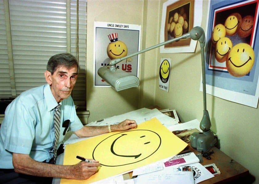
The not so smiley creator of the iconic yellow ‘Simley’ [www.smiley.com]
Whether it’s getting them to read a story in a magazine, donate money to a charity, or RSVPing to a wedding invitation, all these, as small as some might seem, need to affect an emotional state while telling you a message clear enough for them to take action in some way – which can be done a variety of ways.
1. Through Tone
A lot like the pitch and cadence we speak throughout the day – often unnoticed – your tone of voice will change the intention behind your words – and perhaps carries more meaning than the words themselves! In design, this is no different.
The tone you communicate should encompass the reputation somehow. If you are designing the packaging for luxury branded chocolates you may decide to use a very posh script typeface and use colours such as gold, and deep saturated tones such as this classic After Eight identity.

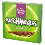
When we compare that with the Matchmakers identity, we are given a totally different emotion.
When given a known franchise that already has a solid reputation built, you’ll need to respect and enhance that emotion. For example, if you were designing the poster for a new Superman movie, you probably wouldn’t employ the use of Comic Sans for the copy – but then again maybe you would. It all depends on what the product or service is telling you.
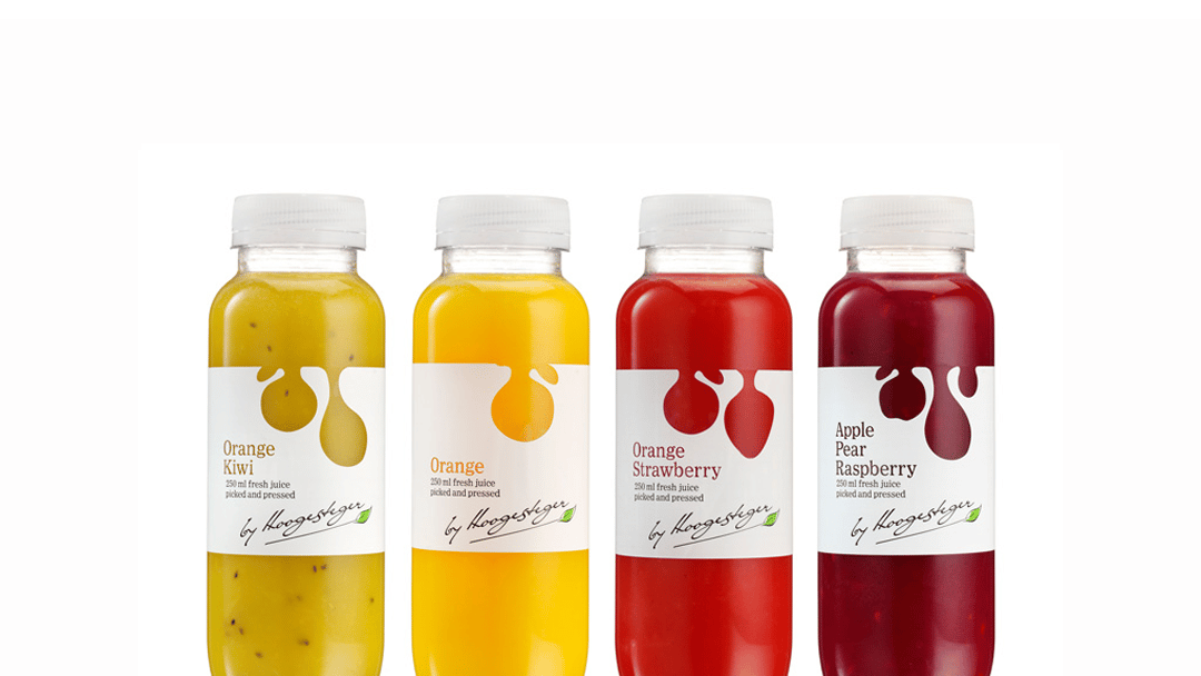
Of course, it can be a lot more nuanced than simply picking an appropriate typeface, as DesignBridge demonstrated with their packaging for ‘by Hoogesteger’; a “pick and press” fruit drinks company from the Netherlands.
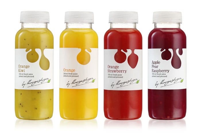
by Design Bridge [Hoogesteger]
They incorporated cut wrapping in the form of silhouetted fruit shapes to highlight the ‘real’ ingredients, drawing attention to the authenticity of the product while also backing it up with the name of the company in a signature-like script adding consumer confidence to the product with a warm invitational ‘approval’. From this quick example, we can see perhaps one of the key objectives in the brief was to convey trust between the company and its targeted audience.
2. Didactics
Didactics here means translating the use of practical information and sometimes complex information in a clear, concise, and immediate way, for example:


It’s unlikely you would see a stop sign and think “not to stop”. The use of capitals, clear spacing, flat hexagonal edges like no other sign and the sheer power of red tells us that we need to divert our attention as soon as possible and follow instruction.
Airport signage is well-known for this as it needs to transcend all language barriers and communicate vital messages in navigating the mess (and stress) of an airport.

3. Style
Of course, in amongst the precision of creating a sign which can be interpreted by all and mistaken by none, you also have the style.
Splitting up represented meaning into two categories you have the signifier and the signified. The signifier can change in a variety of styles and alter the tone of the service, product or environment people are entering.
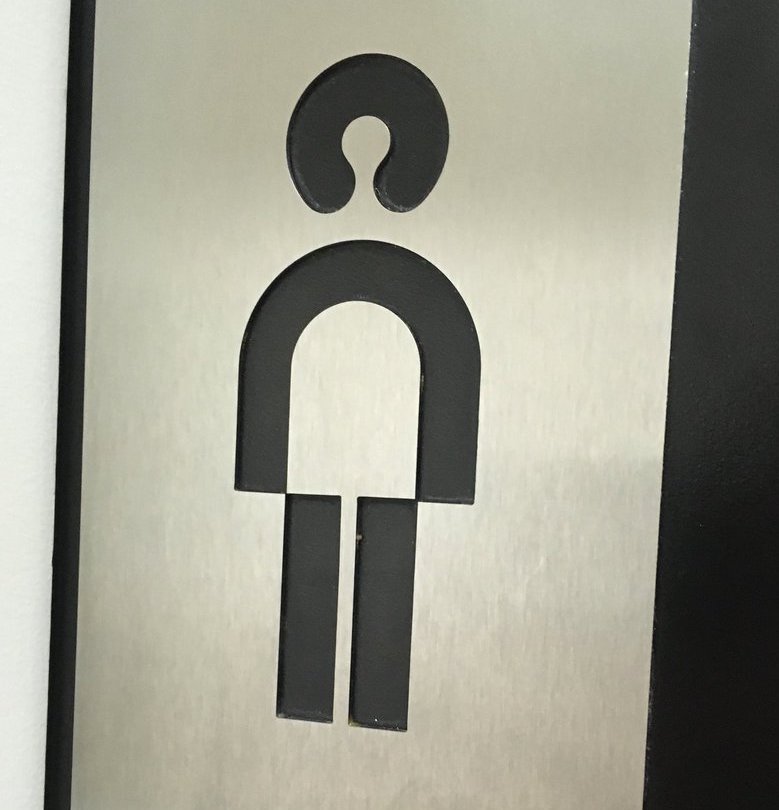
The signified, on the other hand, is the actual meaning behind the message. You need to retain this at all costs, otherwise, you won’t know which is the boy’s room or the girl’s room.
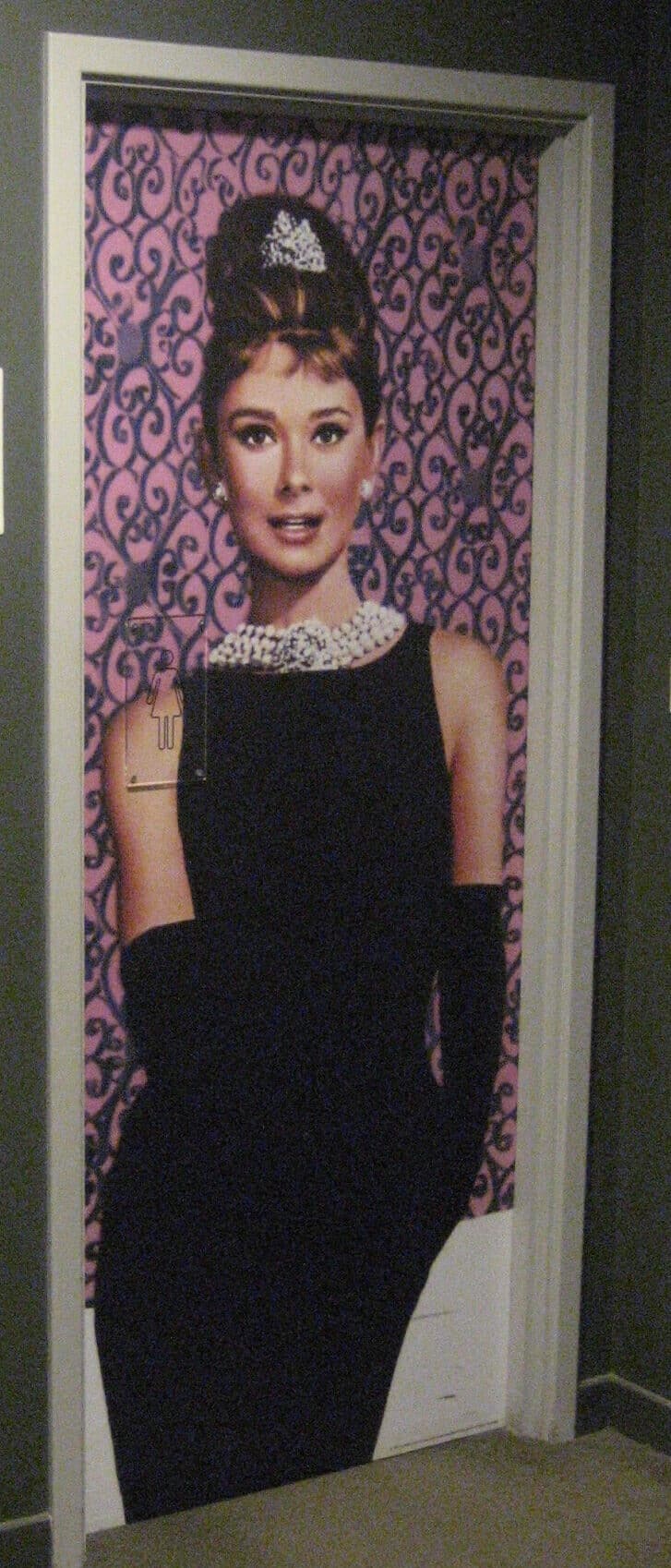
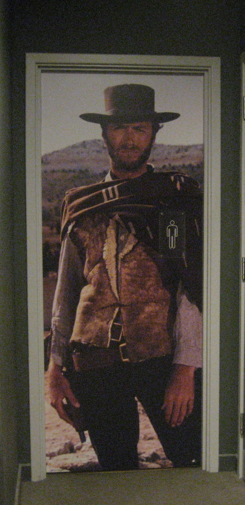
In a certain HMV Curzon near me, the toilets have a height-sized Clint Eastwood on the men’s toilet door and Audrey Hepburn directing the use of women’s toilets. This is a fun way of showing the toilets while keeping true to Curzon’s “for film lovers” brand.
Designed by Otl Aicher, the Olympic pictograms used in the 1972 Munich Olympics remain a great example of style and function. They convey the message of the sport quickly and effectively while additionally showing a more dynamic competitive element through the images.
Note that football isn’t simply a football or hockey simply a hockey stick. These would’ve communicated the sport just as fast and efficiently though probably not as effective.

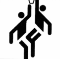
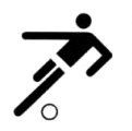

by Otl Aicher [1972 Munich Olympics]
4. Metaphor
Using visual metaphors is how you get an idea to stick in the viewer’s mind. It gets the person to stop reading and start participating in the design.
Some images over time have become such strong visual metaphors already.
It works by triggering associations that the mind is naturally adapted for and by doing so you are getting the view to participate and invest a little more time in the work.

by Milton Glaser [I Love New York].
A letter, a symbol, and an abbreviation.
Repeated through frequency and public positioning, logos themselves will also eventually become metaphors. In 1995, Nike just about had it with wasting ink on printing the word ‘Nike’ over and over. So they scrapped it and now solely use the iconic ‘Swoosh’ to communicate the sports brand.

by Carolyn Davidson [Nike Swoosh]
Of course, not all companies can be so bold. While Uber has a simplified logo without the word ‘Uber’, they still need to include it all advertising for their brand to get the right traction.
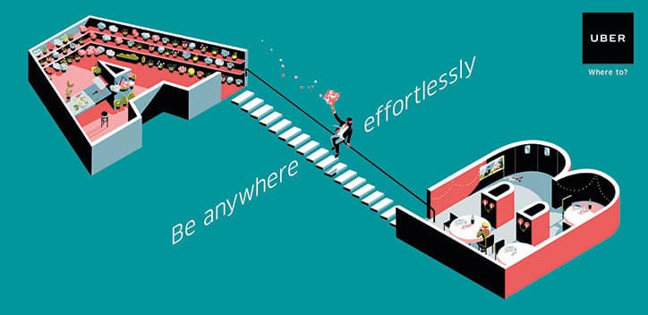
by Tom Haugomat and BBH London [Uber, Be anywhere effortlessly campaign]
5. Poetics
For myself, poetic form in design, is design at its the most intriguing, though is delicate tool to put into use.
It works exceptionally well if you want to…
- Provoke or stir controversy with your audience
- Tease your audience
- Want thoughtful responses
- Or want to promote ambiguity in your communication
A purely artistic design has the ability to really grab the attention of your audience and hold their interest long enough for the message to be remembered. However, poetic form does tend to have difficulty of immediacy and accessibility with a wide range of people. But perhaps, you’re not after immediacy or a wide range of people?
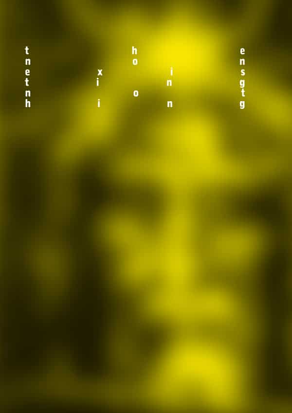
by Fons Hickmann [The Nonexisting Nothing]
This is an example of an exhibition poster that demands your time. It is far from immediate, the letters are spaced wildly, the image is drastically blurred and drenched in a bilious yellow colour. If they spent the placement budget on motorway billboards, it would certainly not be the best use of the budget.
However, when we take into acount the context of the exhibition, it works. The exhibition titled, ‘Man and God’, is about the mystery which surrounds the idea of God and its relationship with people.
With this in mind, the designer’s choices are all clearly conscious ones. Using a blurred image of the ‘Shroud of Turin’; already an artefact of debate. Incorporating extremely wide spacing to the typography, leaving the message just as cryptic as what the exhibition suggests. The yellow expressing the murky ambiguity and mystery associated. All coming together to voice that exhibition… you just need to give it time.
For the most part, poetic form lends itself best for exhibitions, galleries, music posters, albums, etc.
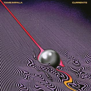
by Robert Beatty [Tame Impala – Currents]
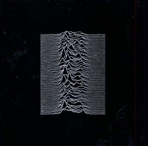
by Peter Saville [Unknown Pleasures – Joy Division]
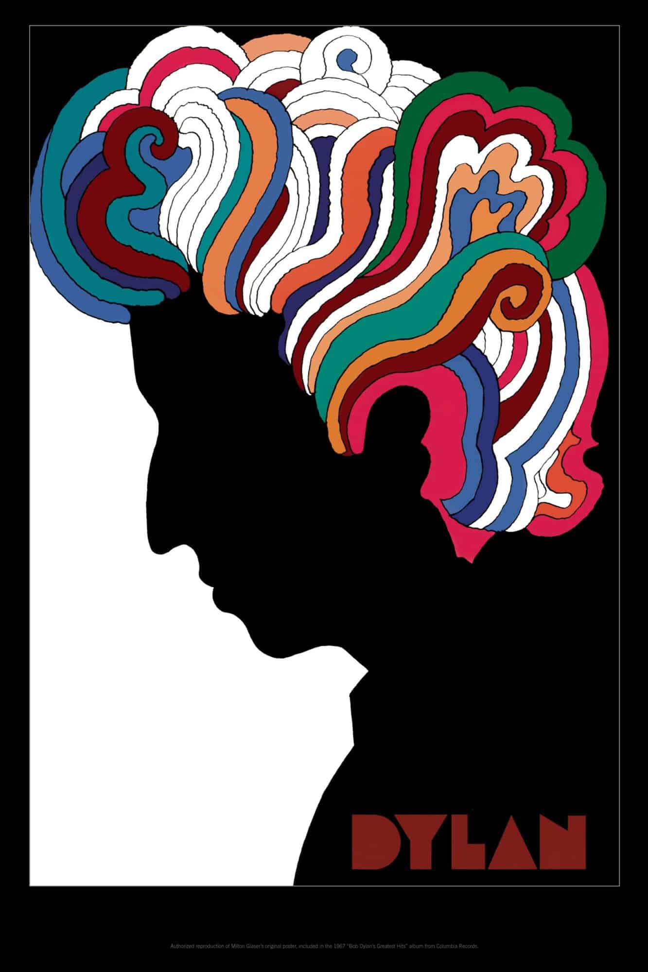
by Milton Glaser [Dylan Poster]
Lightly speaking, all designers will incorporate these tools somehow for effective communication.
From the Tone of the design, allowing the mission of the product, service, etc, to be consciously expressed. The practicality of Didactics while employing a defined Style to give clear communication to an audience. Using Visual Metaphor for quick associations, impact, and immediacy. And above all, to create beautiful work with meaning. You are an artist, no matter what beret-wearing beatnik says. Just because it has broad visibility and less indelibility doesn’t make it any less valid. There’s no reason why design shouldn’t move people and help them discover new worlds.
