Judging A Book By Its Cover
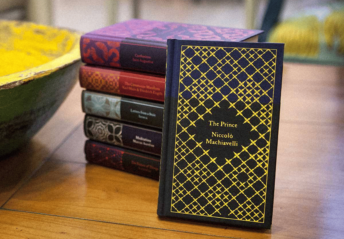
On the left side of my desk, I stack my “quake books”. These are books that have fundamentally changed me in some way; shaken the foundations of who I am and helped me on some sort of path. Placing these on the side of my desk they prove as daily anchors where looking at the binding alone helps me instill the principles or philosophies to live by (having read it of course).

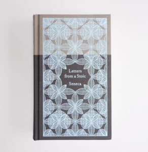
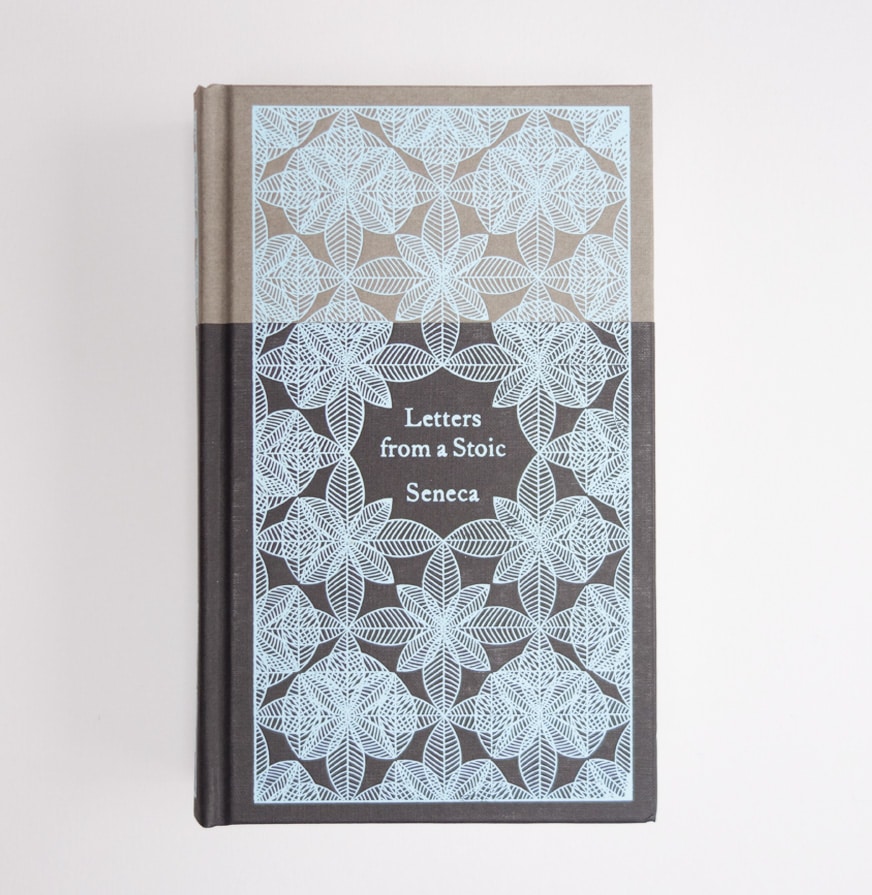
One of these books, by far the best looking, is ‘Letters from a Stoic’ by Seneca on the Penguin Classics Pocket Philosophy Hardbacks which was design by Coralie Bickford-Smith. And it’s beautiful.
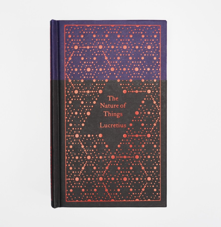
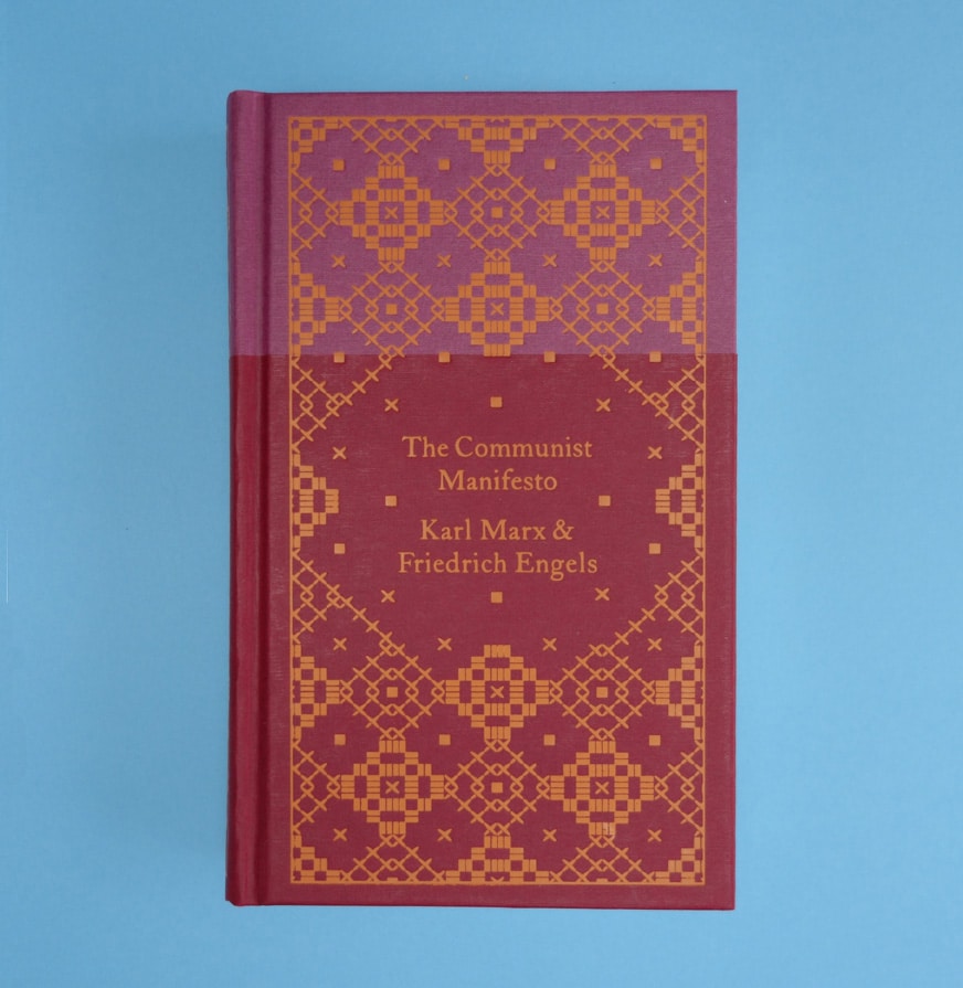
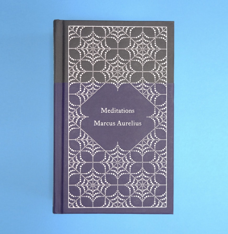
More importantly for this post is that the book is actually part of a set that includes other thinkers like Marcus Aurelius, Machiavelli, Marx, and many more, and they all sit together beautifully in unity with each other but at the same time, each of them can stand alone and have their own distinct identity – ideal for the varying philosophies and stances lying behind each cover.

More importantly for this post is that the book is actually part of a set that includes other thinkers like Marcus Aurelius, Machiavelli, Marx, and many more, and they all sit together beautifully in unity with each other but at the same time, each of them can stand alone and have their own distinct identity – ideal for the varying philosophies and stances lying behind each cover
Looking at the way these books are presented, it is clear that they belong to each other in some way. But how is this achieved? The colours are all different and each pattern used are all unique.
It’s the unique patterns and varying colours which give the book collection the qualities to make them all stand apart individually. The unifying factors, however, are those of material, format, type, composition, size, and above all, style.
Just by looking and not feeling the clothbound material, the style of the pattern is the most aligning factor here. Style has some contradicting definitions, but here a style is an appearance determined by the principles or process of how something is designed. This means that even though the patterns and colours all differ, the style ties it together, allowing them all to appear equal but allowing each book to secure its own voice and meaning.
Even though each pattern is uniquely different like that of a snowflake, the style of the patterns all have the same finicky quality, they all utilise one monochromatic colour over another, they have zero shadings or dimension leaving them flat and timeless, the tones used are warm giving them all wholesome tonality.
What’s nice about this is that even though they are not strictly part of an anthology (Vol 1, Vol 2, etc), it still would make you want to collect each one. It’s another example where a well-done design system is essentially working an implicit marketing approach.
Also, writing this turned me on to Coralie Bickford-Smith and her other award-winning work. Everything has a lovely, warm, human quality. It makes your heart feel good.
You can discover her work here: cb-smith.com