Colour Inspiration That Comes From Everywhere
When it comes to colour, it’s easy to get a bit lost.
Like picking a typeface, it’s the sheer amount of options that paralyses us. It doesn’t seem to be a problem when we have strict guidelines telling us which colours to use or typefaces to employ. Though when we don’t, it’s easy to fall into that black hole of endlessly tumbling through menus and potential colour harmonies.
Picking a single colour and shade can be tough enough but it’s when we want to find that magic combination that can make everything pop it gets ever more bewildering.
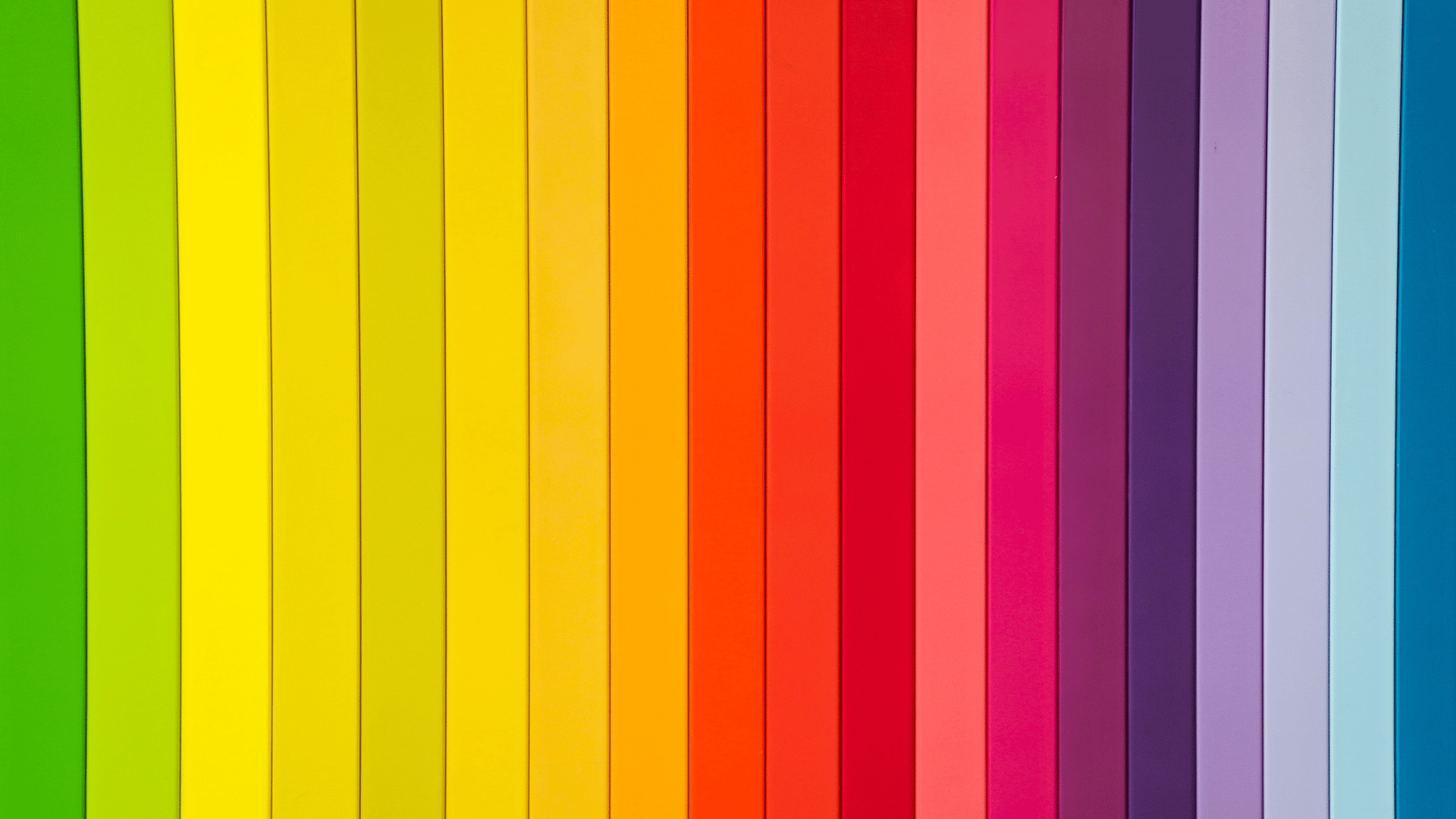
Many people like to use predefined colour harmonies, whether it’s analogous, complementary, quadratic, etc. Where this could be a good source of inspiration, I have personally always found it… a little mechanical. It doesn’t feel natural and think it’s easy to lose touch with how colour affects us in the real world.
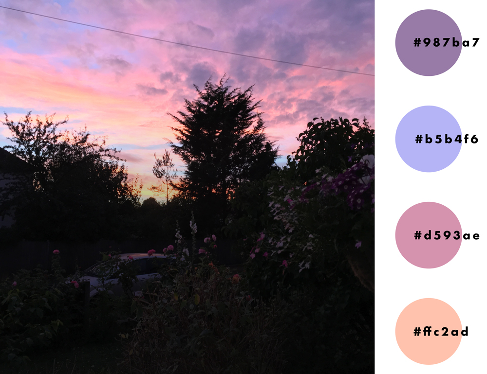
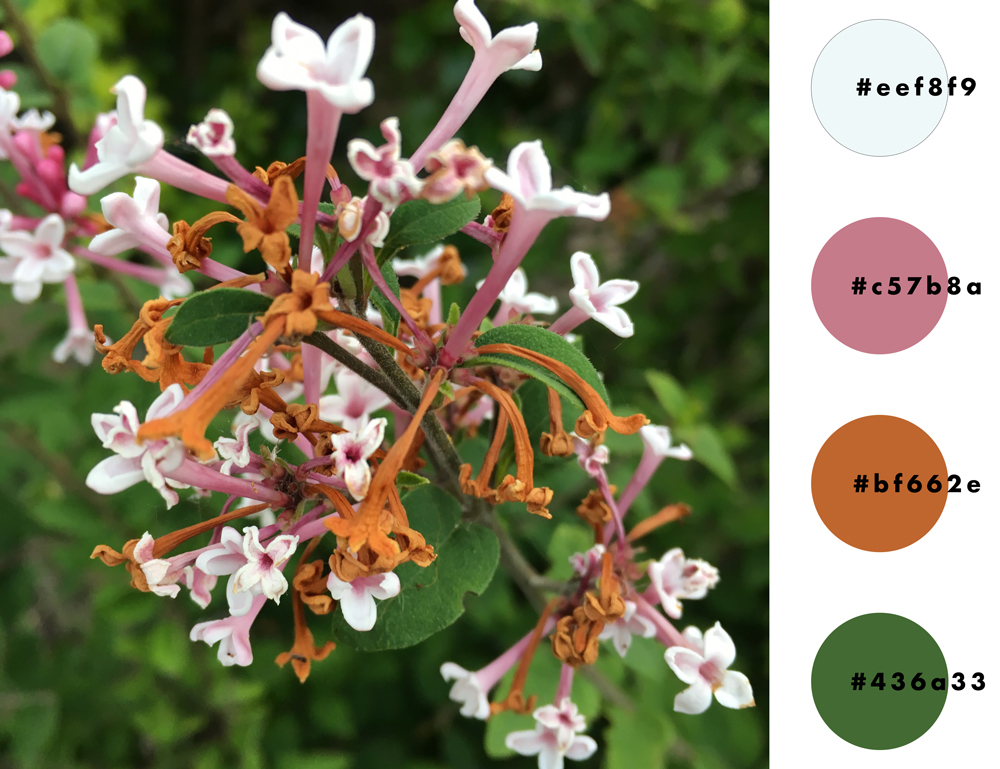
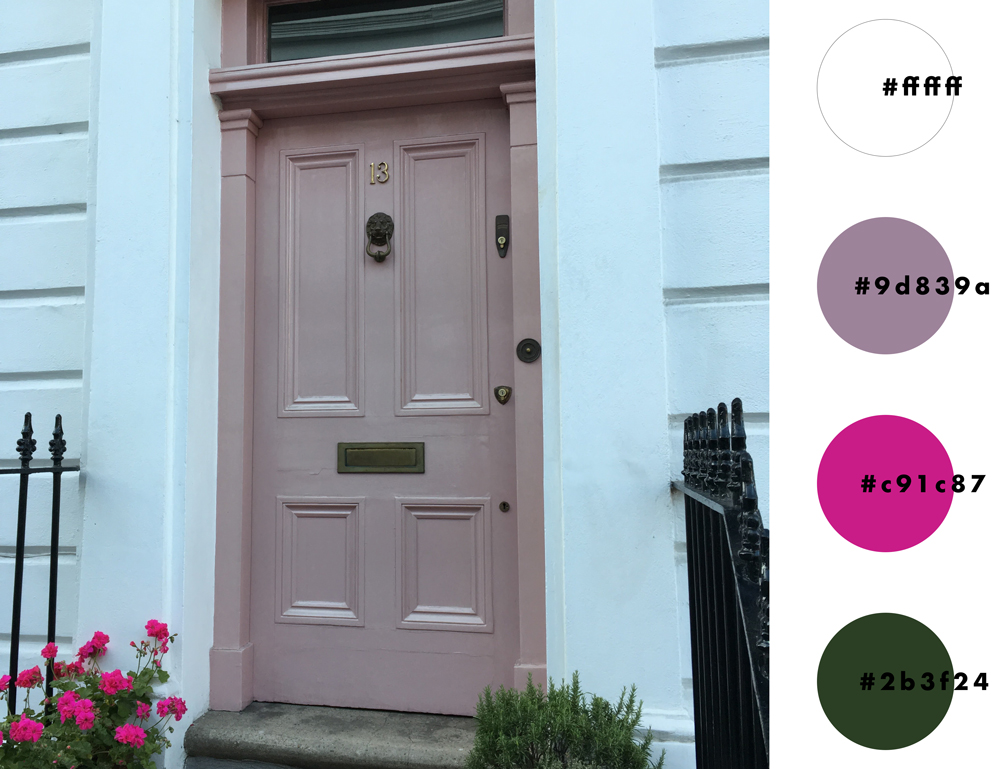
I turn to my inspire folder on my computer. My phone auto uploads all the photos I take into an inspire folder which I sought through on the first Monday of every month. This Inspire folder contains many things which I will probably run through one day on this blog, but for the sake of this post, one such category is ‘colours’.
This folder has all the first-hand data of colour inspirations I’ve found on my travels. For no particular reason, most tend to be flowers, leaves, and trees – maybe I was a tree-hugging hippy in my past life.
Of course, they are not all from natural sources. Some will be an advertisement I see from the train, the highlights in an old women’s hair, the colour-way on a car, etc. This act of looking at the world through this lens is to think about colour in the context of the whole rather than the hyper-focused tunnel vision we get intent on one design solution.
As Josef Albers writes in ‘Interactions of Color’, colour in action rarely appears alone. Even in demonstration, a showcased colour red will be on a white or black background, affecting the output completely. Like music, one note played on its own wouldn’t be classed as music, similarly, a colours relationship with its other will voice something else to be contrasted and compared with another choice.
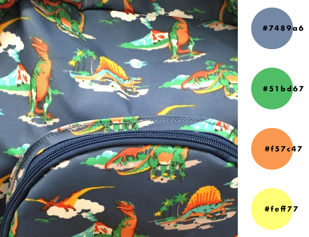
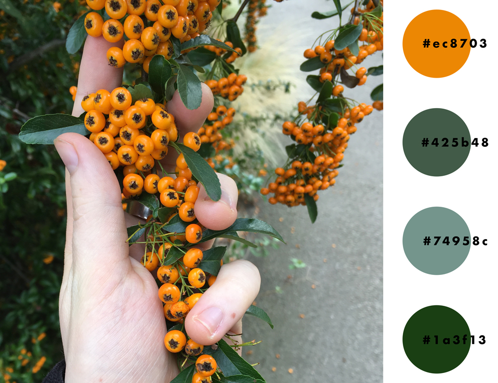
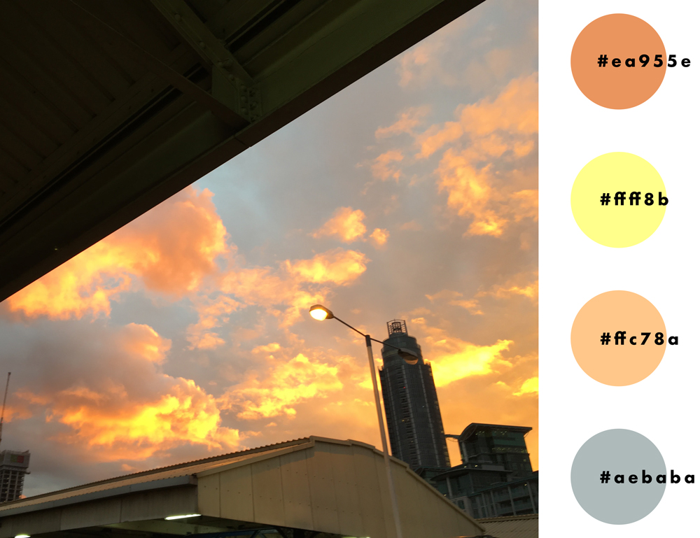
Here are some recent explorations below.
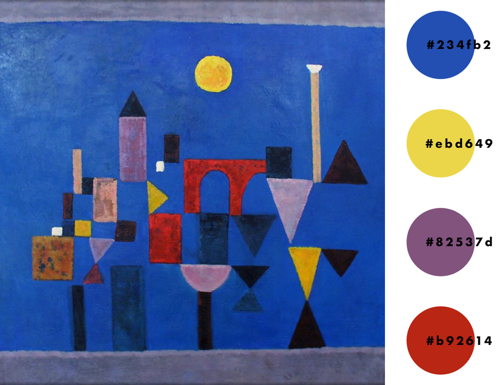
[Paul Klee – Red Bridge (1928)]
What I find interesting with this workflow is, that because you are only ever taking these pictures when an emotion of awe strikes us, we can connect the colours with the emotions which they elicit, and looking at these few quick examples we can see how they could serve as design considerations for projects which need to emote similar values/responses.