Using The Line
A long narrow mark that divides, directs, adds dimension, creates momentum, tension, or tranquillity, can be used to communicate everything from emotion to information. A line is an everyday tool of design and like maneuvering girders with a crane, they should be placed with precision and care.
Guiding the eye to specific areas of information, lines are the usual culprit to organise complex information; dividing one section to the next and compartmentalising one set to another.
This example from Christopher Eustaquio is a Wolfgang Weingart inspired redesign for the cover of Led Zepplin IV. Showing us how lines can be used creatively and constructively to not only make it easy for us to interpret different information but also rhythmic and dynamic.
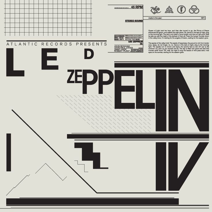
Christopher Eustaquio, Led Zeppelin IV, Concept (2016)
The style of a line can emote a range of feelings. Soft, sensuous lines can communicate harmony or tranquillity, while more jagged, sharp lines communicate discord or frenetic energy.
Looking at the differences between Franz Kline’s full, pushed stokes which look as though they were painted with the entire arm and William De Kooning’s later work where the lines meander more gently with purpose we can see the differences.
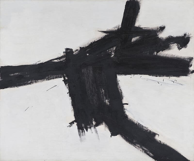
Franz Kline, Buttress (1956)
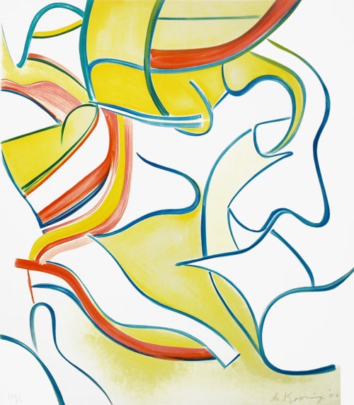
William DeKooning, Untitled #2, from Quatre Lithographies (1986)
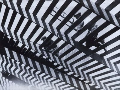
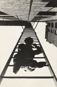
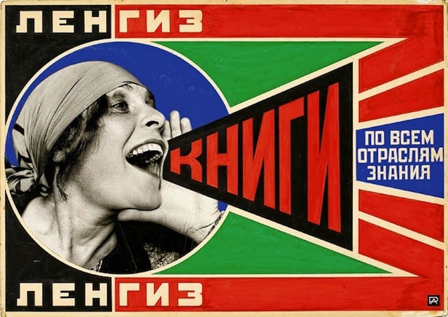
Simple lines can also add a new dimension to a two-dimensional plane. Adding two converging lines will add the illusory effect of receding back into a vanishing point. Exemplified in Alexander Rodchenko’s photography we see a fascination with these sort of lines and how it is then applied to his graphic work.
Horizontal lines, however, imply open planes of peace or solitude. As a horizon is always the furthest we can see on any given plane we naturally associate them with closure or ending. This can be seen in the late work of Mark Rothko shortly before his death in 1970.
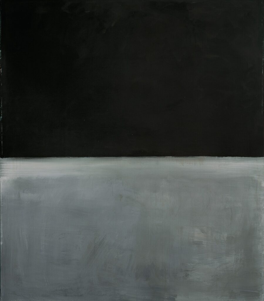
Mark Rothko, Untitled (1969)
Vertical lines can give a sense of power and strength like that of a Roman column. A vertical line going from top to bottom off the edge of the canvas can also give a feeling of infinity as it doesn’t seem to have any real end. This can be seen in the wonderful paintings of Barnett Newman.
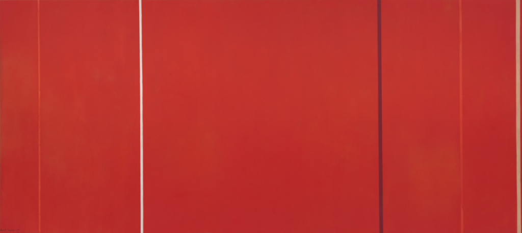
Barnett Newman, Vir Heroicus Sublimis (1950)
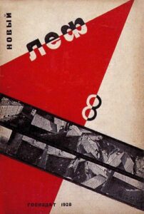
The use of diagonal lines indicates movement and adds an energy. Working great for leading the eye downward or upward to specific information, this piece below by Gustav Klutsis employs the use of diagonal movement through lines and falling forms which powerfully drag the eye from the top of the page to the bottom of the page with what seems like a natural force.
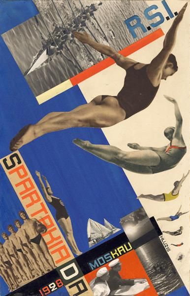
Gustavs Klucis, The Moscow Spartakiade (1928)
The reduced form of a line can be employed for almost any use, but as shown above, it should not be used without care, as even the slightest tilt can convey or confuse the message. Whether you’re adding motion, movement, rhythm, momentum, direction, hierarchy, closure, or just tidying up the information a little, something as simple as an extended narrow mark can be your best friend.