
Hierarchy and Tone
Hierarchy is one of the first principles in graphic communication.
Designing a hierarchy is a compositional skill. It’s to arrange the elements in a way that emphasises the importance of information.
Traditionally, we are taught to find the most important information and use skills in the hierarchy to focus this information as ‘important’. Of course, problems arise when we go directly to the default way of thinking about hierarchical importance which is: TITLE > Subtitle > body.
But what happens if we flip this assumption upside down? What happens if we focus what we think as least important as the most important? When we ask this question we force ourselves to start playing with tone.
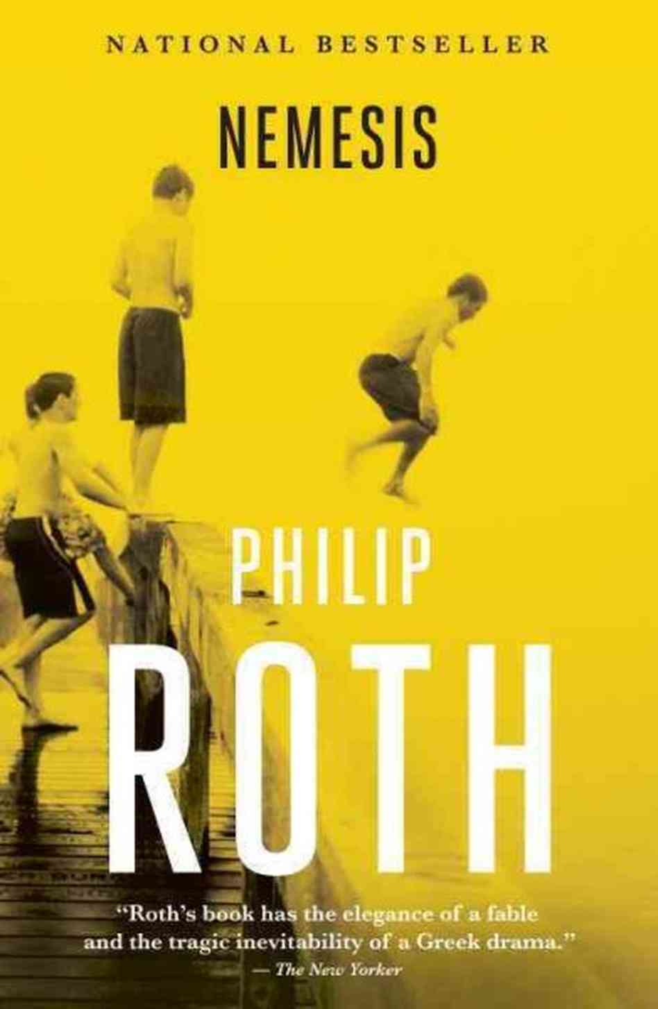
As the author’s name becomes bigger than the title of the book, the author’s myth becomes larger than the work, and so the cook becomes more important than the curry.
Interestingly this is common with books but rare with films.
As the ad copy for a shoe overtakes the hierarchy of the company logo, the narrative leads the product before we’re introduced to the ever-familiar brand.

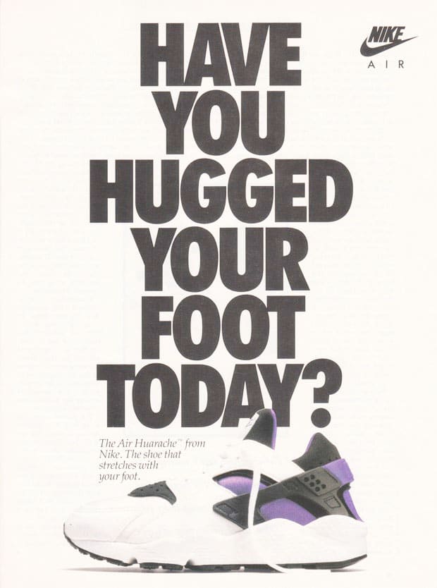
Nike, 1991 Advert
Approaching the hierarchy as something which establishes the tone is a much healthier frame than simply deciding what we want to communicate the fastest. It acknowledges that each problem needs its own solution and even something as fundamental as hierarchy needs to be pondered to establish what is truly important to the specific function of the piece.

Samsung, Galaxy S8/S8+ Advert
It’s suddenly fun to realise we can tilt the angle and tone to either be formal, informal, serious, or polite. It becomes a more creative decision.
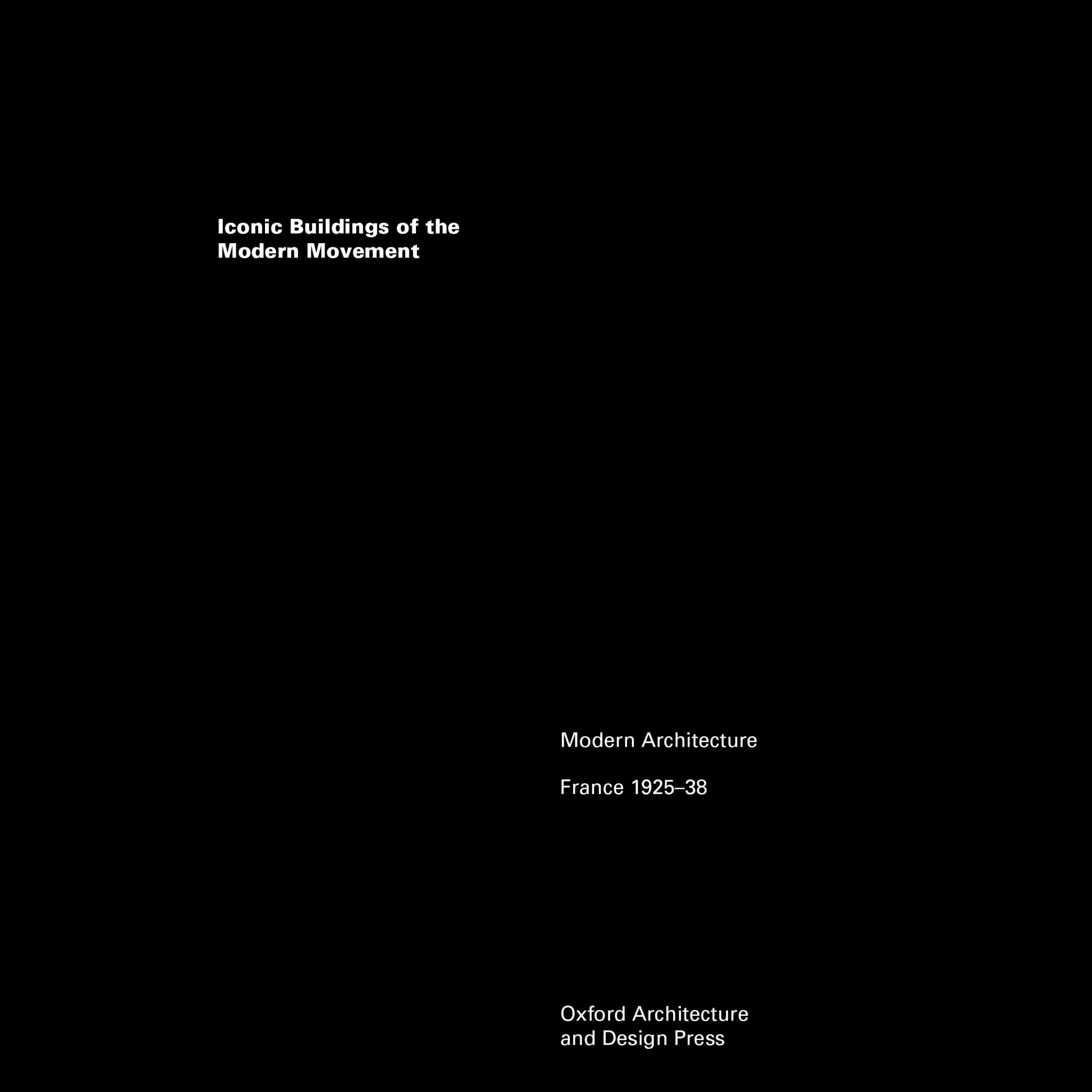
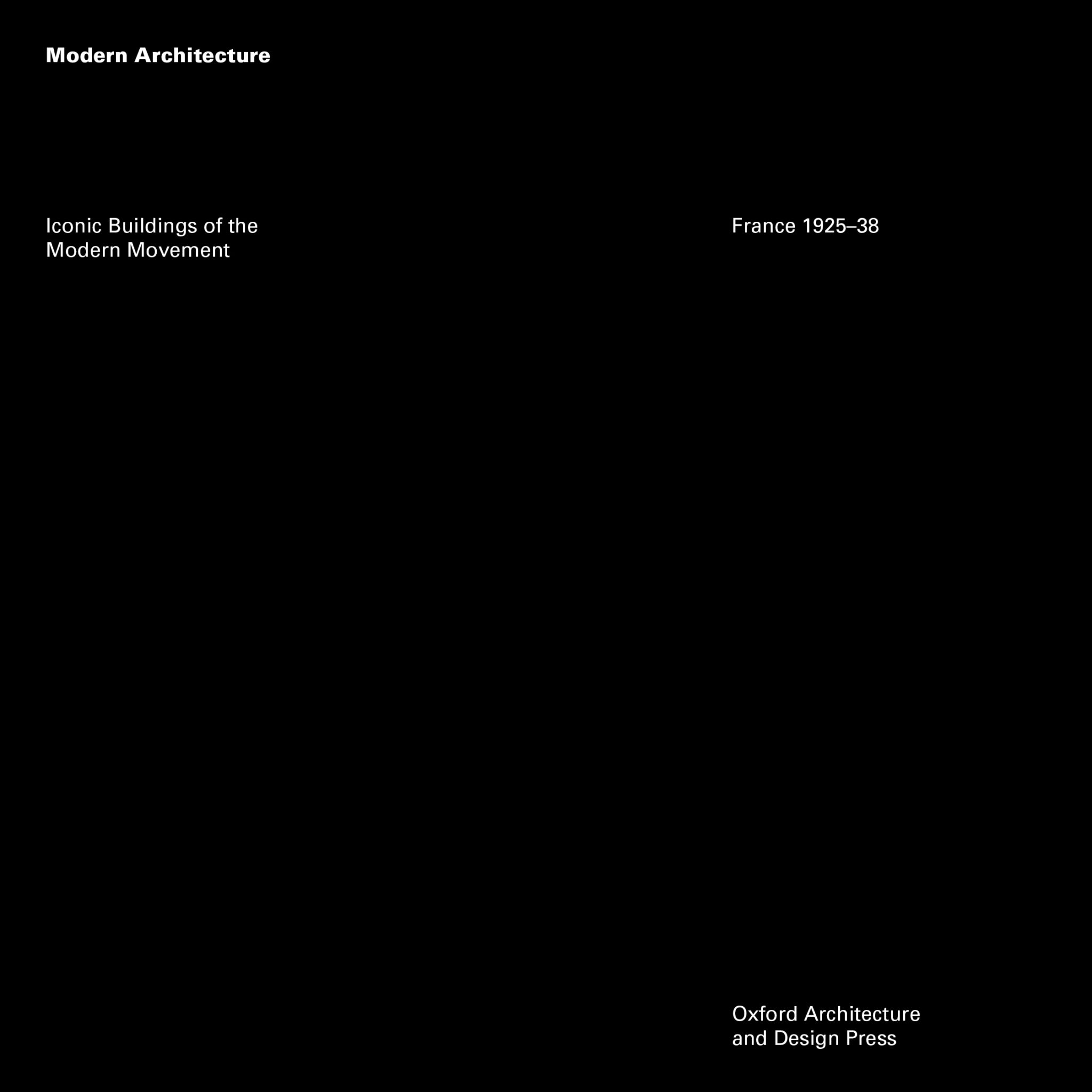
Below I play with the hierarchy in a purely compositional format, only allowing for one type size, one font (Univers), and up to two weights to see how far we can take this.
The headings used are two equal titles, “Iconic Buildings of the Modern Movement” and “France 1925–38”, subject heading, “Modern Architecture”, and the publisher, “Oxford Architecture and Design Press”. There are no images or forms, just a black square with white typography.
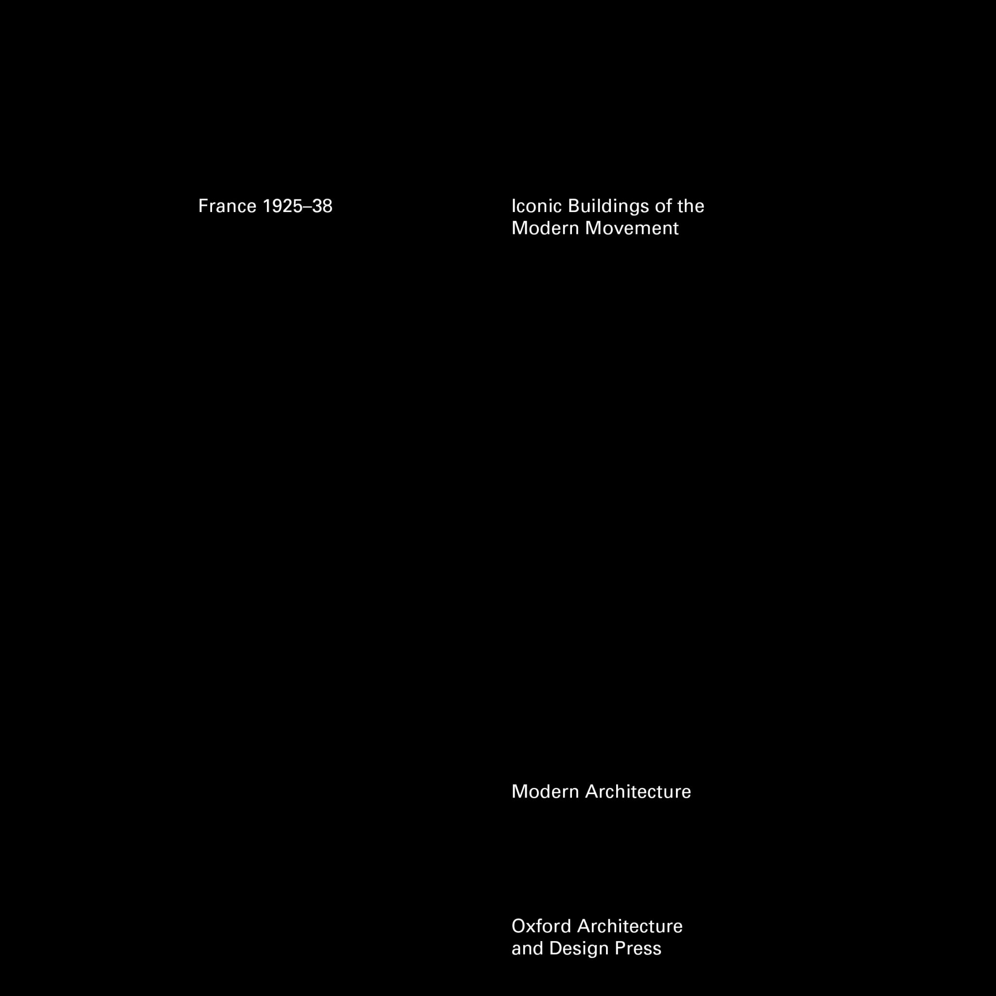
The first example is a more traditional hierarchy. The importance is decided upon what is functional to discern this from other books the fastest.
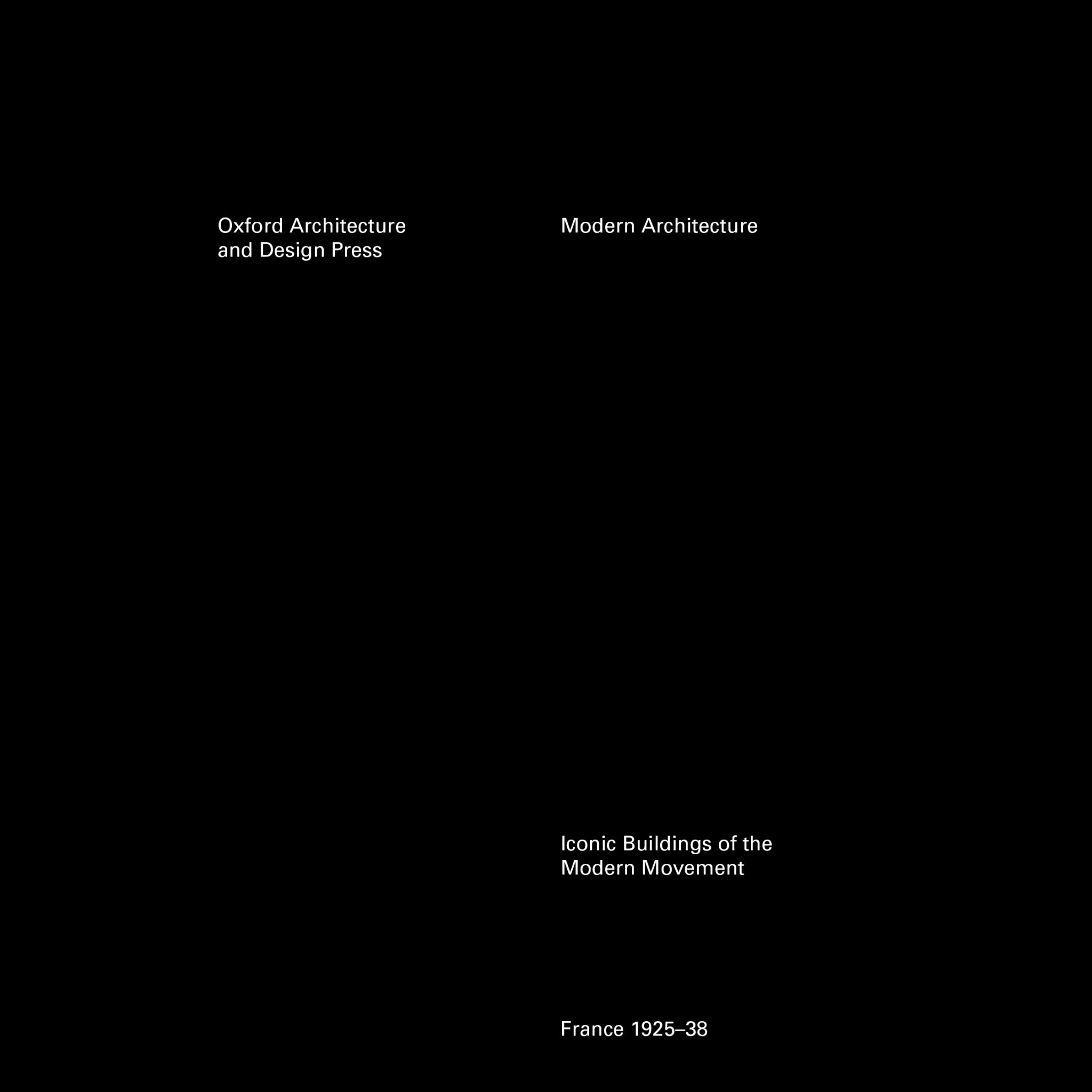
Here we see the same composition but with the hierarchy flipped to create a formal tone. The order which our eyes digest the information gives importance to the publisher and the series before any identifying title is given. It’s like an announcer announcing a boxer first with the accolade of “three-time heavyweight champion of the world…” before they define their name… Sort of.
Mixing the titles and applying a weight change, we can also achieve a more polite tone, giving focus to one of the series titles and moving down to another series heading, the identifying title, and finally the publisher.
Again using alternate weights, this hierarchy seems to achieve a serious tone, articulating first the series titles then moving on to the rest with increasingly progressive space between.
Going back to the beginning
Going back to the beginning and pushing at the boundaries of what we think we are supposed to be doing we can discover some new compositional theories which we thought were set in stone.
When something is taught as a principle, we often forget that these rudiments can be tested and stretched. What we can discover will either affirm the principle or we could find something interesting and new. Here it’s important to take a step back and discern what is actually the most important information to focus rather than succumbing to a default.