Leading Social Change With Design
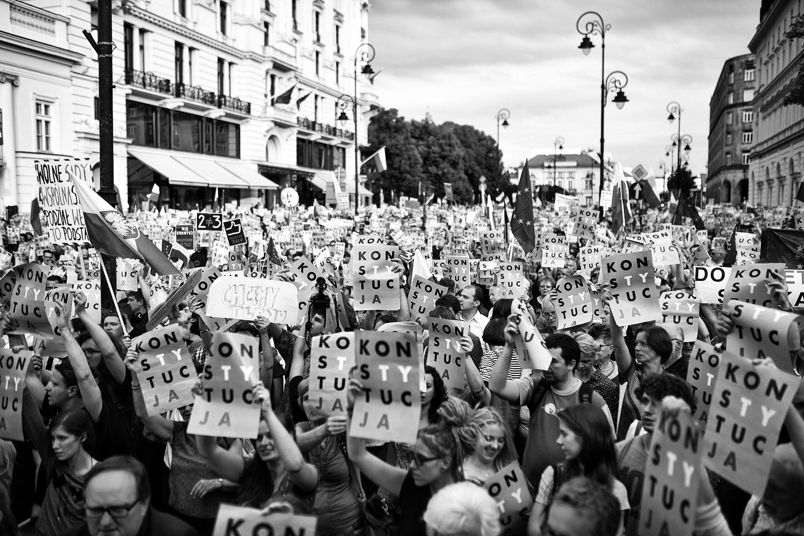
From the Constructivist movement in early 20th century Russia to the more recent happenings in Poland with this design clenched in protester’s fists, design has been used again and again to provoke social change and extend political stances – why do visual messages play such frequent roles in the history of political change and what makes them such powerful tools?
From 1913 Constructivist art was adopted by the Bolshevik government in Russia to extend their political messages. This was called propaganda and it showcased the extent to which art was used politically and in this particular case, how it contributed to the 1917 October Revolution.
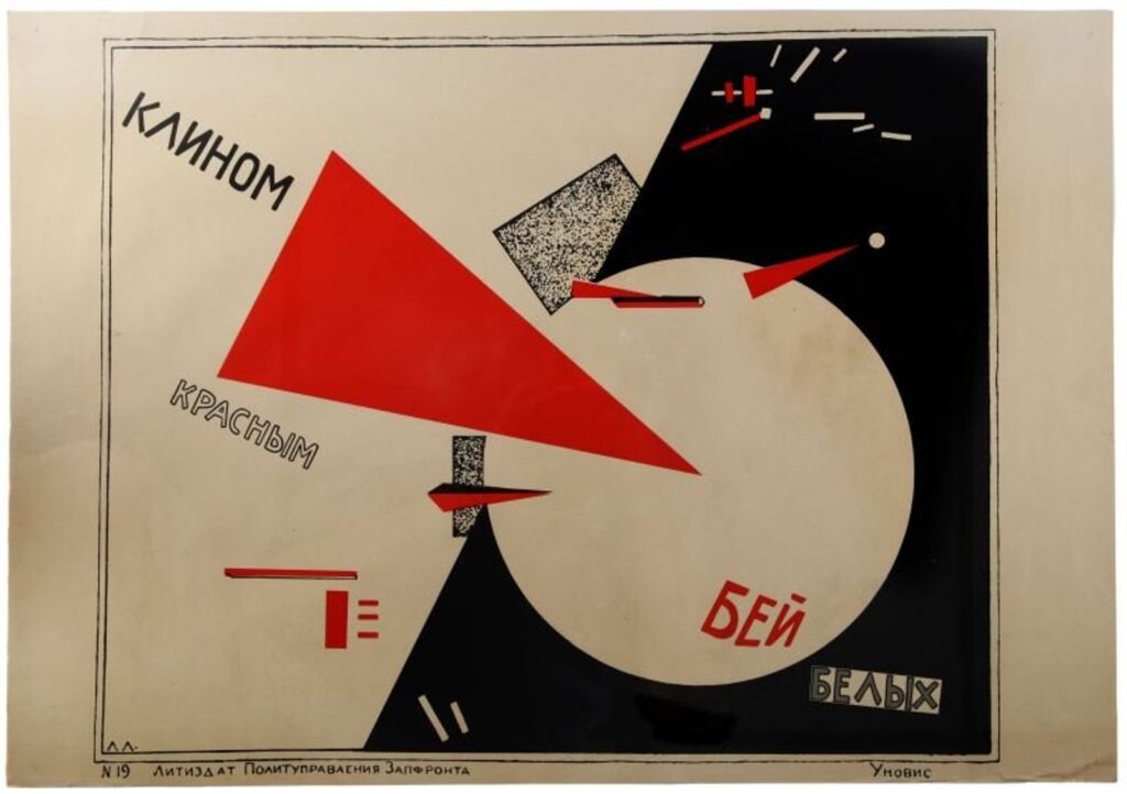
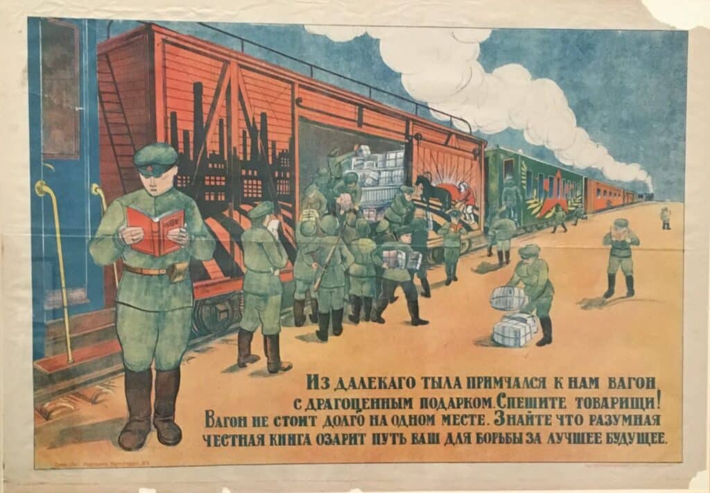
With a strong belief in the benefits of propaganda, the Soviet Communist Party employed the use of Agitprop Trains (agitation and propaganda) to travel to the deepest parts of Russia and Eastern Europe. On these trains were libraries of propaganda art, equipped with printing presses, speakers, artists, and radio communication.
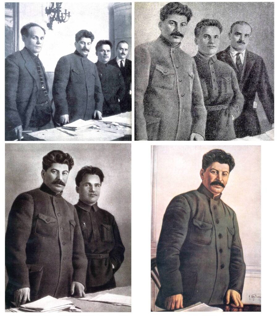
Later, this power saw Stalin manipulating images for his own political motives; slowly removing people who came out of favour with the “people’s republic”.
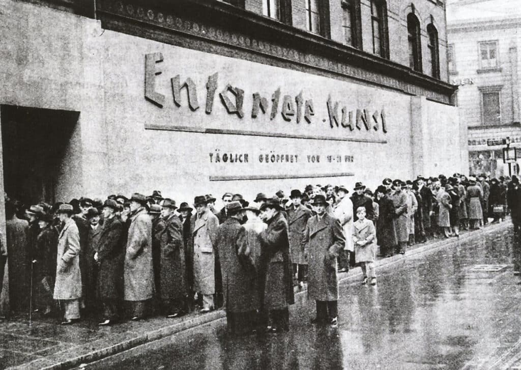
During World War II in 1937, the Nazi Party opened “The Degenerate Art Exhibition” which feature over 600 works of art that were previously confiscated as they depicted images that weren’t of Hitler’s favour, stating they insulted “German feeling”, or destroyed or confused natural form or that it simply revealed an absence of adequate artistic skill, where in fact they depicted more of the realities of the war.
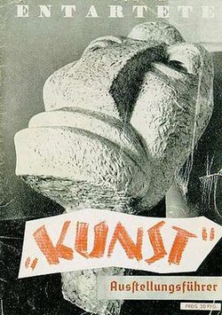
Rebranding certain art this way drew attention to what the Nazi Party deemed “real” art which was shown across the street in the “Great German Art Exhibition”. This counterpoint saw millions of people attend “The Degenerate Art Exhibition” to gawk, laugh, and humour the artwork. Some of the artists featured in this museum ended up committing suicide as a result of the humiliation.
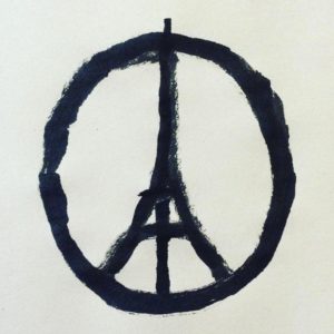
In more recent times of Instagram and aggregated media, Illustrator Jean Jullien painted a simple design in the wake of the 2015 Paris attacks which saw widespread solidarity and reclamation of peace throughout the city of Paris and the rest of the world. It was massive. And it was a beautiful thing.
The design merges two iconic images: The symbol of peace and the Eiffel Tower. Instantly recognisable yet still requires just enough focus for the viewer to put it together in their head and make sense of it.
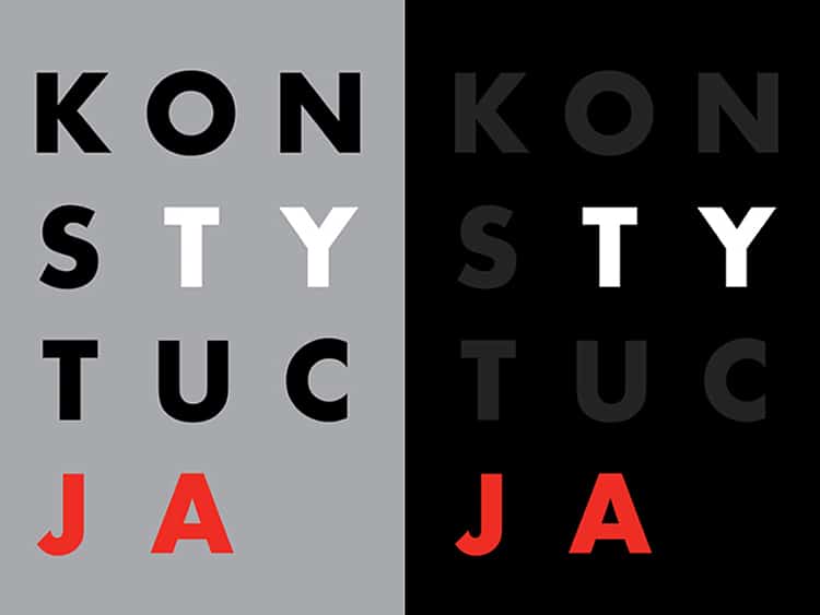
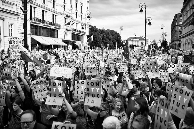
Very recently (of this post), Poland is having things illegally taken out of their constitution which is seeing outcry from the public. To gain attention for something which seems to easily go unreported these days, this design, “Konstytucja” by Luka Rayski, has been getting major coverage, appearing not just in protesters’ hands but on screens at bus stations and train stations across the country.
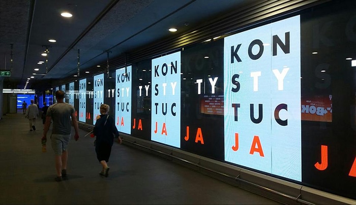
For those who can’t read Polish, like me, Konstytucja translates to Constitution with You and Me highlighted inside the word with Ty and Ja. It’s a little bit clever without being too cerebral – which is important in political design – it involves you, it doesn’t alienate you.

Throughout history, and across the world, we have seen the visual medium playing a big role in political communication; becoming an important tool in promoting views, but why is this?
Simply – it’s communication. When we talk politics we have to be ready to talk at length; weighing up points and platitudes, measuring ethics and actions, it’s long and often tedious approach has resulted in many people turned off from politics for the rest of their lives.
But when we encapsulate an entire stance in a catchy, involving design, we galvanise all those charged emotions and articulate it in what seems like an instant – like a lightning bolt to the heart. And it works fantastically – if not for getting a message across, for activating people’s political power, as we often forget we have.
It’s useful. If people are ambivalent or undecided in a view, seeing an evocative design can intrigue them enough to take up a stance or educate themselves further. Conversely, if they disagree with the view promoted, this helps them to solidify their own opposing view and become a stronger voice of opinion – which in turn should lead to more well-rounded negotiations for everyone.
From the Russian Revolution to the cover pages of The New York Times, evoking political stances has been an important part of the design world which shouldn’t get overlooked; proving that design can play a crucial role in changing the world we love – and not just a stylish coffee shop rebrand (but that’s nice too).
Find more good stuff here:
More information on Konstytucja here: https://designobserver.com/feature/a-sign-of-resistance-a-symbol-of-hope/39638
More on Jean Jullian and the Peace for Paris project here: https://www.dezeen.com/2015/11/14/jean-jullien-illustration-peace-for-paris-2015-attacks/
Really good seven-minute video on the Degenerate Art Exhibition via SmartHistory: https://www.youtube.com/watch?v=hpY22uSAPAA
