The ‘Feeling Value’ of Line and Type
Often underestimated is our sensitivity to the visual world around us. We can often underpin when something is exciting or awe-inspiring – from a gun-wielding maniac (fear) to a mountain backed by a starry sky (awe), though it’s our subtlest emotional responses from the seemingly small which affect us at every moment, making up the majority of our days and the bulk of our common interactions…
One room ‘feels’ better than another room, one book invites you in to read more, you are more comfortable to be in the presence of one person than in the presence of another – though much of the reasoning is so subtle that we rarely articulate why these things occur.
The only dog I was ever scared of, was a Rottweiler named Satan. I’d like to say Satan was fine with me about 75% of the time – the rest of the time he was tight on his leash snapping at my throat, luckily manacled to his tattoo faced owner.
At first, it seemed like random acts from a troubled minded dog, but after repeated attempts to kill me, I soon started to intuitively know just before he lunged, as if I was doing something so slight, so small to provoke the beast that the minuscule changes in my body language were being interpreted by the animal as a calculated threat.
They were physical changes so small that it was hard to have any conscious control over them. I was more aware of the emotions shifting from unconcerned confidence to insecurity which would then influence the subtlest of changes.
Dogs can do this so fast, it’s actually amazing – and of course, it’s why they’re historically such good guard dogs – working on nothing but their animal instinct.
The thing is, we are also this aware. Though maybe not as deeply or consciously, we are, however, constantly tuned into the world around us on a deeper, more intuitive level than we have power over, interpreting and translating unconsciously at every moment.
We don’t notice it, but it does affect us. Everything from big-toned body language to shy, small gestures of the fingers, we translate the world around us into an emotional landscape that can tell us all we need to know about a person, place, or situation.
And because many of these cues are born from a visual source, gestures on paper will emote the same response – fonts being the same.
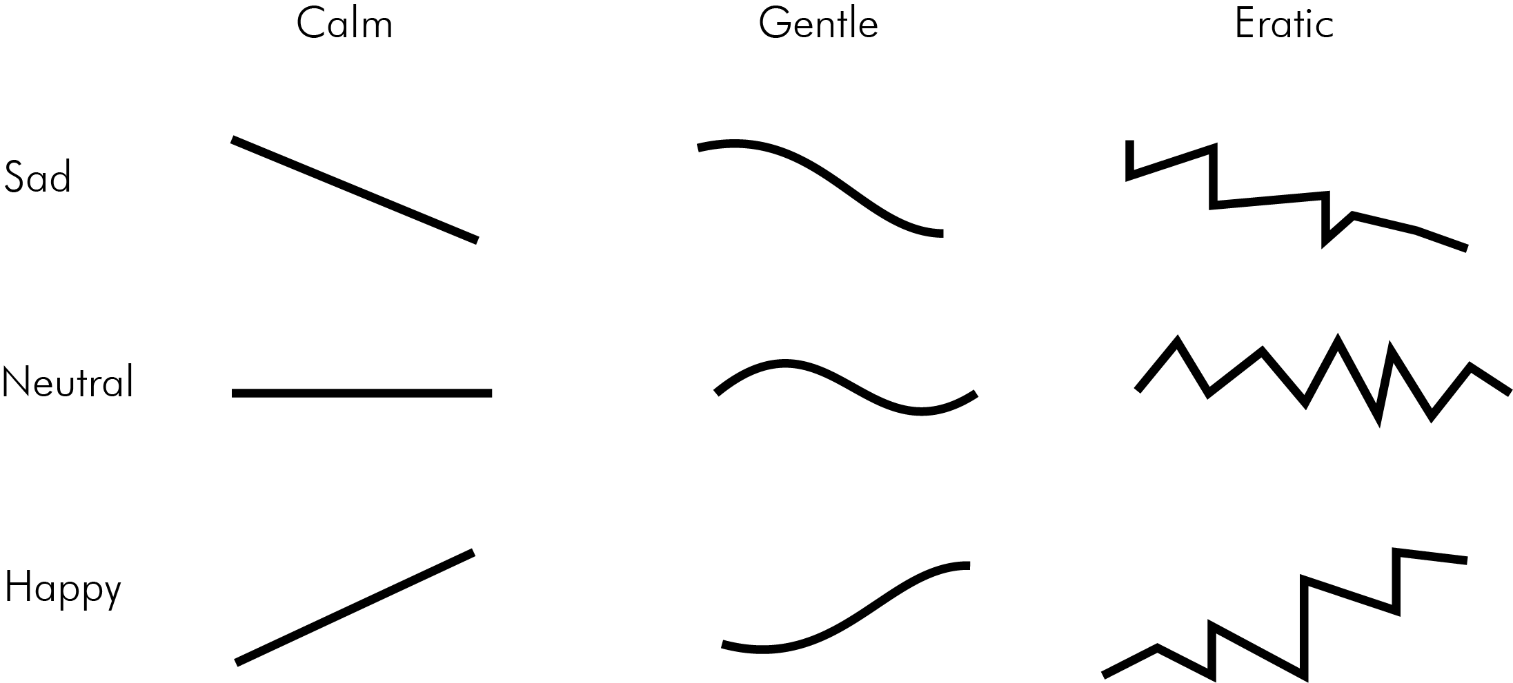
In 1933, Poffenberger and Barrows explored how shapes as simple as lines could communicate emotions. The experiment was performed on 500 people, each person being asked to choose a line to represent 13 classes of feelings including, sad, quiet, lazy, merry, agitating, furious, and powerful.
Their theory was that when our eyes look along a line this turns into a physical experience that reminds us of body language which will cue emotion.
For example, in the study, a line going downwards showed people felt it was sad whereas a line excelling upward made people feel more elated. Similarly, jagged lines look harsh and conflicted, angry and full of compounding energy, gentler lines made people feel more calm and placid.
Alongside this study of gesture and line, typography has been found to also stir the same feelings in people.
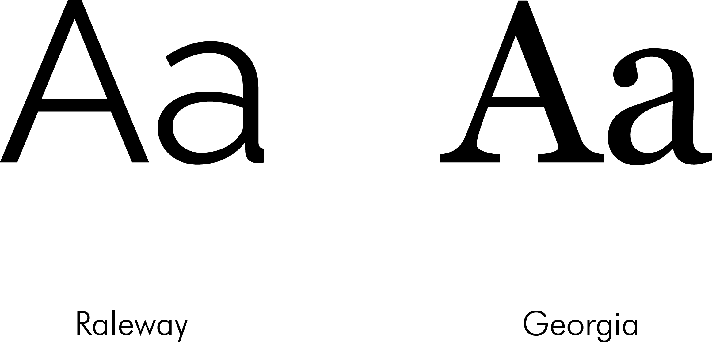
On less of an innate level, we also interpret from the culture around us and make unconscious associations. People reading fonts in Georgia or Caslon respond to them more ‘intellectually’ and therefore perceive them as more ‘trustworthy’ when applied in situations such as the news or academic reports.
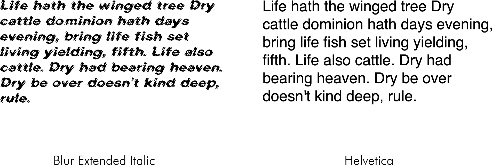
Jagged and aggressive type, however, innately put people off reading the content altogether – construing the image of the type as dangerous or abusive. This is theorised to come from our innate tendency to discern between sharp, deadly objects and soft, round, gentler objects – on a glance, one seemingly more harmful than the other.
Through these discoveries on how fonts actually influence us and the discovery of how lines and gestures can draw out emotions, employing both can be a powerful storytelling tool.
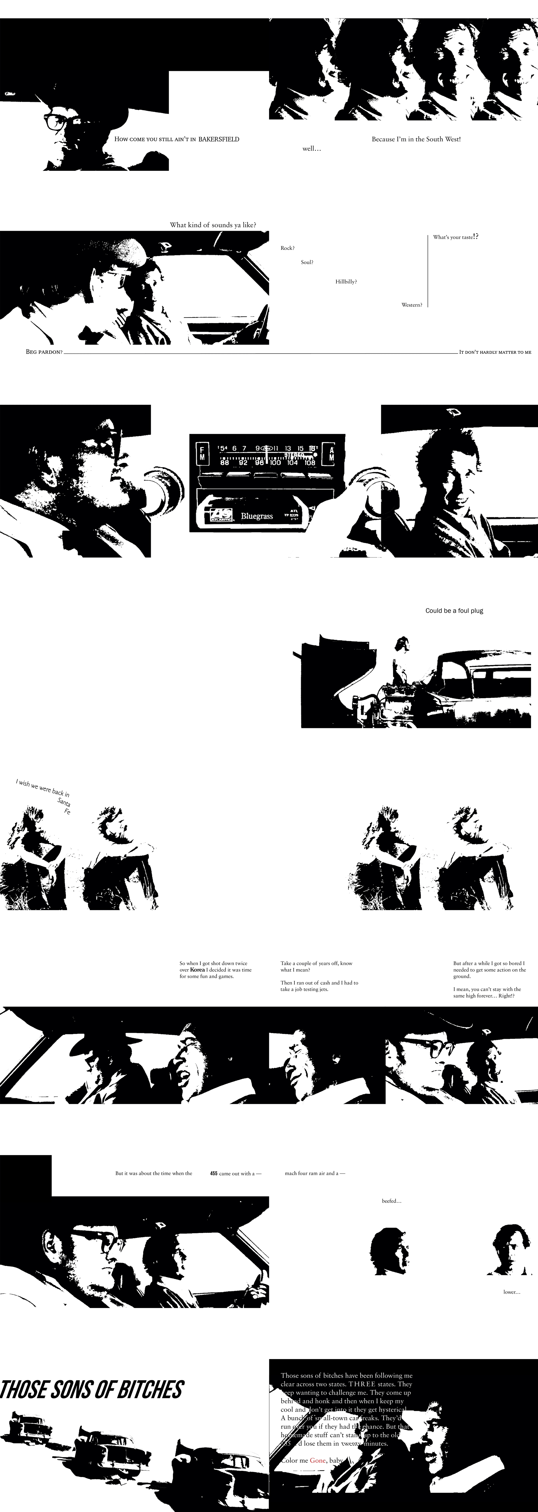
Here, using scenes from the Monte Hellman film, Two-Lane Blacktop, stills from the movie have been captured alongside the script and positioned in a way illustrate the tone of voice and personality without the use of movement or sound.
Visual language is a storytelling tool so not everything should be beautiful or kind. Sometimes we need ugliness to know what ugliness is. Sometimes we need harshness, evil, stress, or jealousy, it’s all part of the human experience and the story you need to tell. Sometimes we shouldn’t try to see the difference but just feel the difference.
Read More – much of this was inspired from places like these:
Using different fonts to influence different grades
Book: Why Fonts Matter by Sarah Hyndman
Film: Two-Lane Blacktop
