Composition
When we compose, we organise.
Whether we want it to look chaotic or minimally peaceful, if it achieves what it’s set out to do, the composition is achieved.
I see composing much like the work of the conductor of an orchestra leading the instruments; queuing them in and gesturing their approach to each phrase – the conductor oversees the big picture while simultaneously moving the piece in the desired direction. Of course, individually, the musicians know what they’re playing but it needs that leader to stand with a firm back to monitor, judge and arrange for that planned emotional impact.
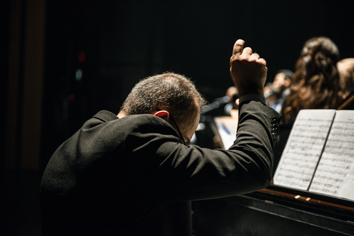
In design, the principles remain the same, just without the harsh constraint of live timing.
This is why the main skill of composition is oversight – being able to see the project as a whole; greater than its individual parts and then, be able to effectively direct the individual parts to create that bigger picture.

But what is it to Effectively compose and what are the most important things to oversee?
Here’s what I’ve learned which has turned into my de facto checklist when composing, helping me get that all-important perspective for the bigger picture.
1. Balance
Whether your composition is symmetrical or asymmetrical, balance is the ‘gluing’ of all the elements in the composition.
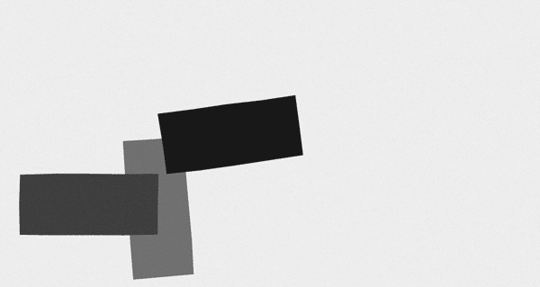
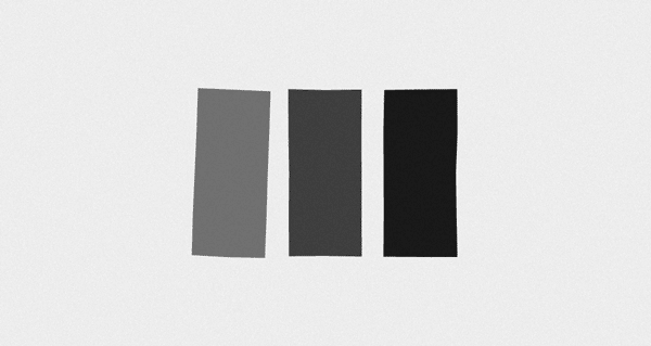
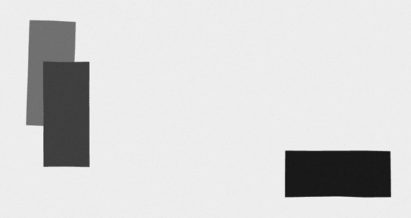
All the elements should be arranged in a way that no one area should unfairly overpower another (unless that’s what you set out to do). Everything should fit just so; the elements interacting with each with minimum fuss; all uniting and contributing to their sum.
Think of the visual weight of each element and how it would be balanced out. The weight of a display font is heavier than a piece of body text, but an evocative image is likely “heavier” than both, balancing them all out on the page helps your viewer see the whole thing at first glance in a more natural manner; inviting them to explore the piece further at a good pace.

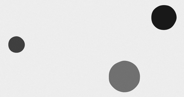
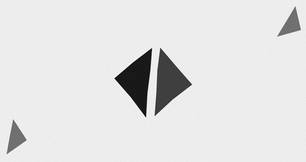
A composition that is unbalanced will have unwanted tension and perhaps attract the viewer to unnecessary areas of the piece in bad order. See here, as I first purposely have badly balanced canvases, and then proceed to try and balance them out.
Unbalanced
Balanced
Unbalanced


Balanced





2. Harmony
Assessing the visual harmony is to assess that the elements are consistent. Whether that’s in their size, colour, or weight, keeping the characteristics of these elements even and unchanged will give the composition a clear and unifying voice.
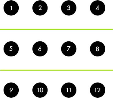
Additionally, harmony is essential if you want to apply contrast to the composition. To achieve contrast, there needs to be an even norm or harmony for there to exist any counterpoint which would create such contrast. Below, it’s easy to find the important number because of the established graphic harmony of the piece.
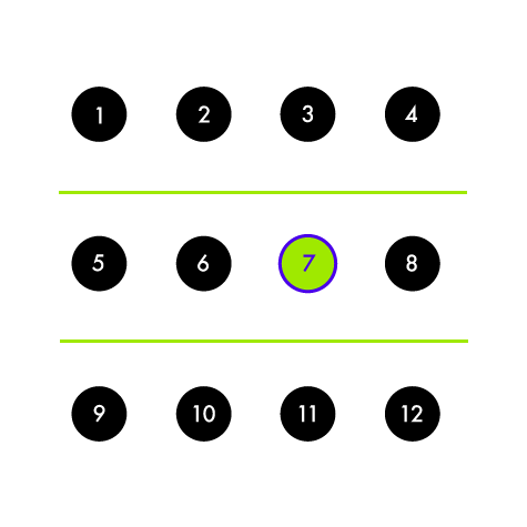
So by establishing a running harmony, you create the grounds for there to be the opportunity for contrasting elements. Which gently brings us to…
3. Contrast
Having contrast is usually important in a composition as it not only focuses the eye to specific parts of information but can work in balancing elements that stand in comparison.
Often the contrast or counterpoint will make the piece stick, giving it a centerpiece or sense of importance to a specific area. A good example is the old silhouetted iPod advert campaign which used high contrast to highlight and focuses the viewer’s eye on the size of the then-new and revolutionary mp3 player and one of the major marketing tools behind the device – the white headphones.

The example below is a good example of gradually contrasting type sizes for subtle hierarchical importance. Not only is it clear where to read first but it is also an extremely evocative use of contrast and the grid.
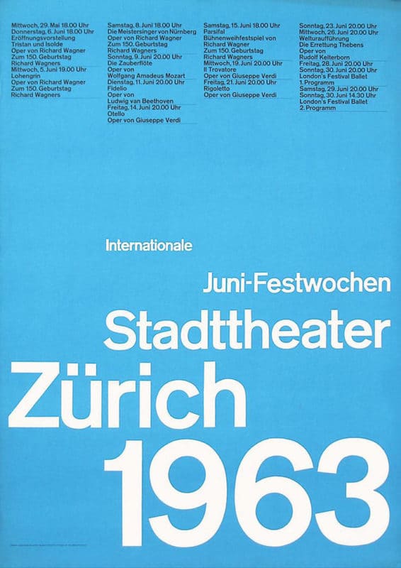
Josef Müller-Brockmann, Zurich Stadttheater, 1963
4. Proximity and Negative Space
Proximity is the relationship between the elements. If the elements are close, it can be more difficult to establish contrast, however, spacing elements close can look more ordered and structured if that is your intention.
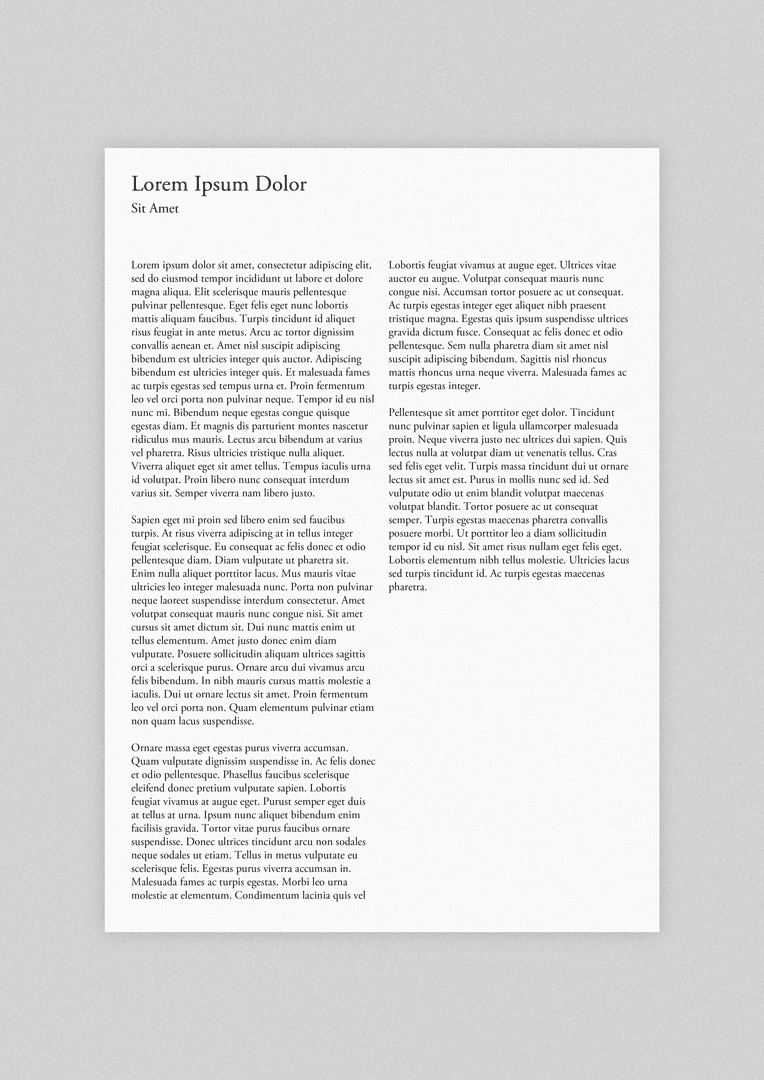
When elements are further apart and broken up a bit you have room to breathe and think, this can be good for those compositions which are dealing with a dense or complicated subject matter or compositions that want to emote finesse or elegance of some kind. See the difference between these two… one being more engaging to read despite there being no images or a real language to draw on our attention.
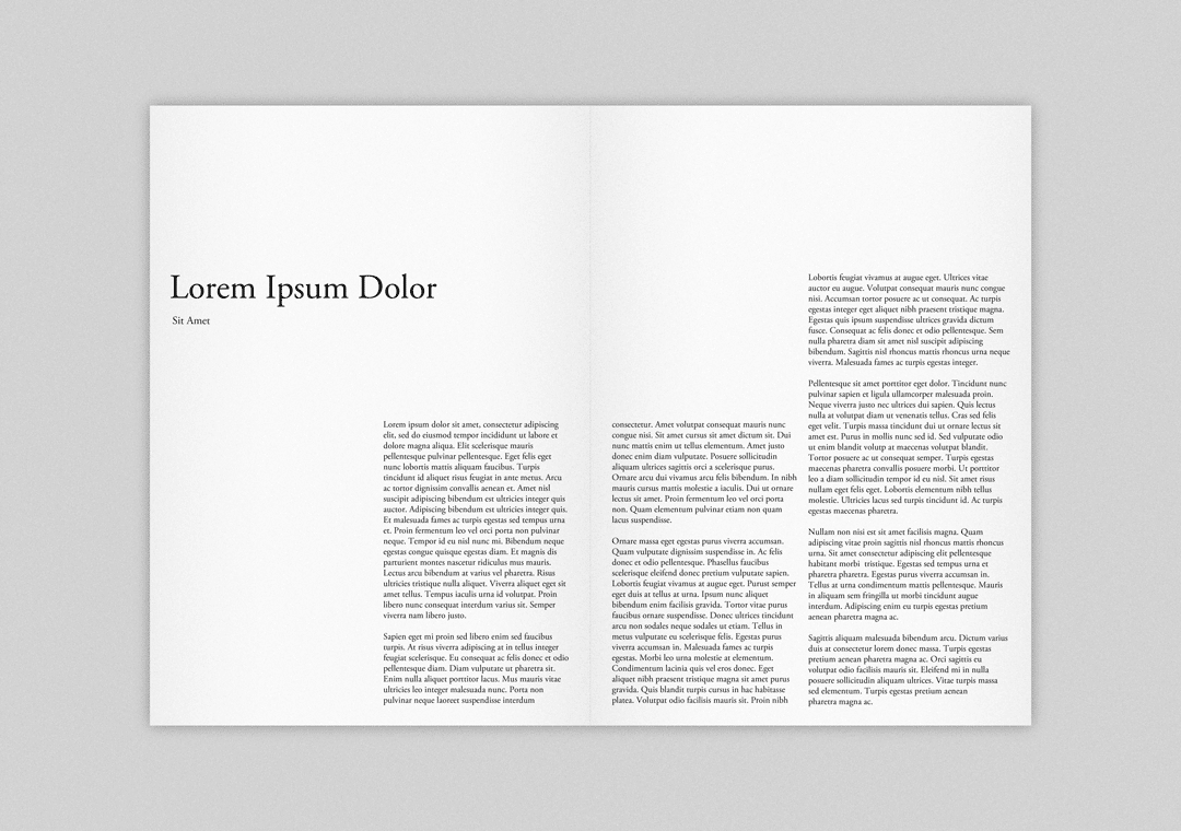
When arranging the proximity of elements you have to take into account the negative space around it. Elements are almost never without negative space and so will always need to be considered. Employing lots of negative space allows the viewer’s introspection and thought. It makes things more digestible. Easy.
When looking at the composition I think of different landscapes and how the composition can emote similar outputs. For example, the inner city of London is full of confusion, congestion and noise, it’s also exciting and full of vibrance. A lone vineyard in the south of France, however, is peaceful and open, time slows down and it invites you to wonder endlessly.
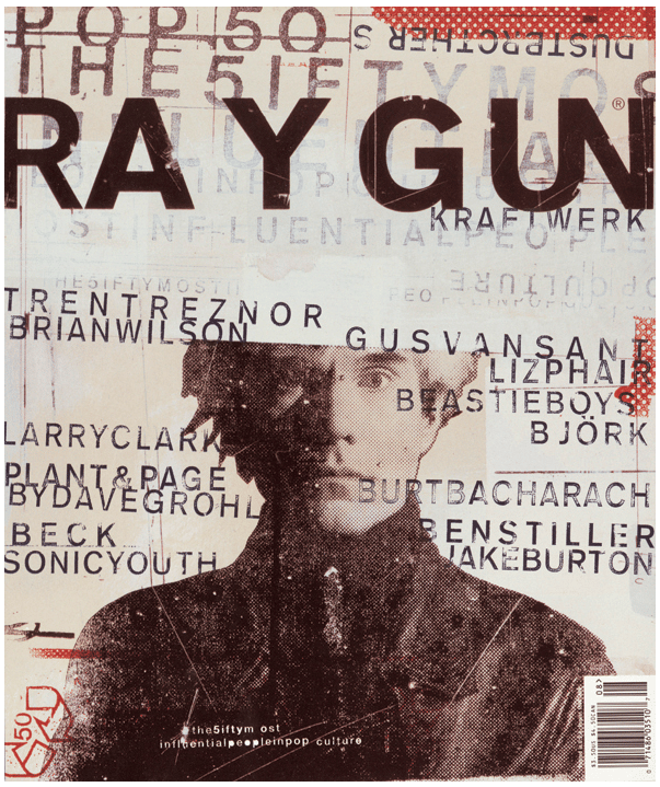
David Carson, Raygun Magazine
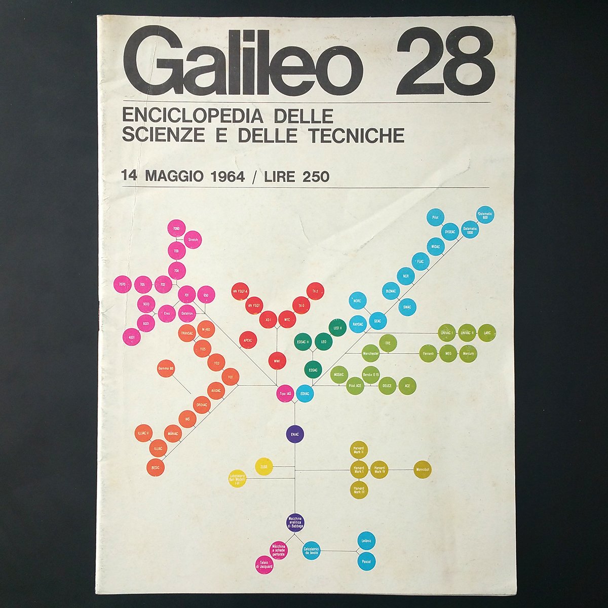
Massimo Vignelli, Galileo
5. Rhythm
A good visual rhythm brings the viewer from page to page and element to element; drawing the eye to one body to the next with what seems like a natural force.
Setting a rhythm is an artsy way of saying repetition with variation, basically repeating and varying the patterns over a given space.
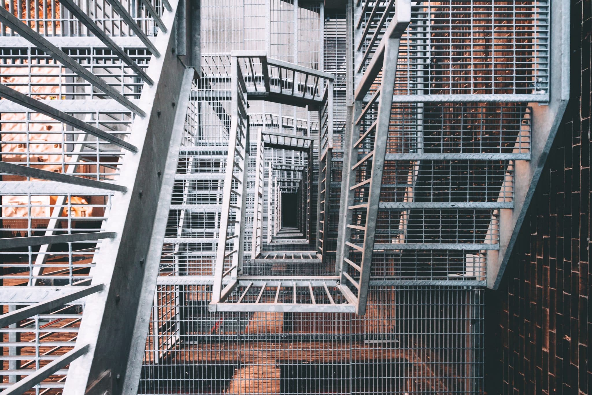
The more you vary the pattern the more interesting the rhythm becomes. Too varied and you lose the rhythm as the pattern becomes unidentifiable. Imagine, you have a steady beat playing on a drum kit versus a drum kit falling down a staircase, the same sounds are present in each but one has a rhythm that makes you tap your toe.
Inspiring visual rhythms can be found in nature like these loose floating rhythms of reeds in the wind…

Or this progressively noisy rhythm set forth by this steel grate staircase…
Or how the colour and perspective creates this gentle fanning rhythm…
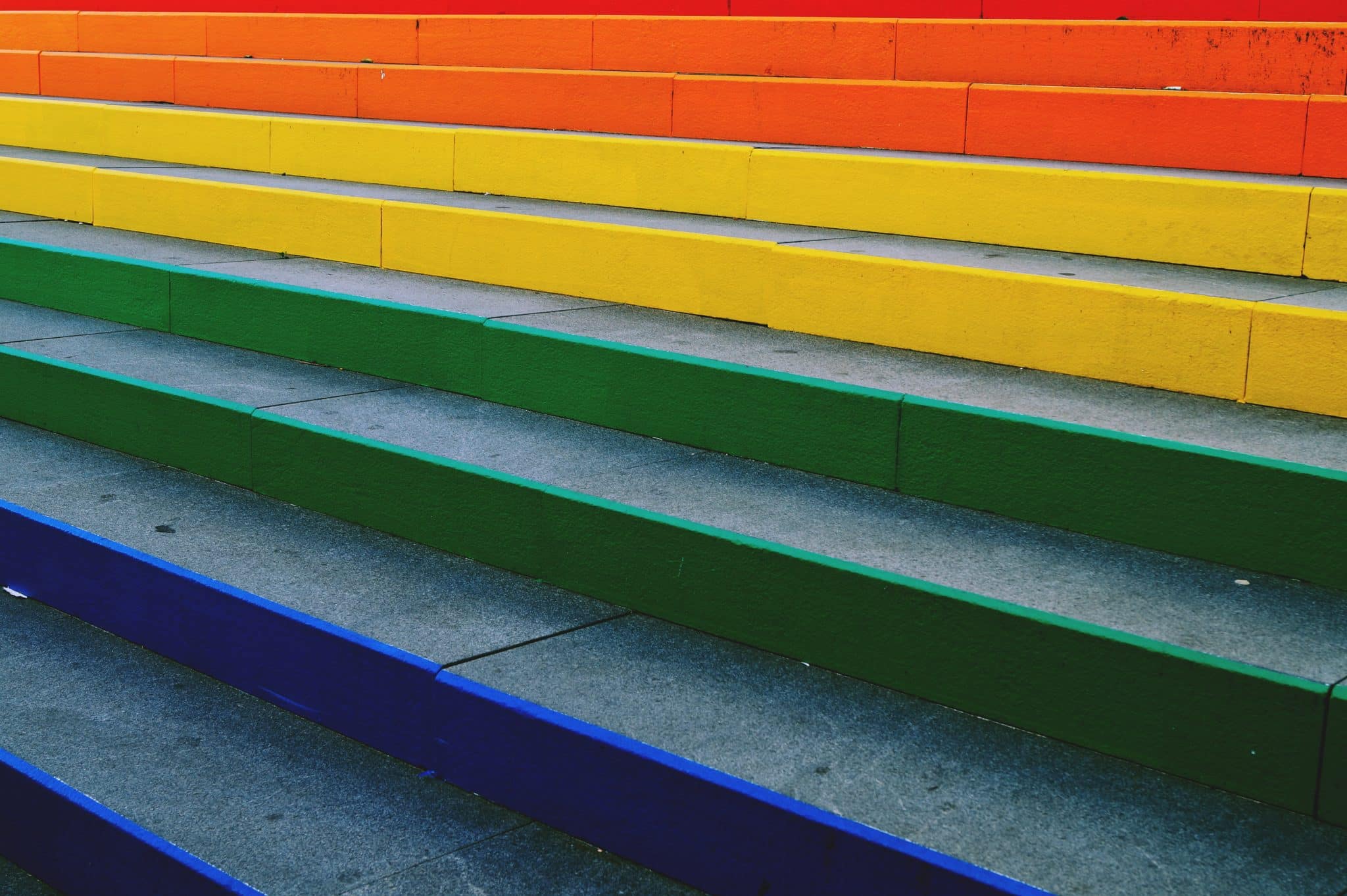
We can see that natural visual rhythm isn’t just dependent on the form itself but where we place ourselves as the viewer; creating the rhythm with our own perspective.
In Closing
Using these five basic pillars of composition, I use them as a sort of checklist for when I’m taking that step back to see the bigger picture.
It’s easy to get lost in the individual elements; unable to see the forest for the trees, especially when you’ve been focused on one thing for what seems like forever. But by using these basic areas of composition, even if I don’t use them all, I can better judge everything as its sum, defining what’s working and what isn’t so I can get back inside it to make my desired composition from its individual parts – like a conductor.
Remember, the composition holds the message you want to communicate, it makes the message gravitate and impact the viewer in whichever way we’ve decided best. So treat it with care and precision and the composition will become our friend, not an untameable animal we struggle to control.