Seeing The Visual Language Of Type
As I type this blog with paragraphs made from sentences built from words spelt by letters constructed from little visual forms, these forms build each pica of the letter to connect and build words to form sentences to become paragraphs to become this article and communicate that behind each typeface which encodes our written language, there is a powerful visual language going unseen.
Another Language
Written language is a representation of our spoken language developed from our writing system (like your pen to paper). Visual language, on the other hand, is different.
Even forms as simple as the visual language of triangles or circles have different perceptions attached. For example, we’re psychologically tuned to find the circle innocuous from its round harmless sides, it’s soft and doesn’t appear innately dangerous. The triangle, on the other hand, has sharp and potentially harmful corners. It may not mean that we’re scared of triangles, but it does mean acute angles have a more exciting presence.
Even colours have these instinctual reactions. Red, being the most urgent, high-frequency colour, it communicates danger (blood) or arousal (sexual flush), and as many manipulation savvy ad men know, proves the most stimulating colour and so has become the official colour for adverts and “buy now” buttons everywhere.
But through these two distinctions in language (written and visual), we can view typography through an interesting lens, a lens which few people are aware of, and that’s a hidden language in the words we read every morning on our emails, in the newspaper, or glancing at the train times on the platform going home at night.
To make a typeface work, each letter needs to be consistent. That means that throughout the entire typeface (punctuation and symbols included) there needs to be a consistent family of visual forms.
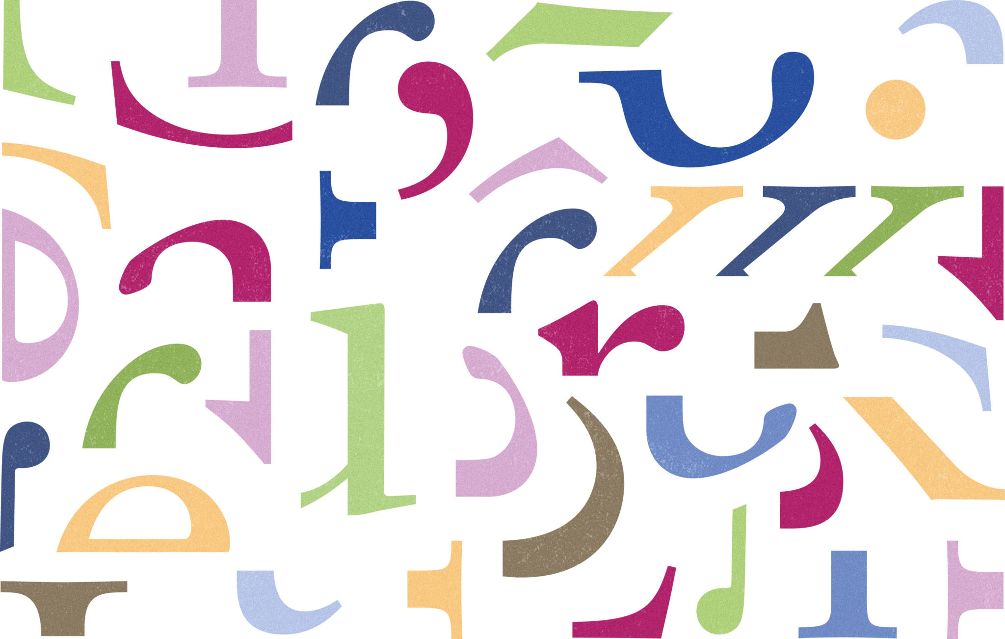
Family has proved an important word in typography as no one letter in the typeface should look estranged or even as second cousins – each glyph should be of good relation to each other; being able to spot the hereditary genes throughout the font. The decided visual gestures can be seen as a finite toolbox of forms, all chosen to construct the letters in a given typeface.
Genes of Sabon by Jan Tschichold (1902–1974)
Seeing The Visual Language
Lisa: A rose by any other name would smell as sweet.
Bart: Not if you called ’em stench blossoms.
Homer: Or crapweeds.
— The Simpsons
The words which we write would have a definite influence over the visual language. We don’t read letters, we read words, and more specifically “word-pictures”. It’s why we misread some words when reading fast – mistaking them for other words which look similar in their “picture”.
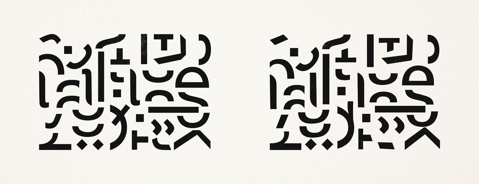
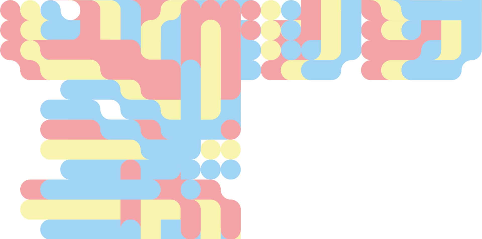
So to uncover the visual language of a typeface, we’ll have to abstract the letters into something nonrepresentational, disrupting the written language so that the representational draw leans into abstract form and all we’re left with is the visual to be absorbed as a whole rather than the individual glyphs.
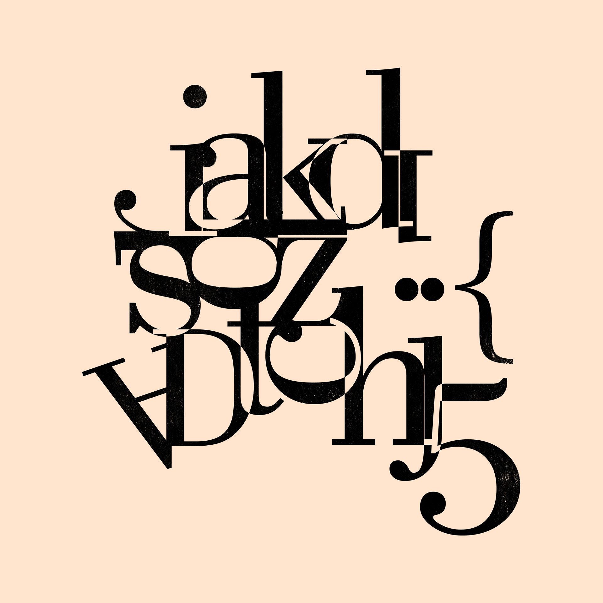
Taking the modern serif typeface Bodoni, we can construct the forms in a way where we can still recognise what makes Bodoni recognisable but is limited in its representational word power.
Composition of Bodoni
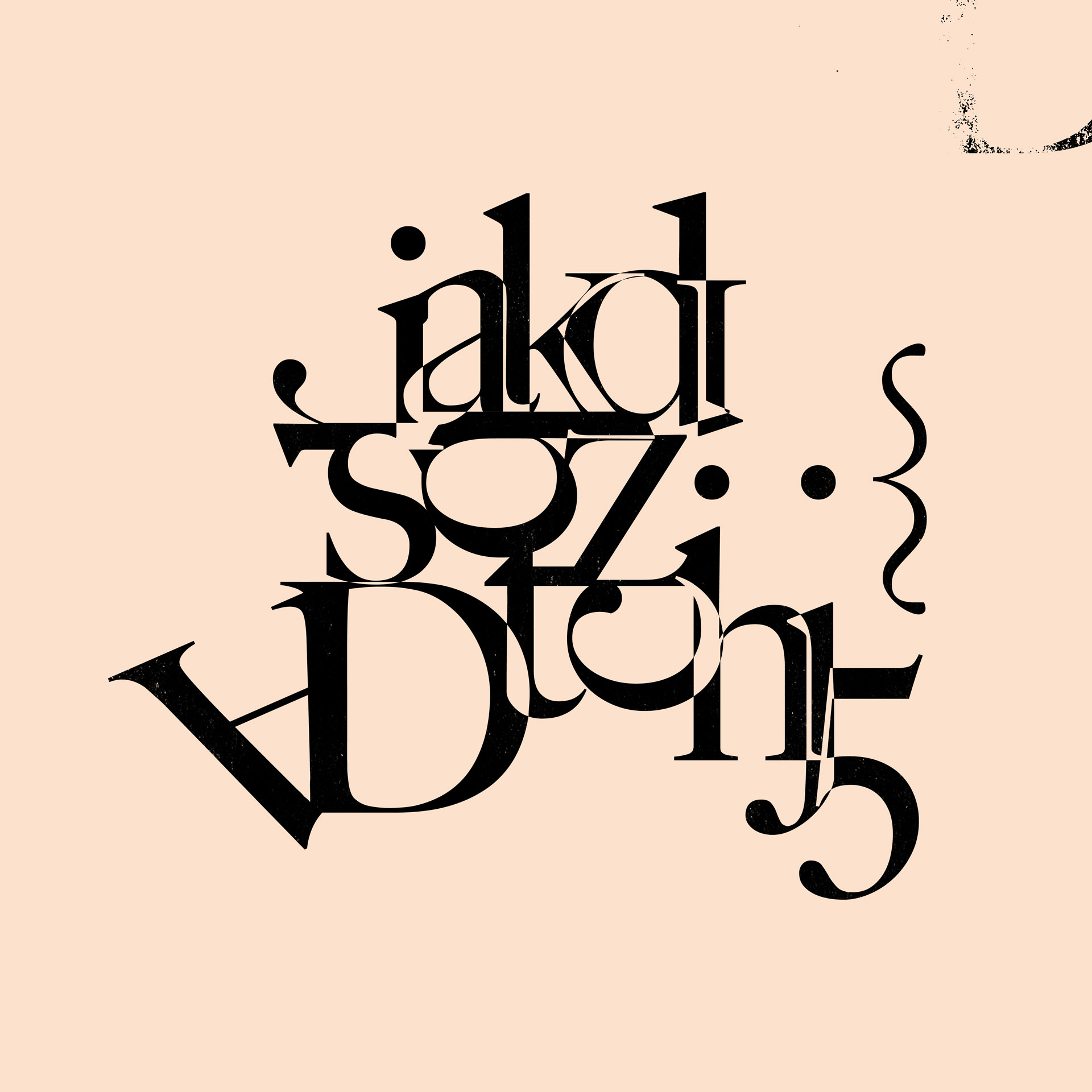
It gets interesting when we compare this with another typeface and use the same composition. We can feel the difference in the visual language.
Composition of Big Caslon
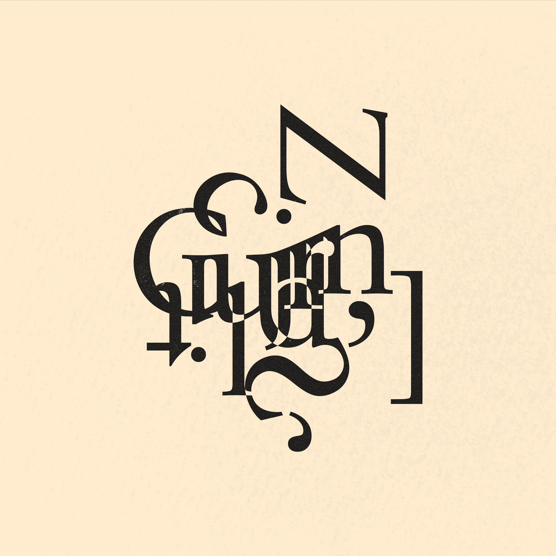
Like painting with acrylic and painting with watercolour, the output will be completely different. So creating these typographic abstractions, this time with Walbaum and Garamond, we achieve completely different output – they’re two different visual languages inspiring two different works.
Composition of Walbaum
Composition of Garamond
Some visual languages are so similar that the feeling changes little. In this comparison between Helvetica Neue and Univers 55, there is only a difference when you inspect closely but nothing changes dramatically. To me, this proves that four-hour deliberations on deciding between Garamond and Sabon are largely a waste of time (though is fun to do regardless).
Simple Language
In the world of logo design, there is a bit of snobbery if your logos aren’t geometrically perfect. All this means is, if your logo was finalised using geometrically perfect ellipses. This can be seen in the Twitter logo, the Apple logo, and many others.
Of course, any Cy Twombly-esque scribble you do can be traced with an infinite amount of perfect ellipses after the fact. The difference lies in that if you begin with perfect ellipses, your illustration will be simple and theoretically more pleasing and easy (less challenging) for people to absorb (perhaps making it more memorable). It’s a simpler language. Like recording a hit song with three chords and diatonic melodies – it’s pop music – though it doesn’t necessarily make it any easier to compose.
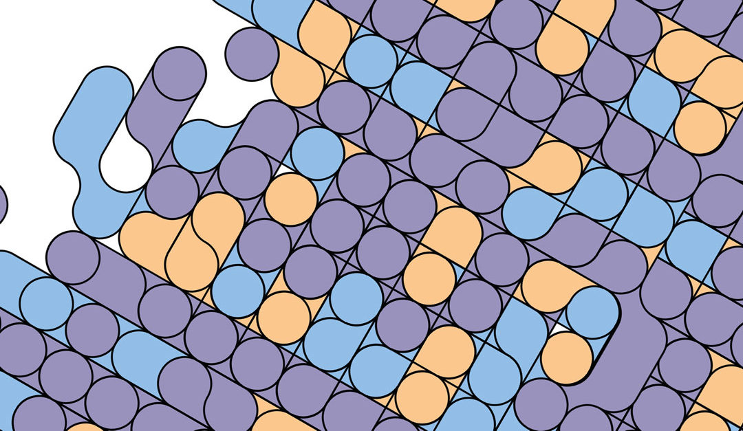
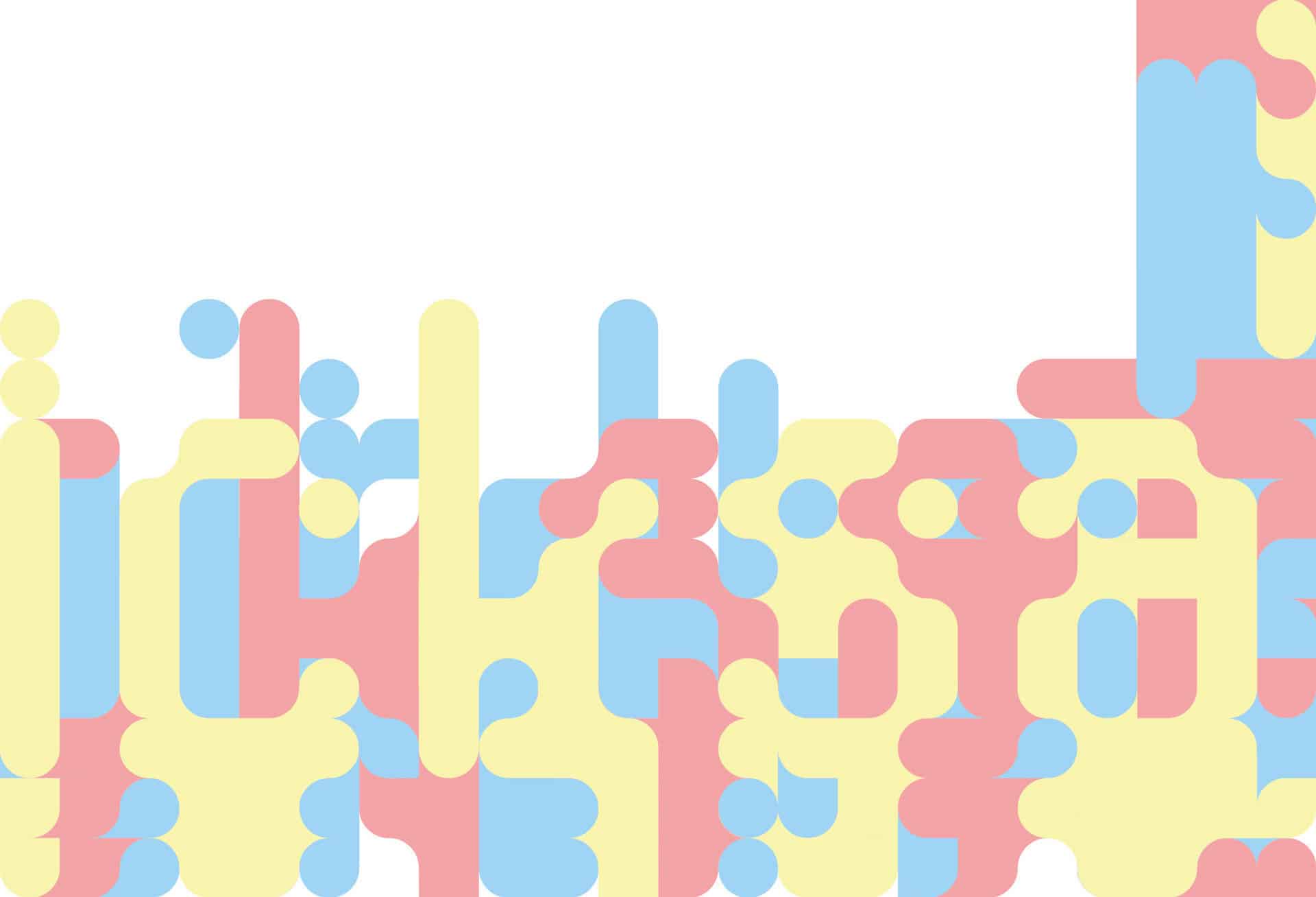
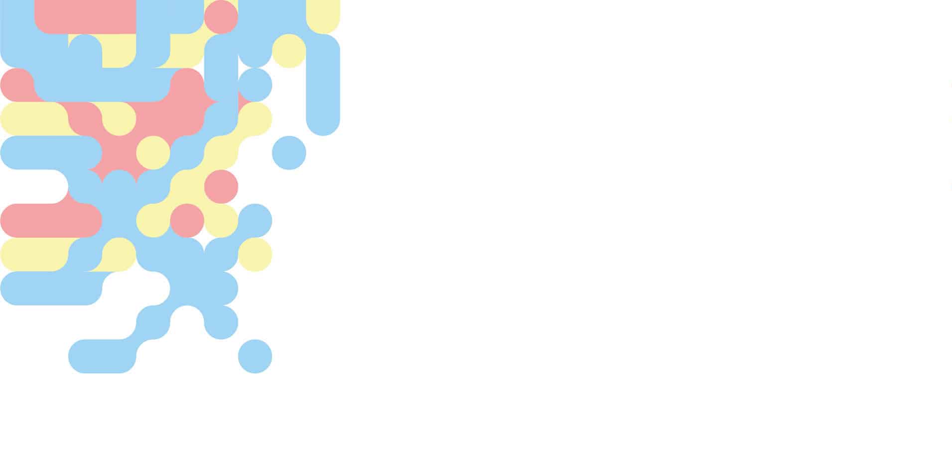
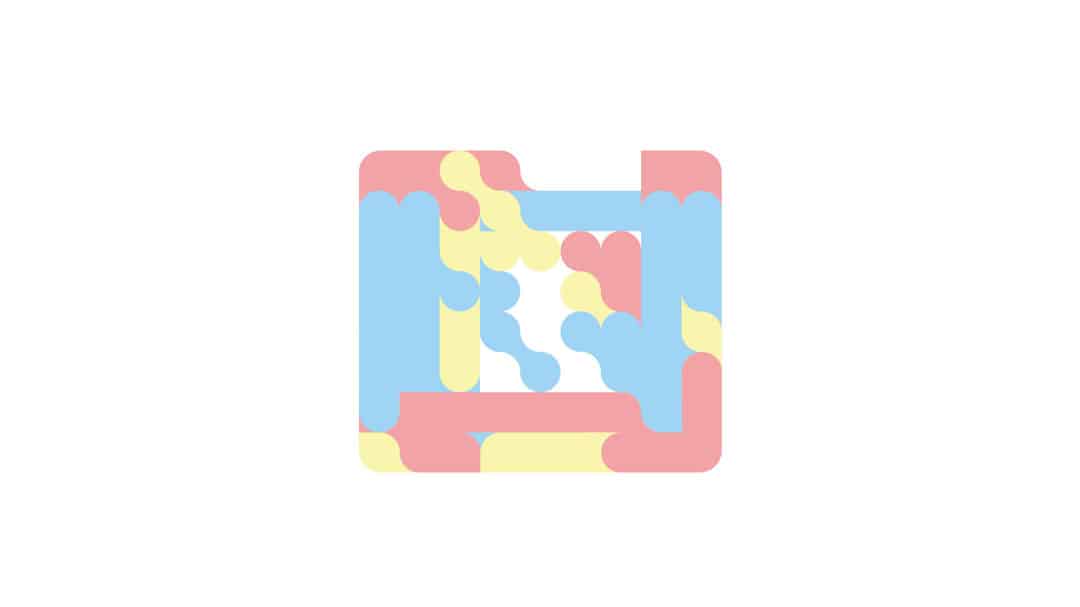
Using this idea as a basis, I created a modular typeface with simple, large, minimal units. What we end up with is a language that can be replicated simply and aligned together precisely to create compositions that escape the world of written language entirely and enter a purely visual universe of pattern and expression.
Using the same visual vocabulary as the typeface Quicksands we start to see other forms take shape.
Looking at type this way is to look at written language with new eyes, to notice beyond the word and beyond the individual letter to notice the nuance in the curves as they’re written, to see the context of the crossbars, the language of the lines and to see another language inside something we consume more often than food.

