Album Artwork: Pete Davies

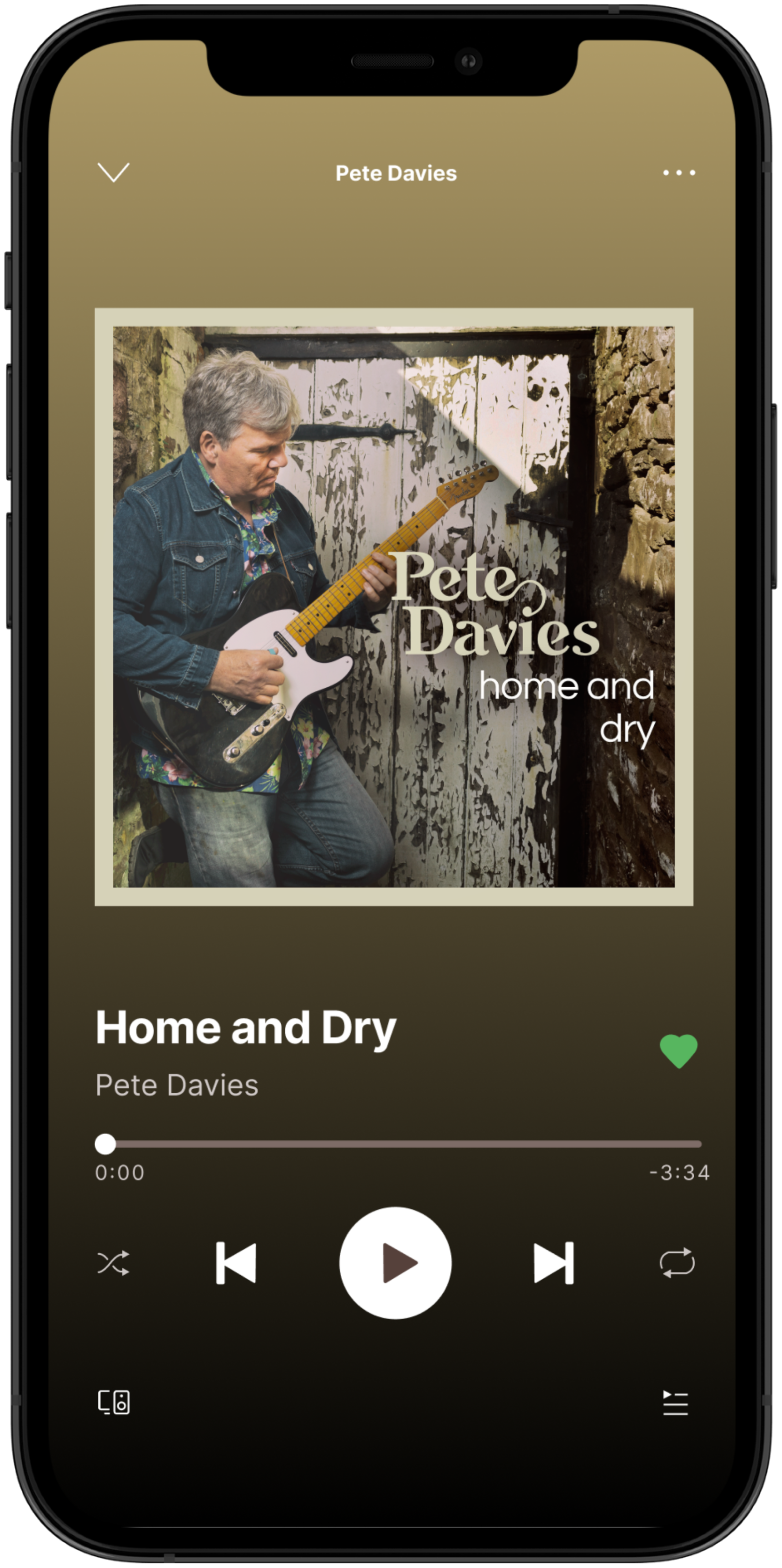
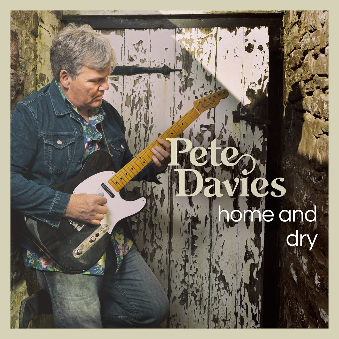
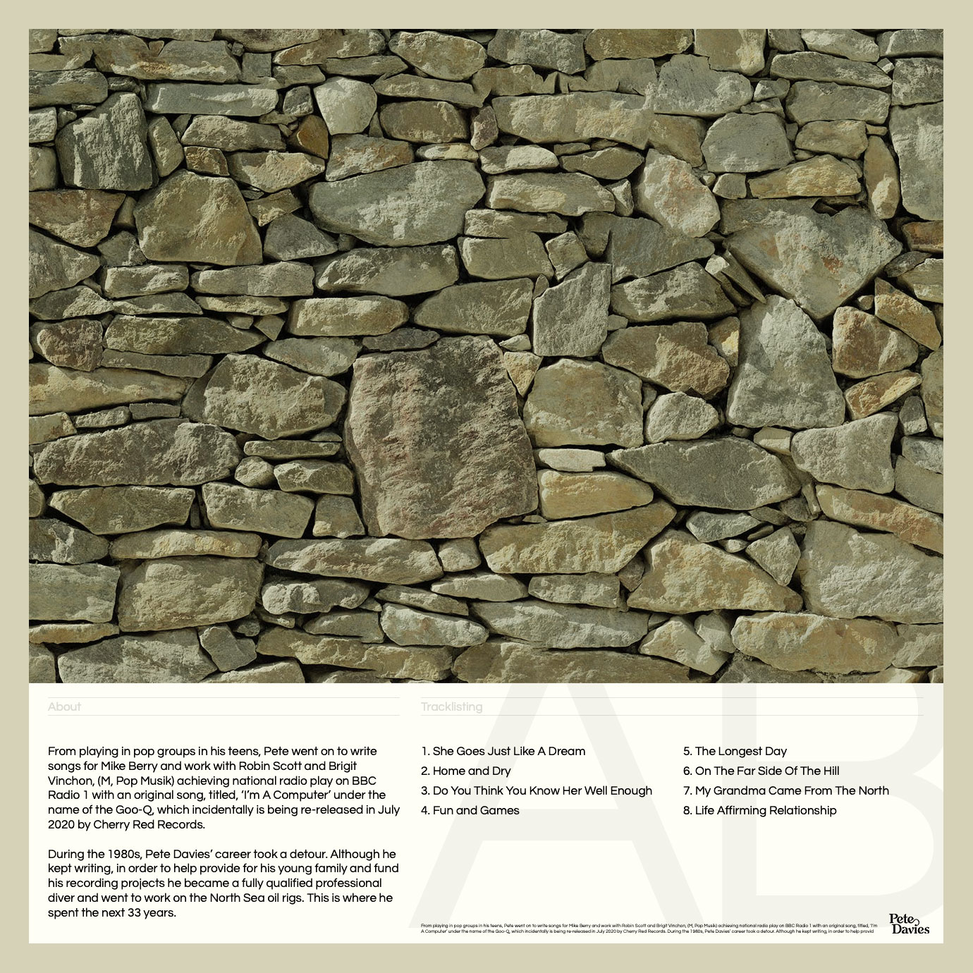
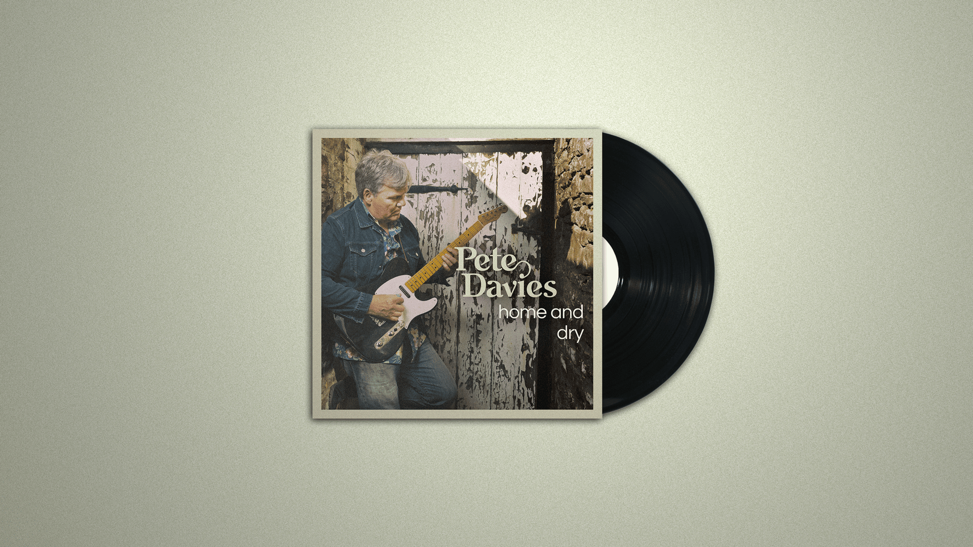
Following the success of the logo identity for Pete Davies, we then moved forward with the same brand values to complete an artwork project for the debut album.


As this is the first album from Pete Davies, we believed it would be best to lead with a photographic image of Pete himself; positioning Pete Davies as approachable, real, and confident with warmth.


Less mystery, more honesty.


The end solution maintains a warm vintage tone through the photography and use of a simple off-white border. At this point, we also chose to diversify the type from the logotype by deciding on the open geometric typeface of Questrial (Joe Prince and Laura Meseguer) which nicely brings the artwork into a more contemporary light.


There is, of course, the naughty practice of letting the type trail off with the orphan word. However, as a title, this not only balances the visual composition but felt this added an interesting poetry and rhythm to the reading.

Final