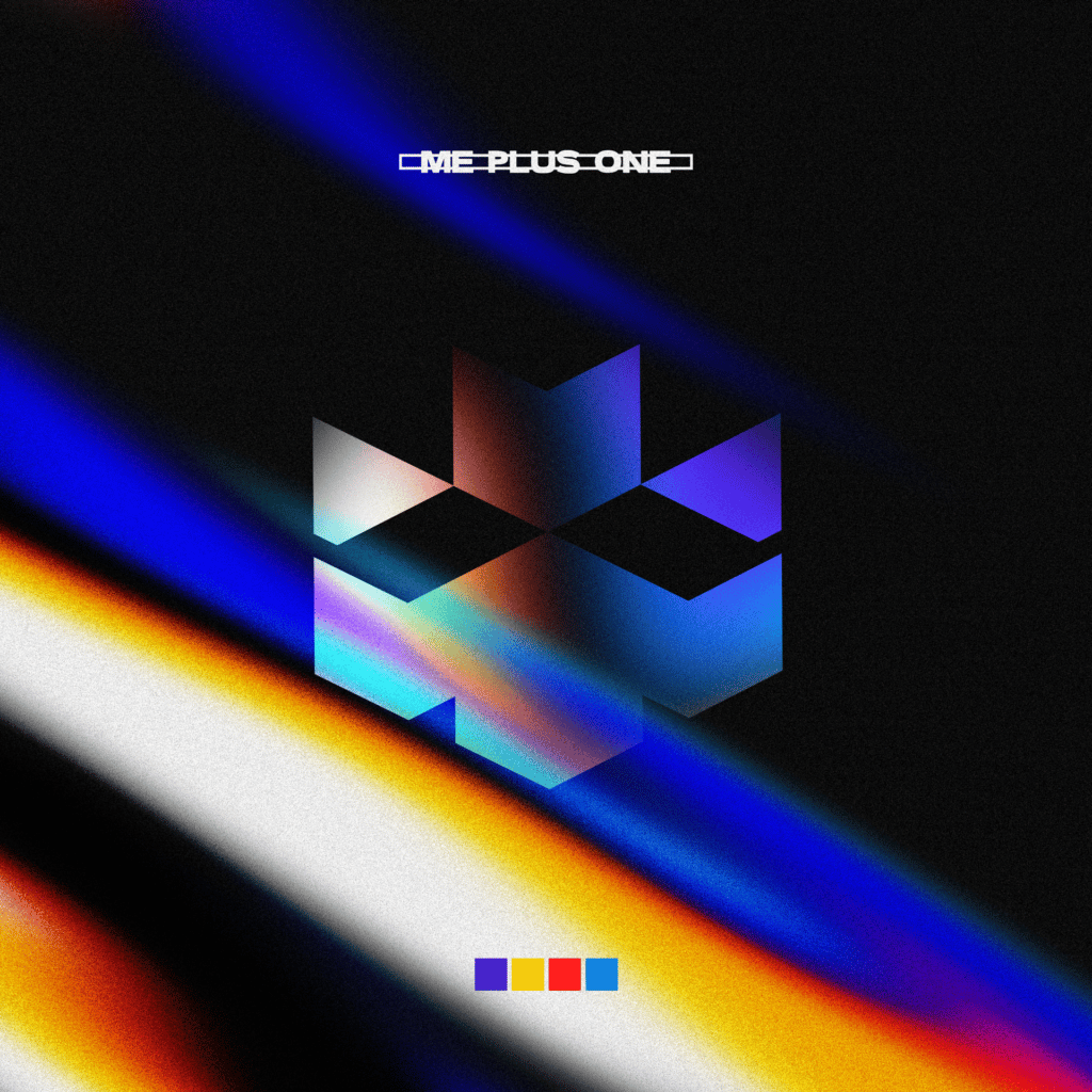
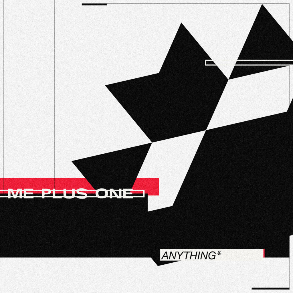
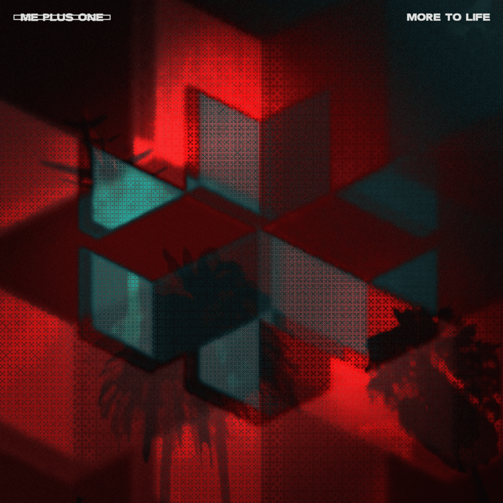
Once the symbol and the logotype were finalised, we started planning the artwork for the first singles – taking into account the content of the music as an attempt to make the abstract somewhat visually concrete (if at all possible). For these first releases, which will be the first interaction the public will have of the band, we decided to use the symbol to drive the piece and start influencing association with the symbol and the group from the very beginning of their music career. This actually became more important with their subsequent EPs.
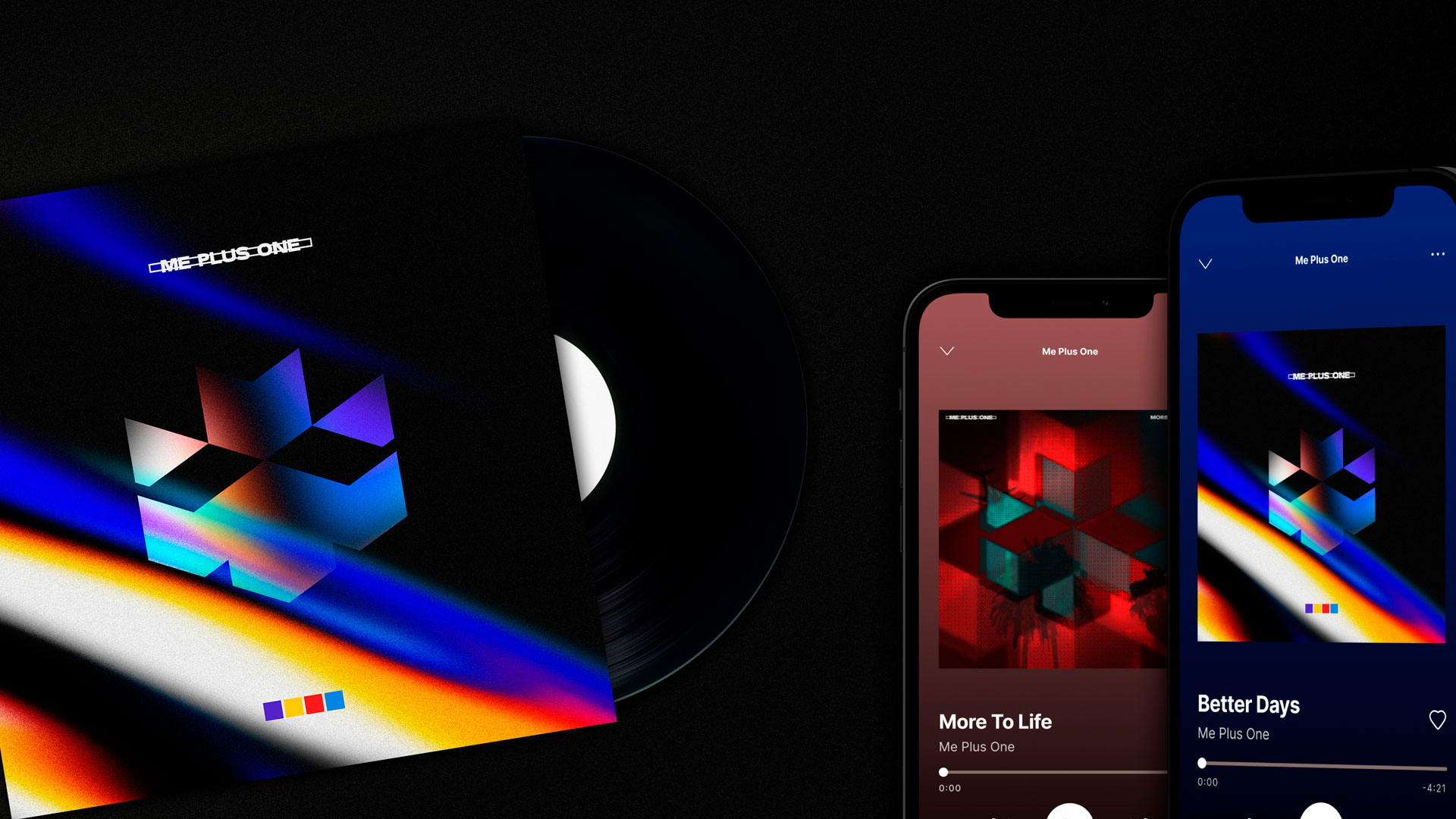
Album Artwork: Me Plus One
Single Artwork
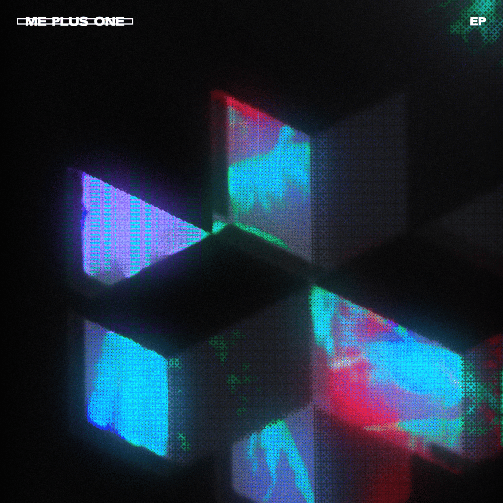
EP Artwork
The concept of the EPs was to contain four divergent colours which would be emblematic of the singles included. Multiple colourways such as this are something I try to stay away from myself, however, obliging to their only direction on this, we accomplished two different EPs again using the primary symbol to drive them.