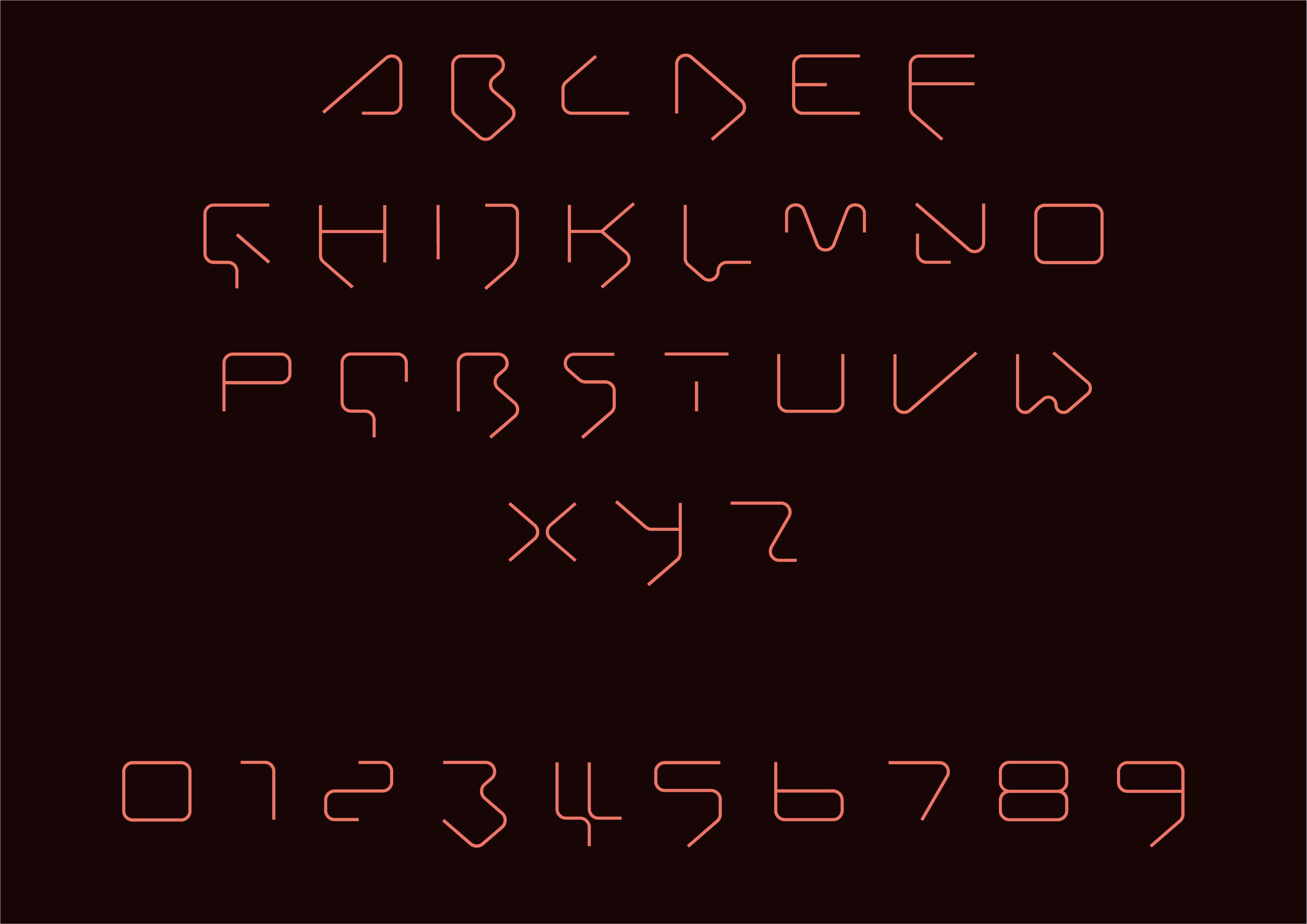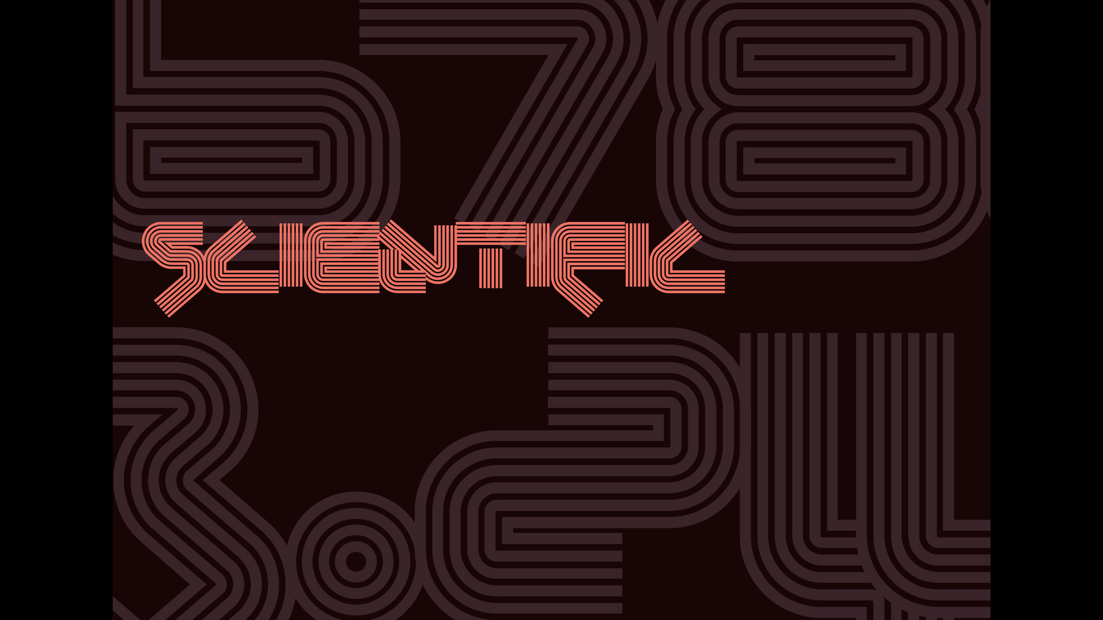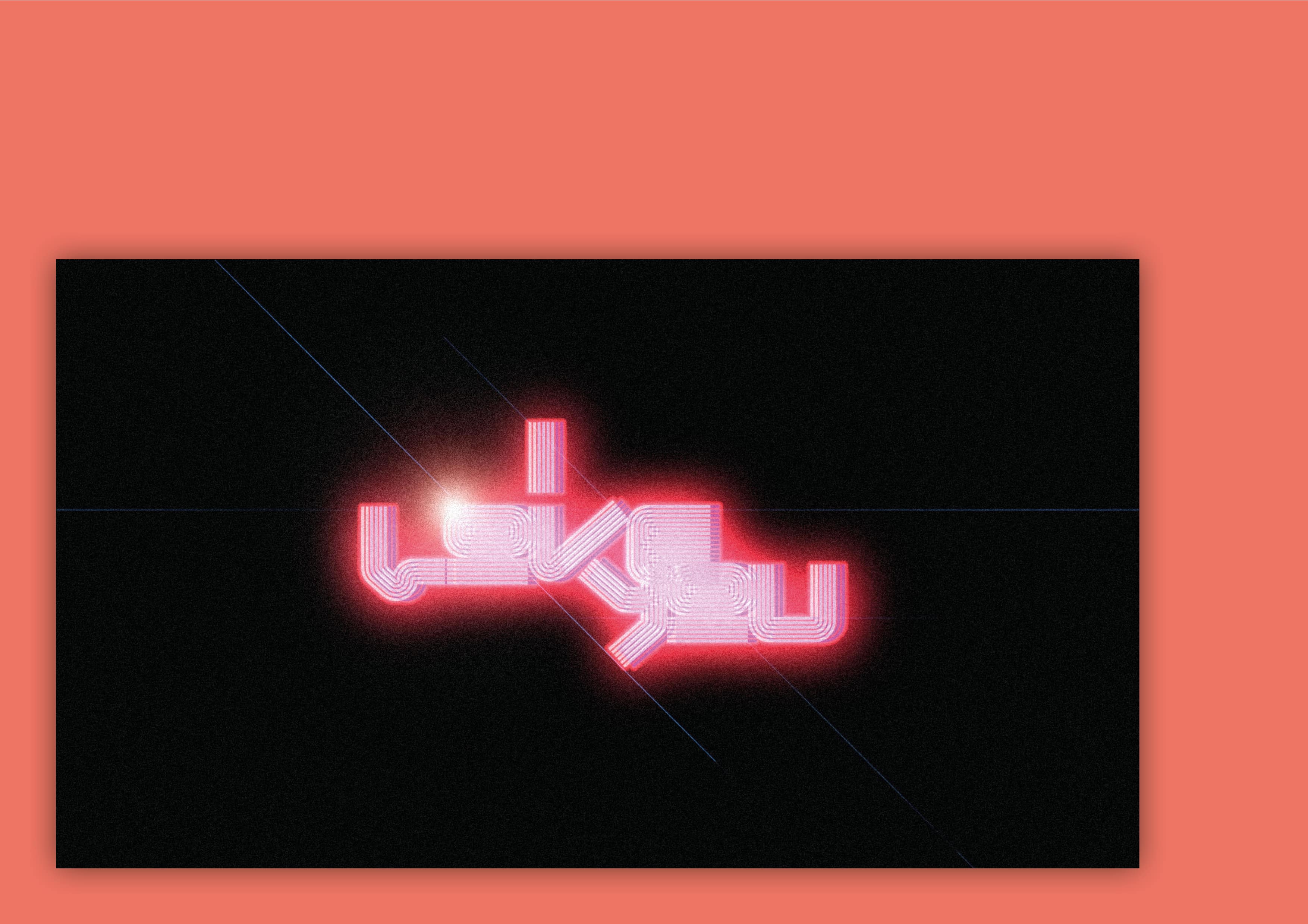
Initially created for a one-off project for a club night in Brixton we then developed this to become a complete typeface for very… specific purposes.
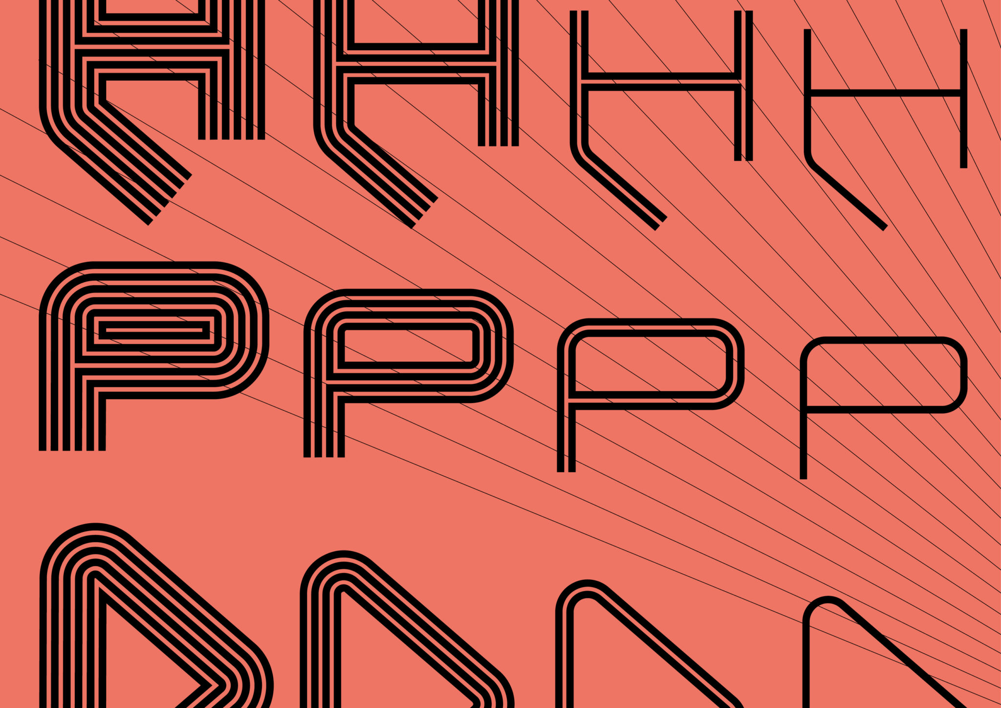
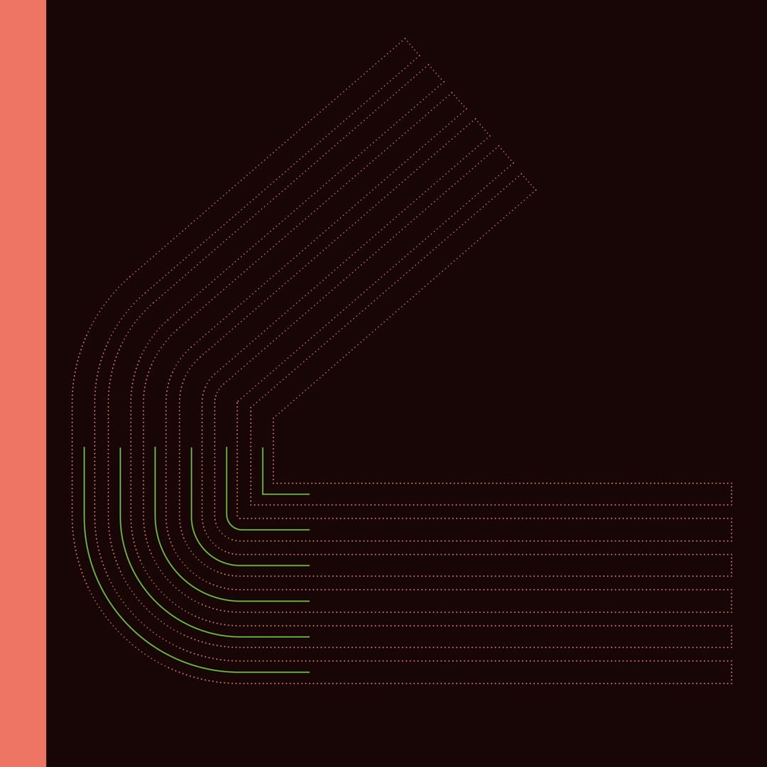
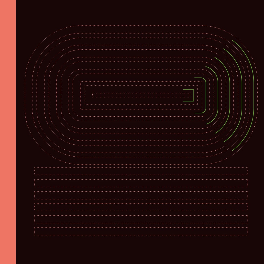
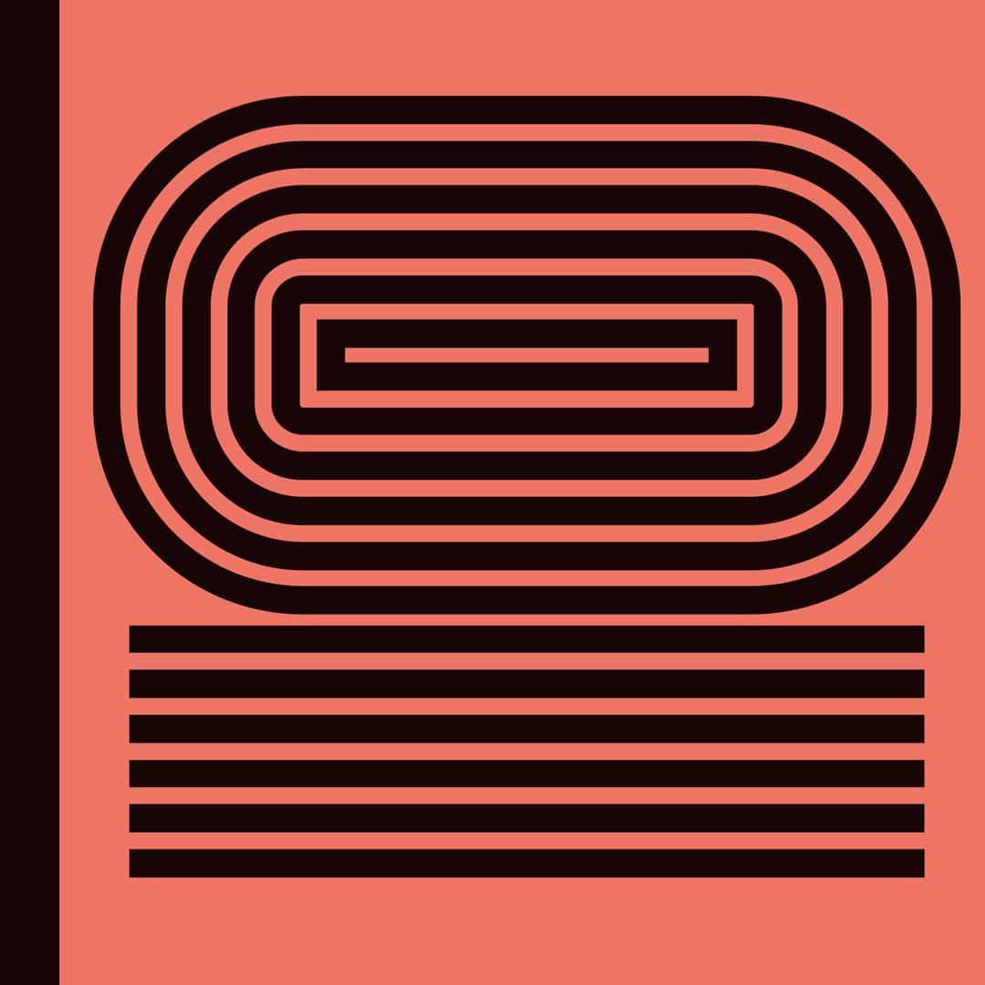
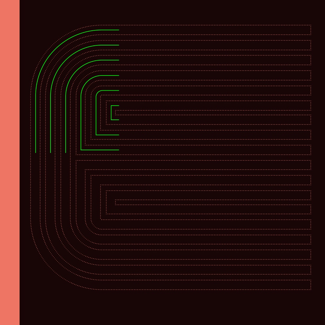
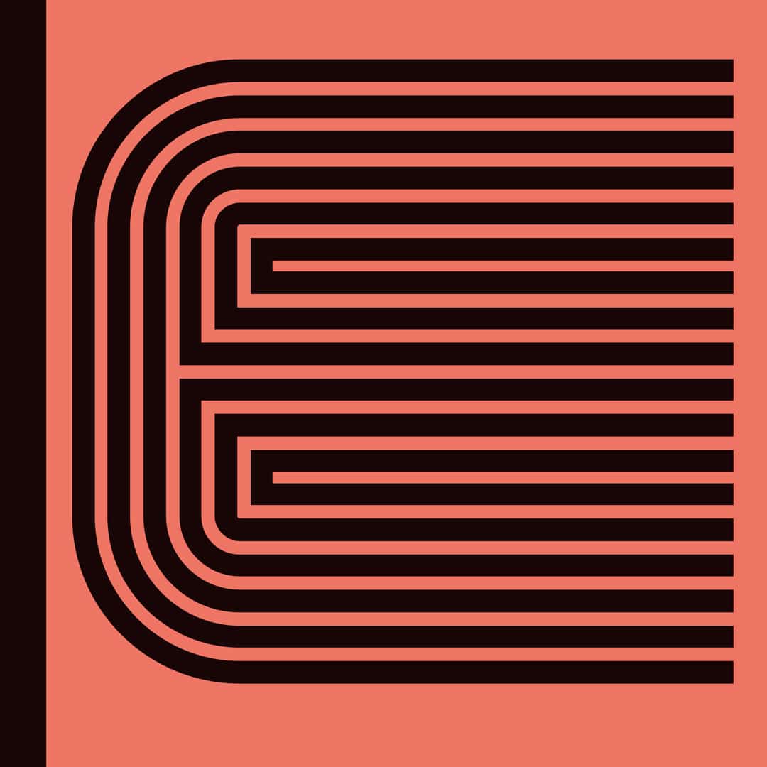
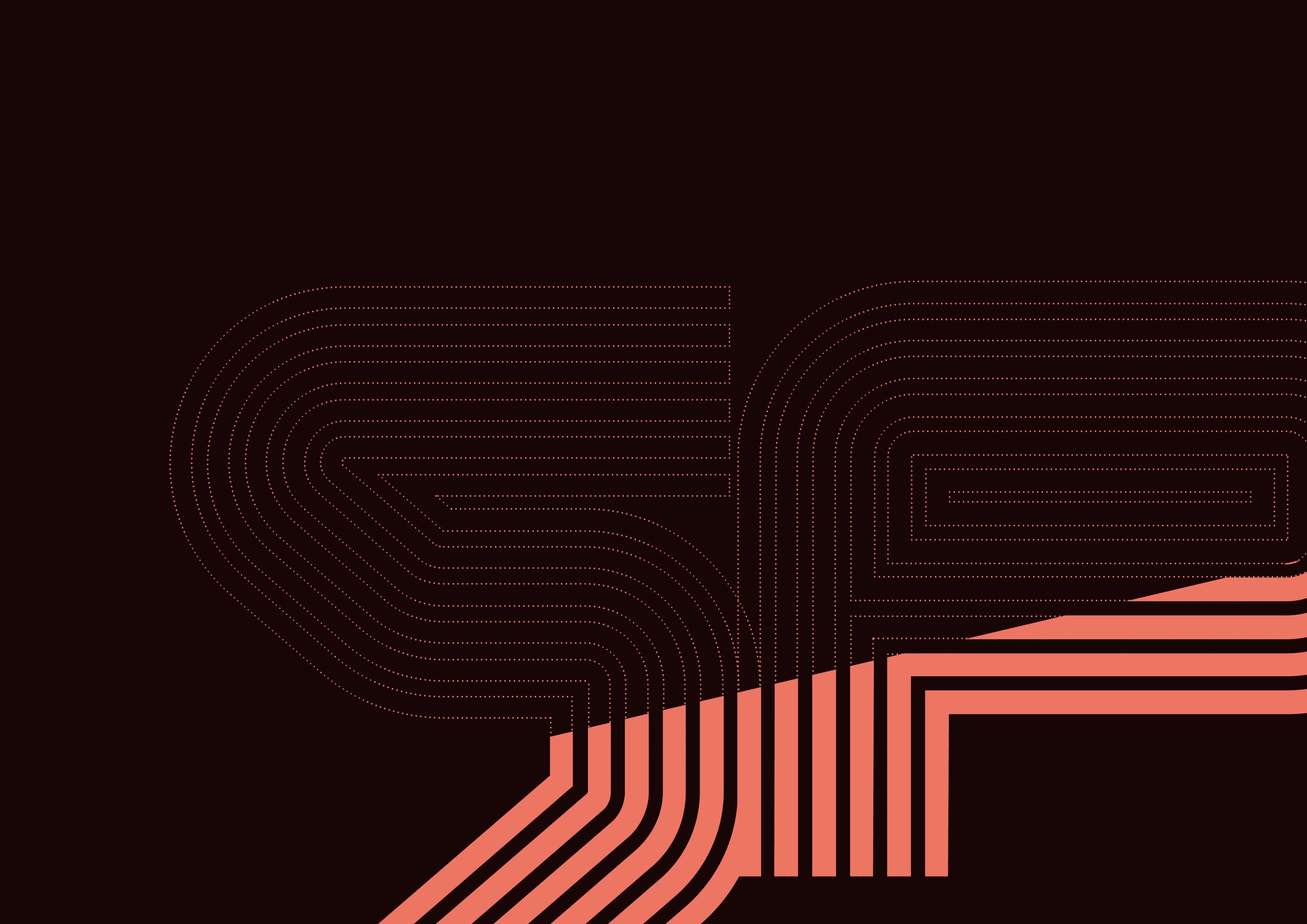
The font was developed from a strict and novel grid system with ten points of contact.
This, along with other set restrictions, created a cold and rational yet progressive and explorative typeface.
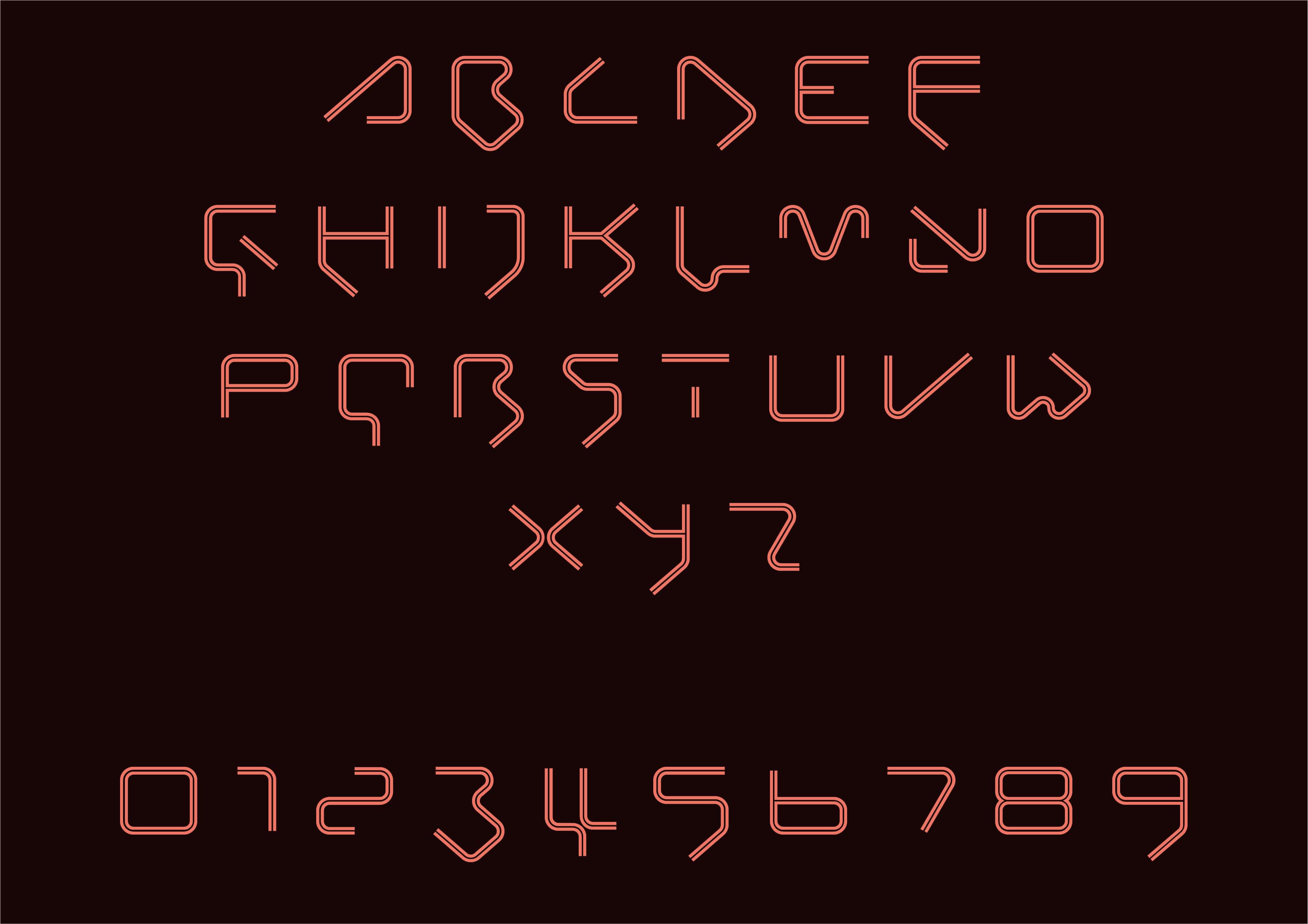
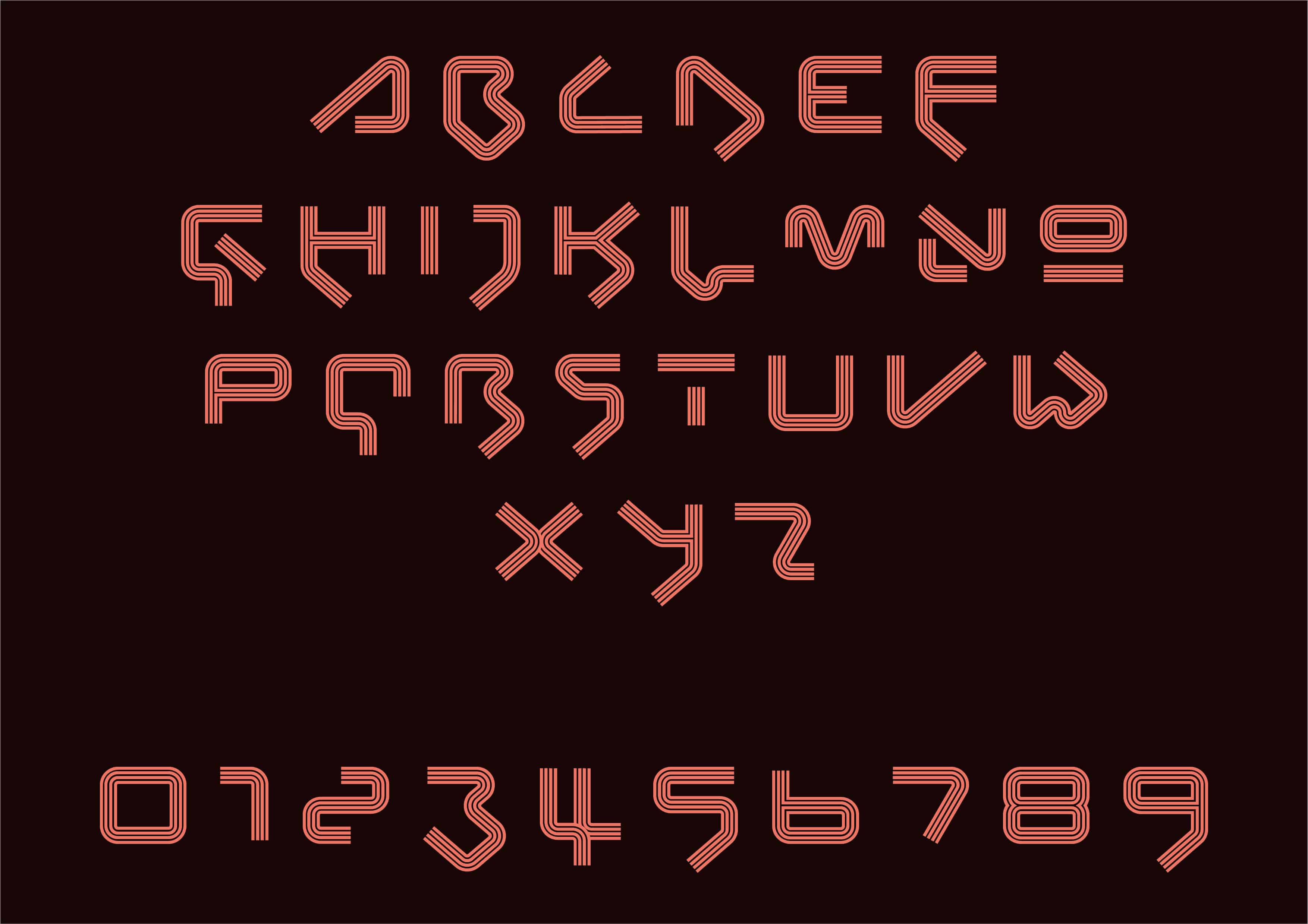
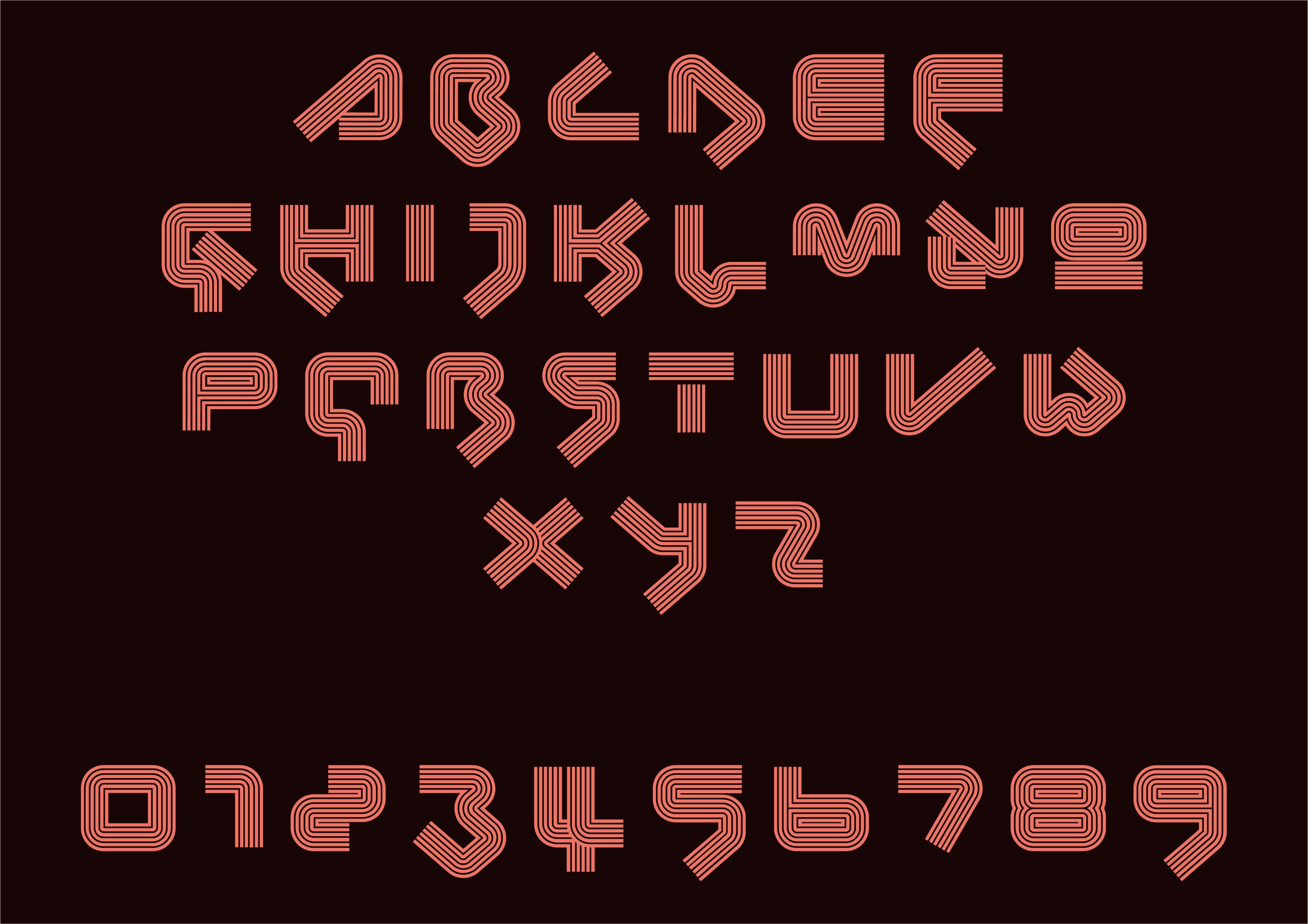
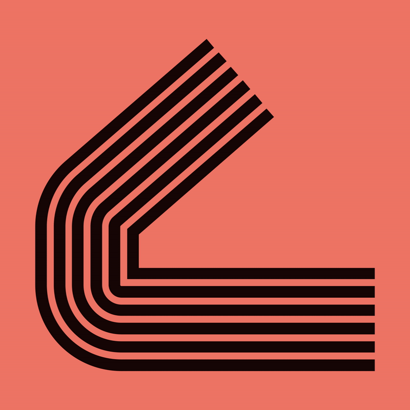
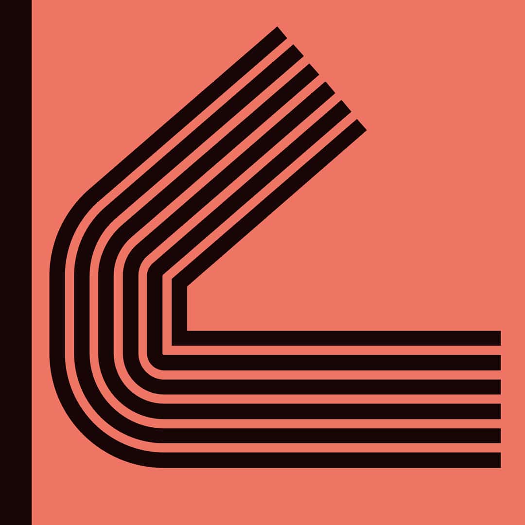
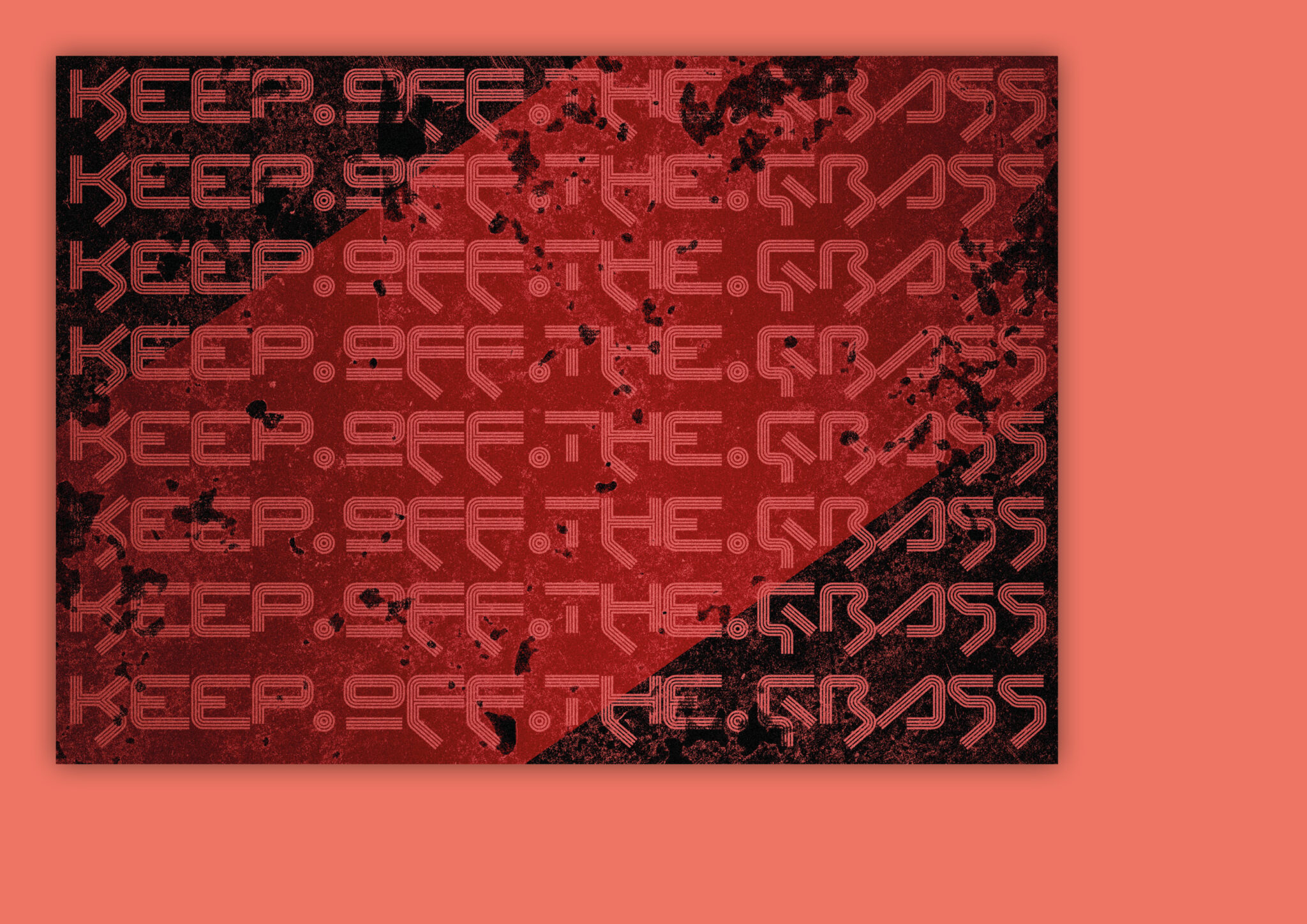
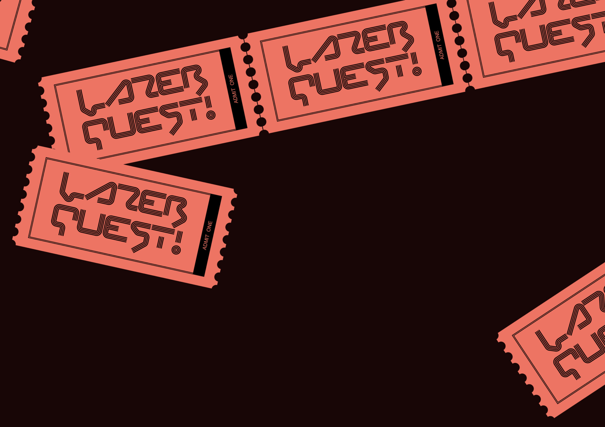
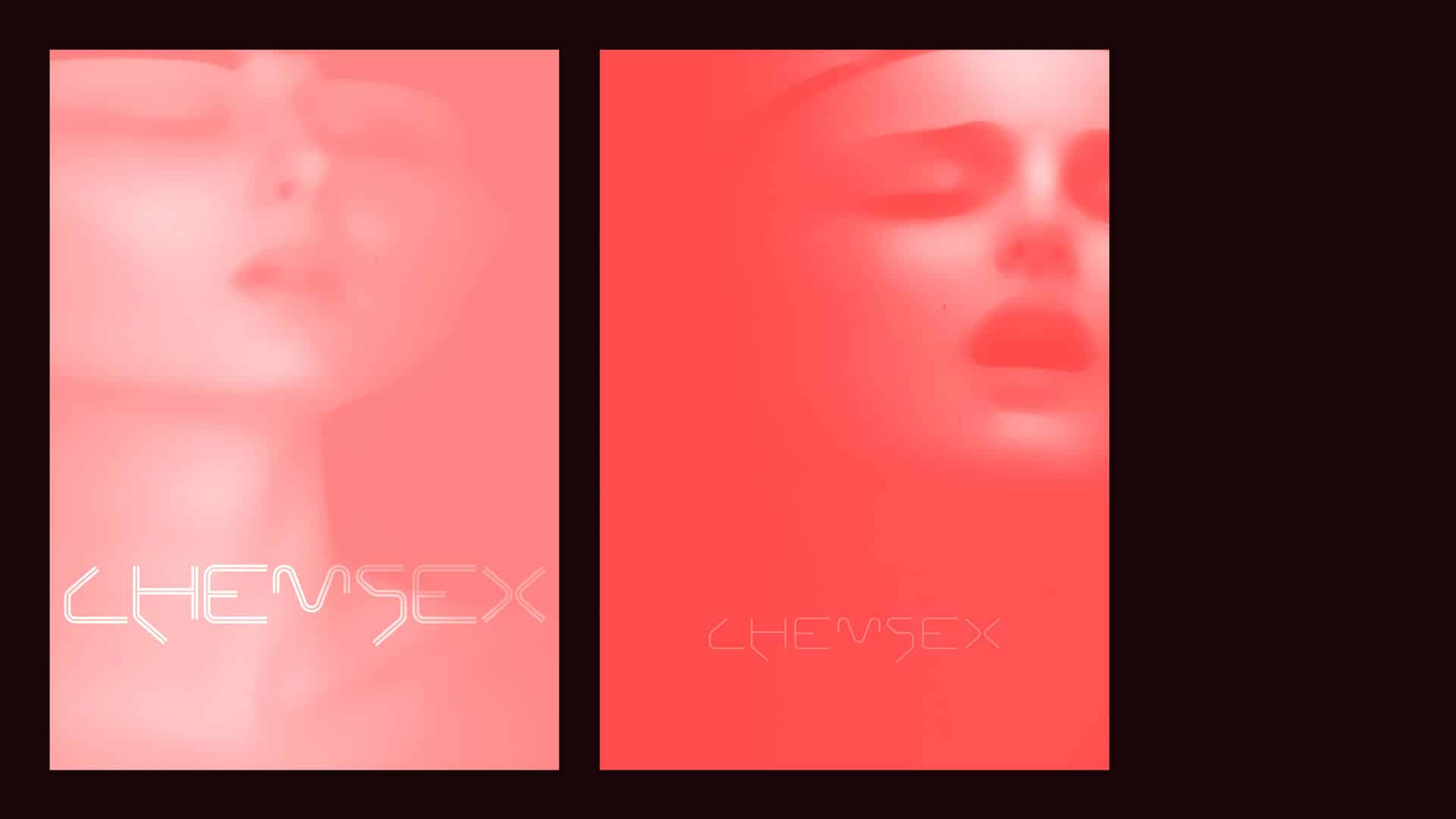
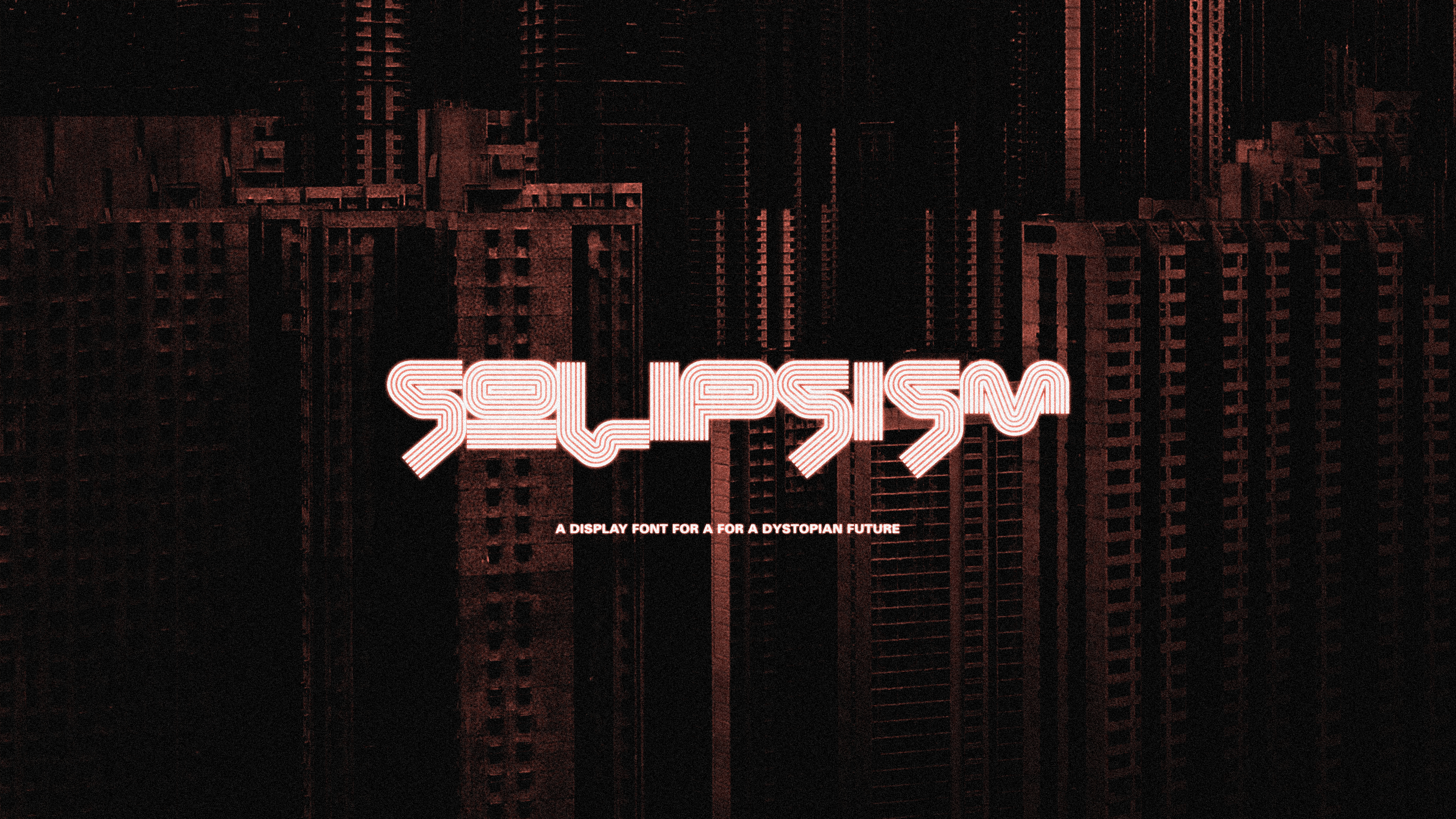
As we increased in weight from light to medium, and from regular to bold, we added density to the glyphs in the shape of two accompanying lines of the same width. It increases to the point when the forms halt curving and start performing hard corners while at the same time closing in on themselves completely.
The end result is something that doesn’t necessarily work for every occasion or even every ‘word-picture’. But for that occasional display treatment which needs something satirically future-facing with a cynical coldness, there is this typeface.