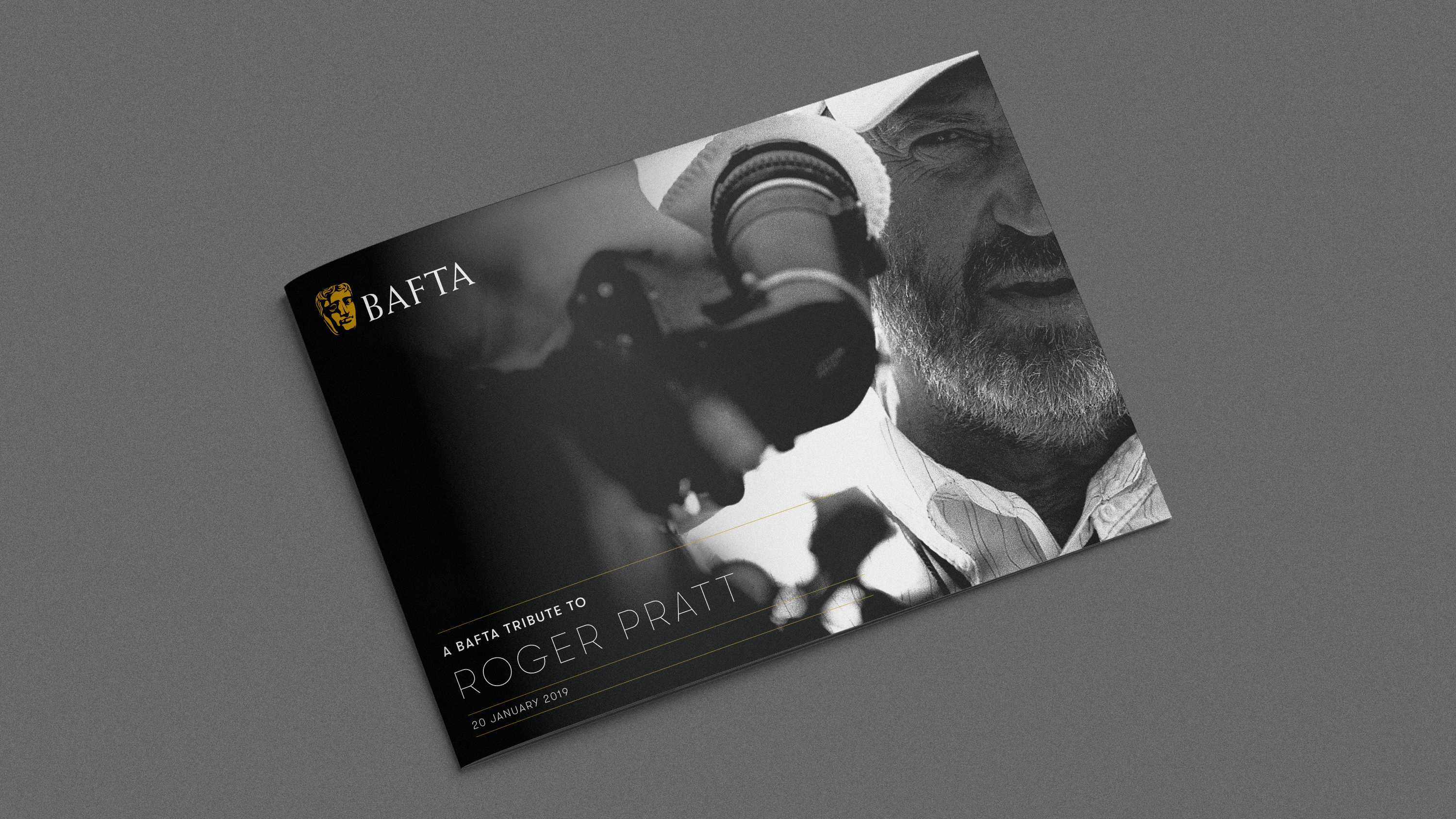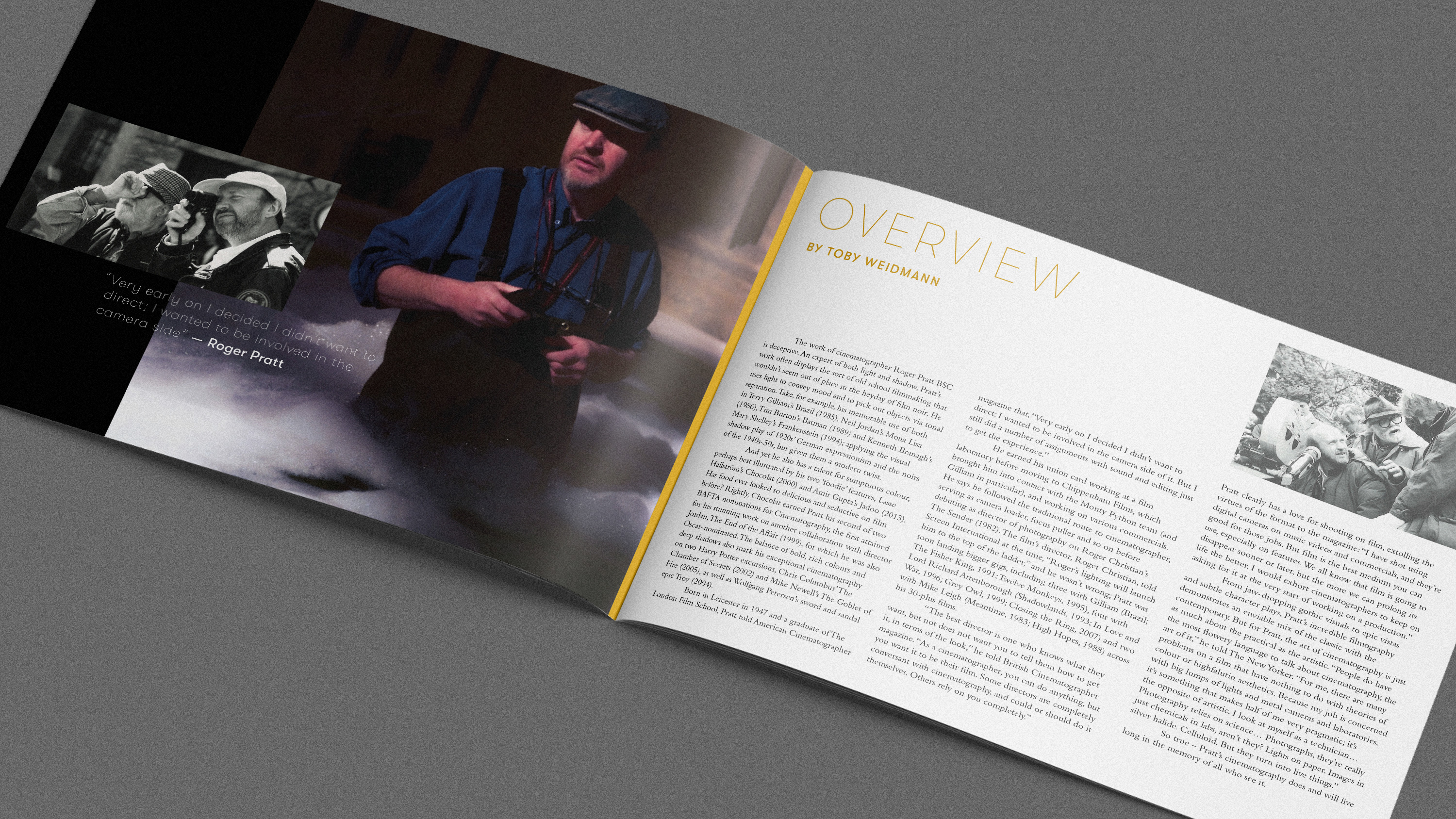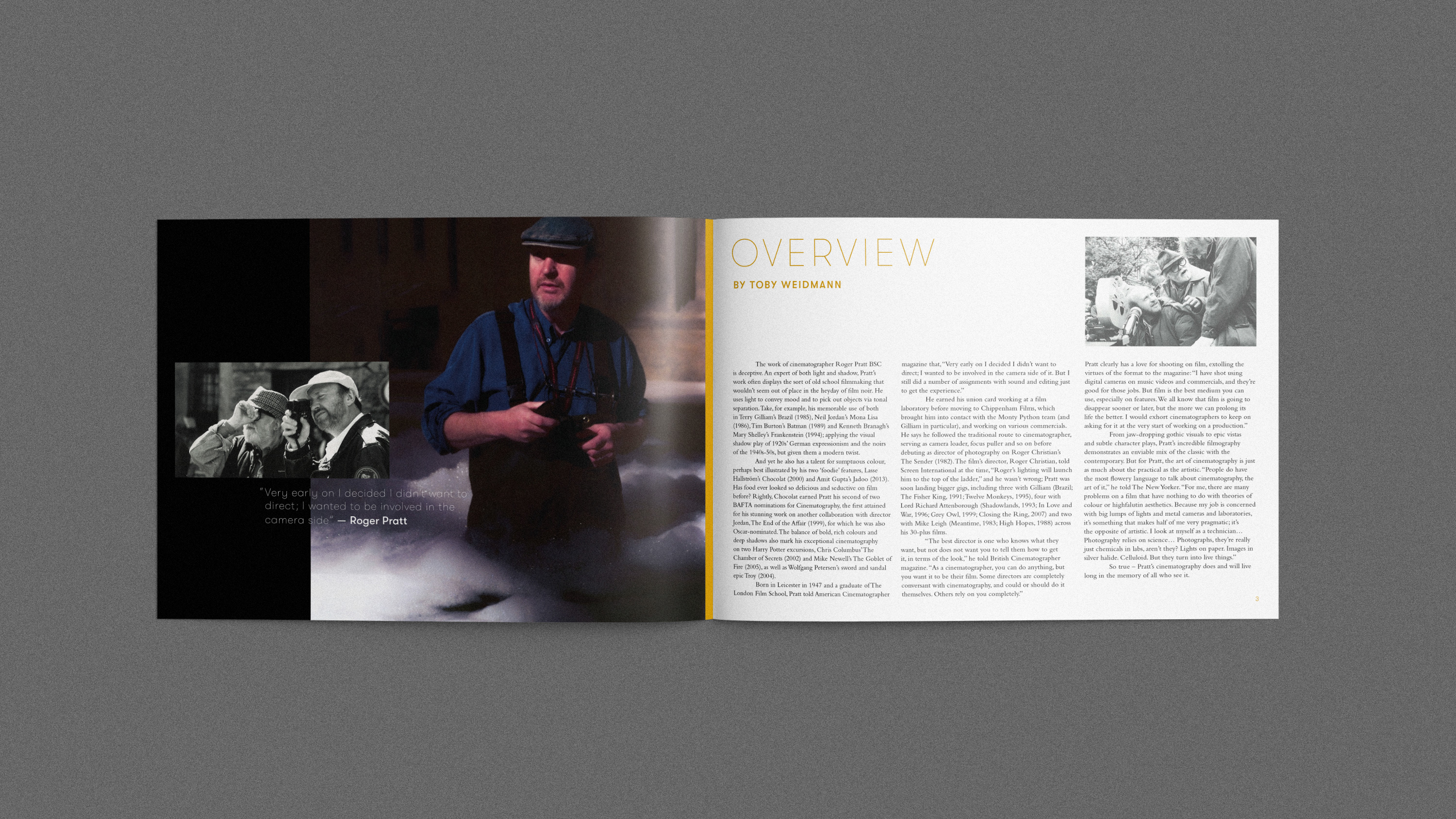
Remaining within the safe perimeter of the BAFTA brand guidelines we worked to design a print piece in honour of the late cinematographer Roger Pratt.
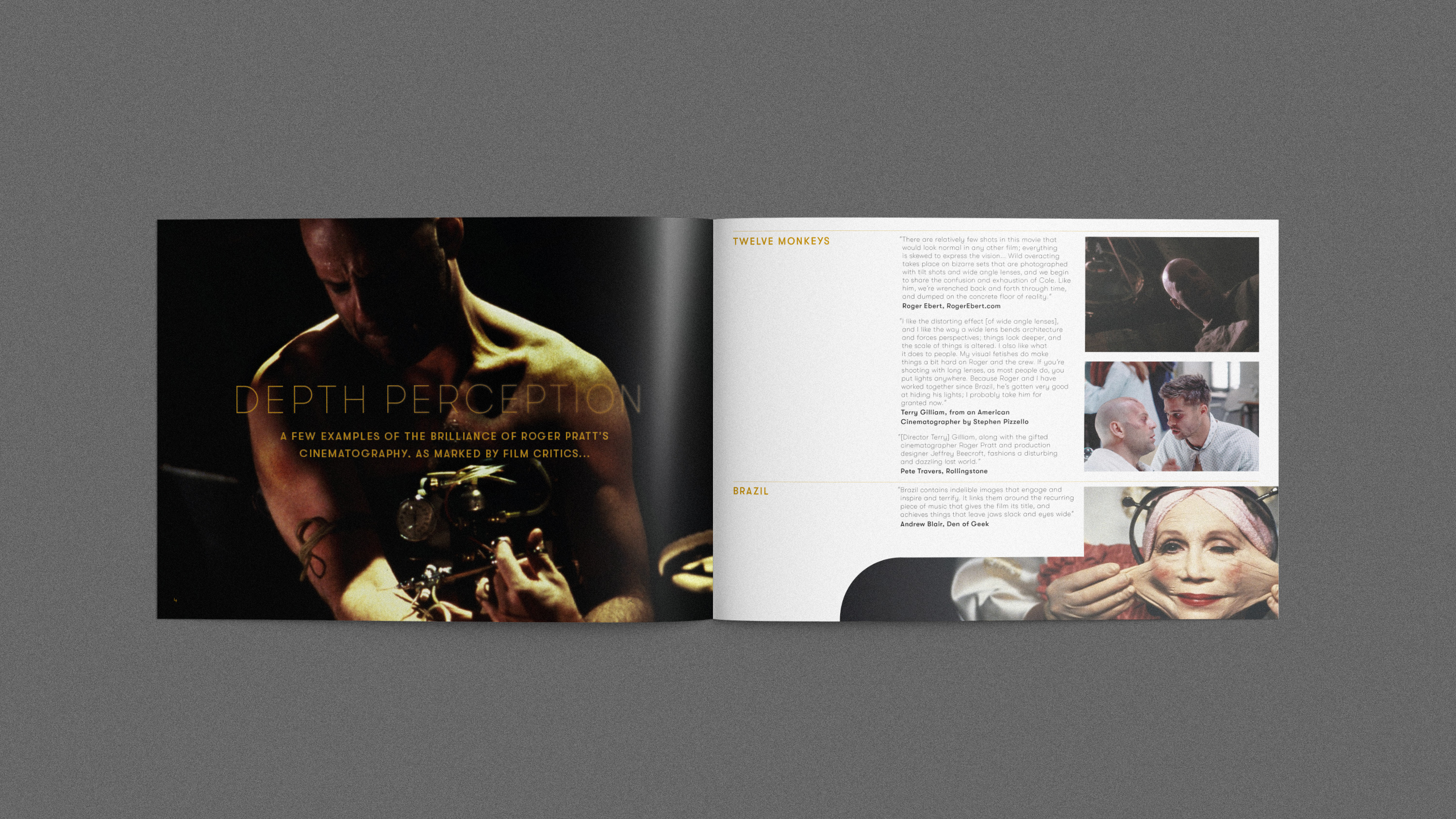
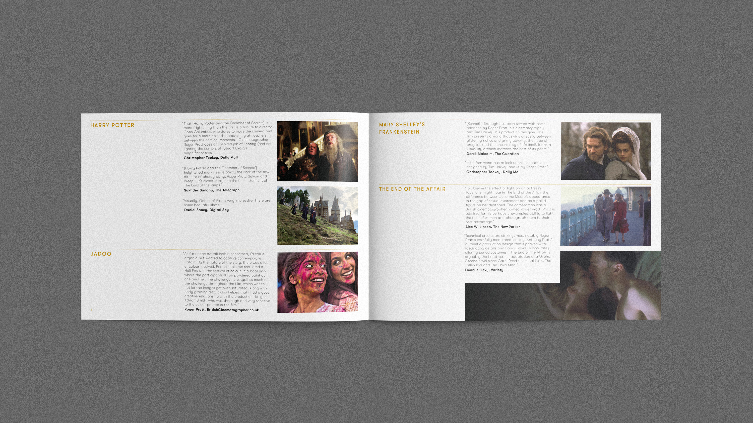
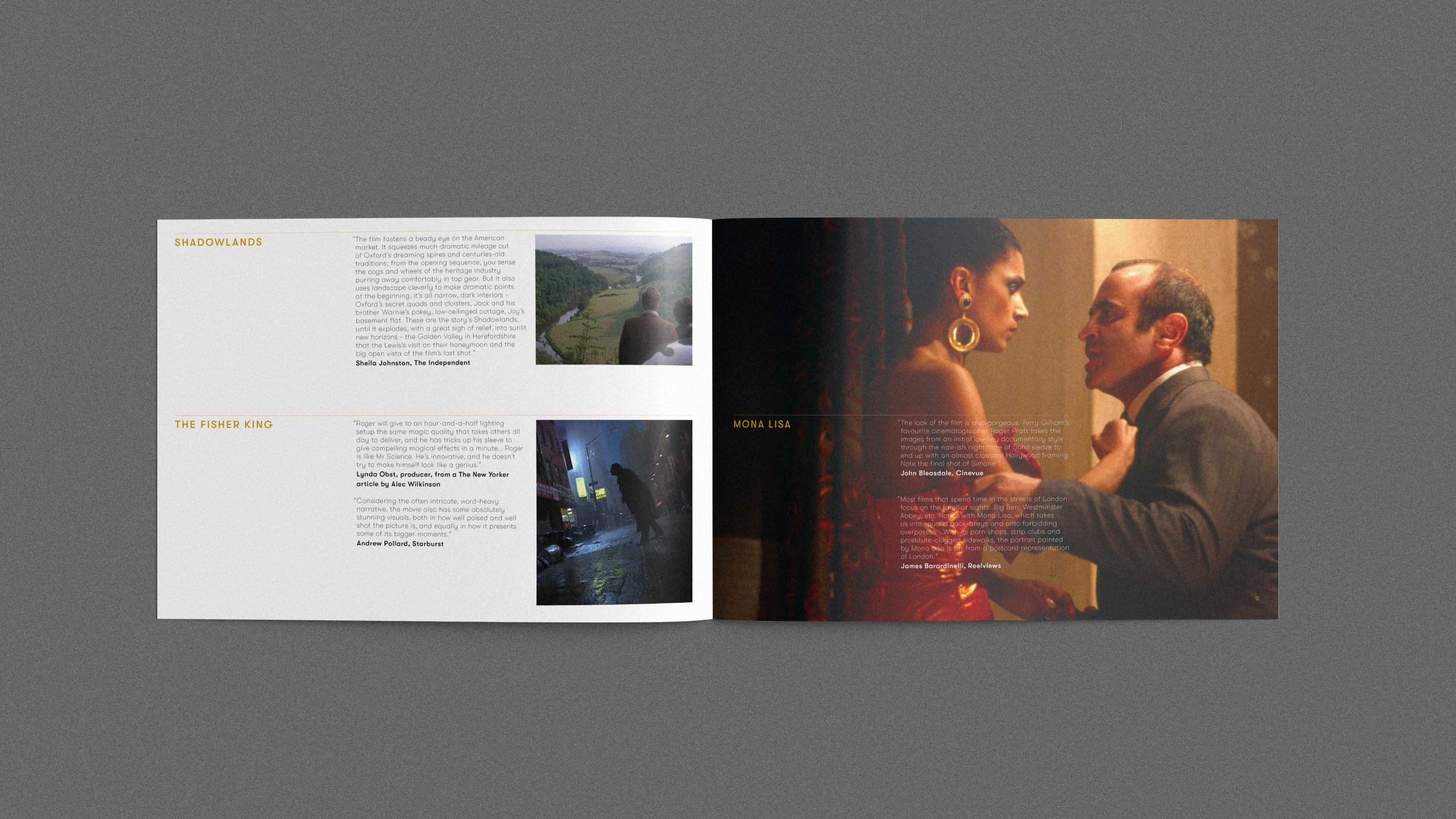
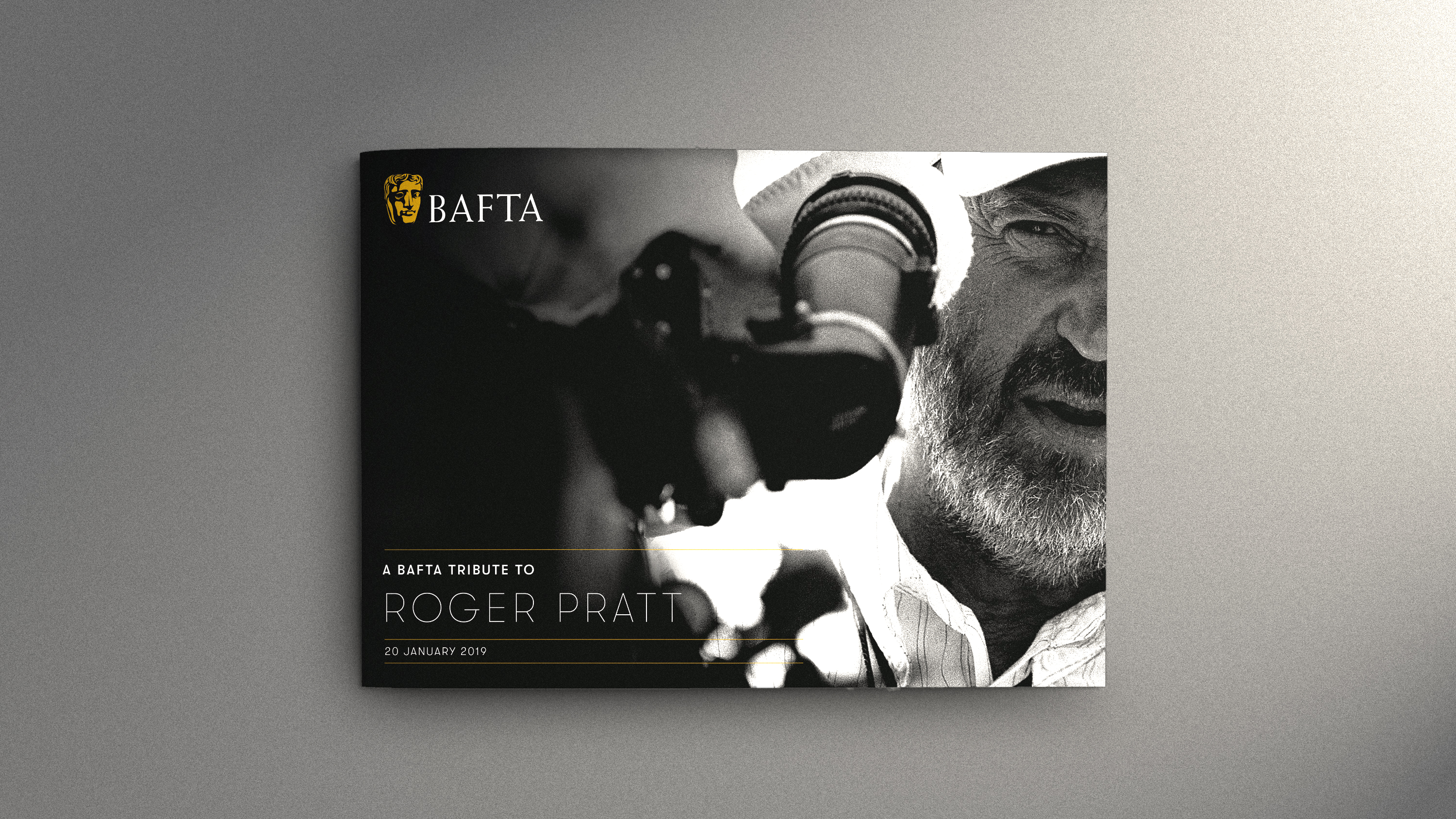
Collating a set of quotes and putting them into a restricted page document proved the challenge. I felt it was immediately necessary to have a full bleed image with a title to separate the artist overview from the quote content “Depth Perception”. More is less. I also discovered in this solution that occasionally creating more information aids in cleaning up the overall design. For example, it wasn’t necessary that the film titles be used and added, though I soon discovered that segmenting the information was ideal for making the overall content digestible and fun, so distributing the information into categories of film titles was made. What’s also noted is how well the design system is established early on, allowing for subtle variations to bring in visual rhythms to keep the viewer engaged and turning the page.