The brief for this project was to take a multitude of statistics of metro systems from around the globe and arrange them in a visual and interactive system with the goal of seamless comparison between the various data sets.
Infographic: Metro Systems – A Global Comparison
Aims and Constraints
To create a visual data system that can be interpreted with intuition while the visual representations of data remain true to the original statistics – meaning graphical representations, ie scale, dimension, placement, etc, needs to be an honest reflection of the numbers. We will work to the constraints of a limited colour palette, descriptions, and display all data within two dimensions.
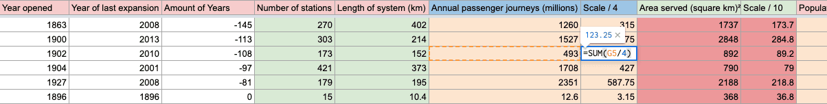
First exploring the data, we needed a way to read the numbers where we could create different meanings between multiple areas – to refrain from displaying statistics as singular.
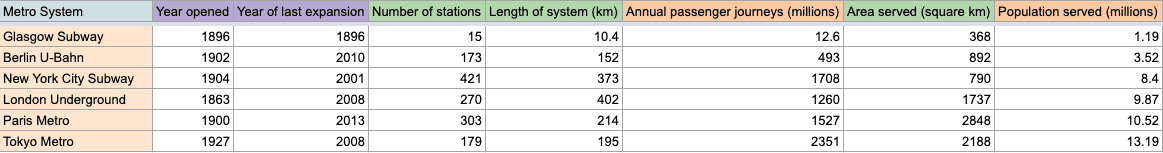
We imported the data into spreadsheets where we could then set the rows to change freely. This simple first move freed us from looking at the numbers in one relationship and spun them in a different light to see new comparisons and thus new meanings between the data.
Additionally, by importing the data into a spreadsheet we were able to scale proportionally specific sets of data that proved too large visually represent in comparison to others.
“Every bit of ink on a graphic requires a reason. And nearly always that reason should be that the ink presents new information”
— Edward Tufte
The Visual Display of Quantitative Information by Edward Tufte always proves the compass to come back to again and again when designing for data visualisation. Full of old examples, the thinking in this book leads with certainty and objectivity on good data communication. It’s a necessary book to navigate this sensitive area of graphic communication. The writing is deep and at moments beautiful.
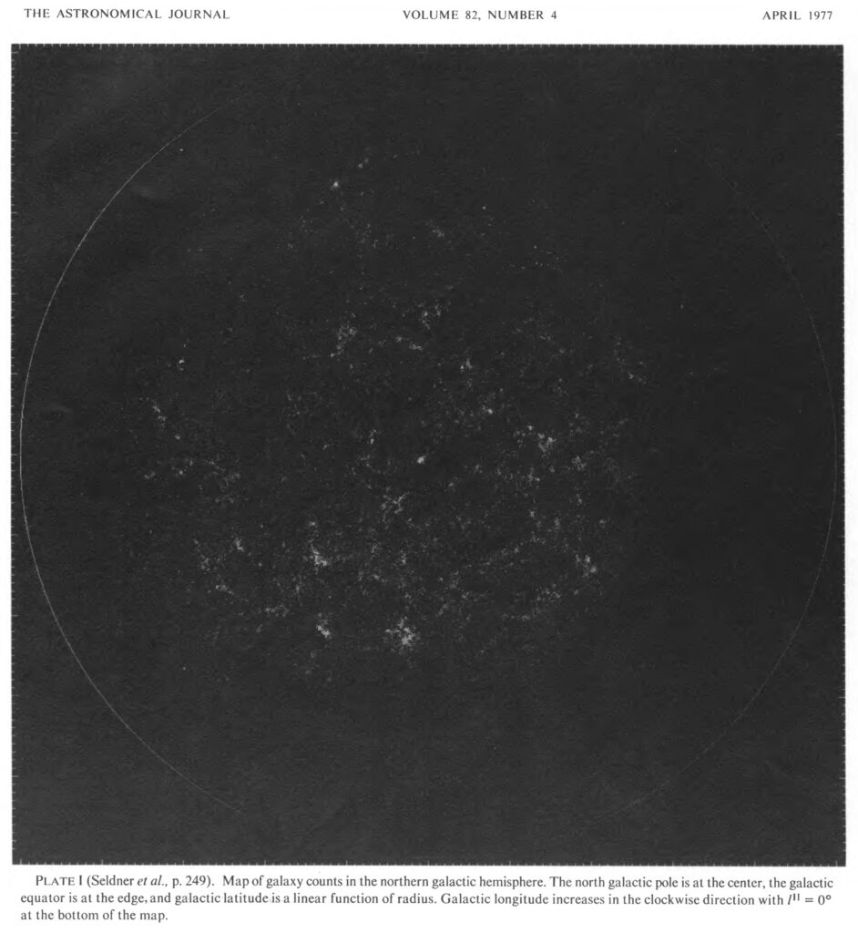
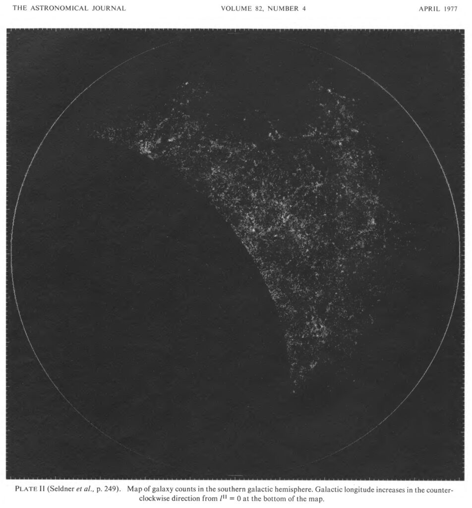
New Reduction of the Lick Catalog of Galaxies, 1977
Michael Sledner, B. H. Siebers, Edward J. Goth and P. James E. Peebles
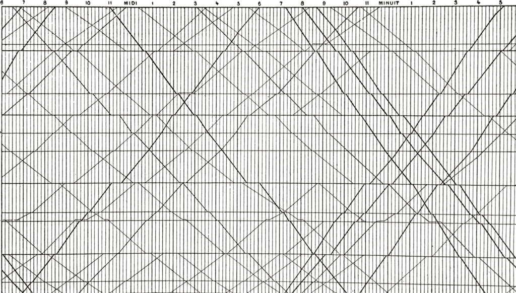
Paris to Lyon Graphical Train Schedule, La Méthode Graphique, 1895
E.J Marey
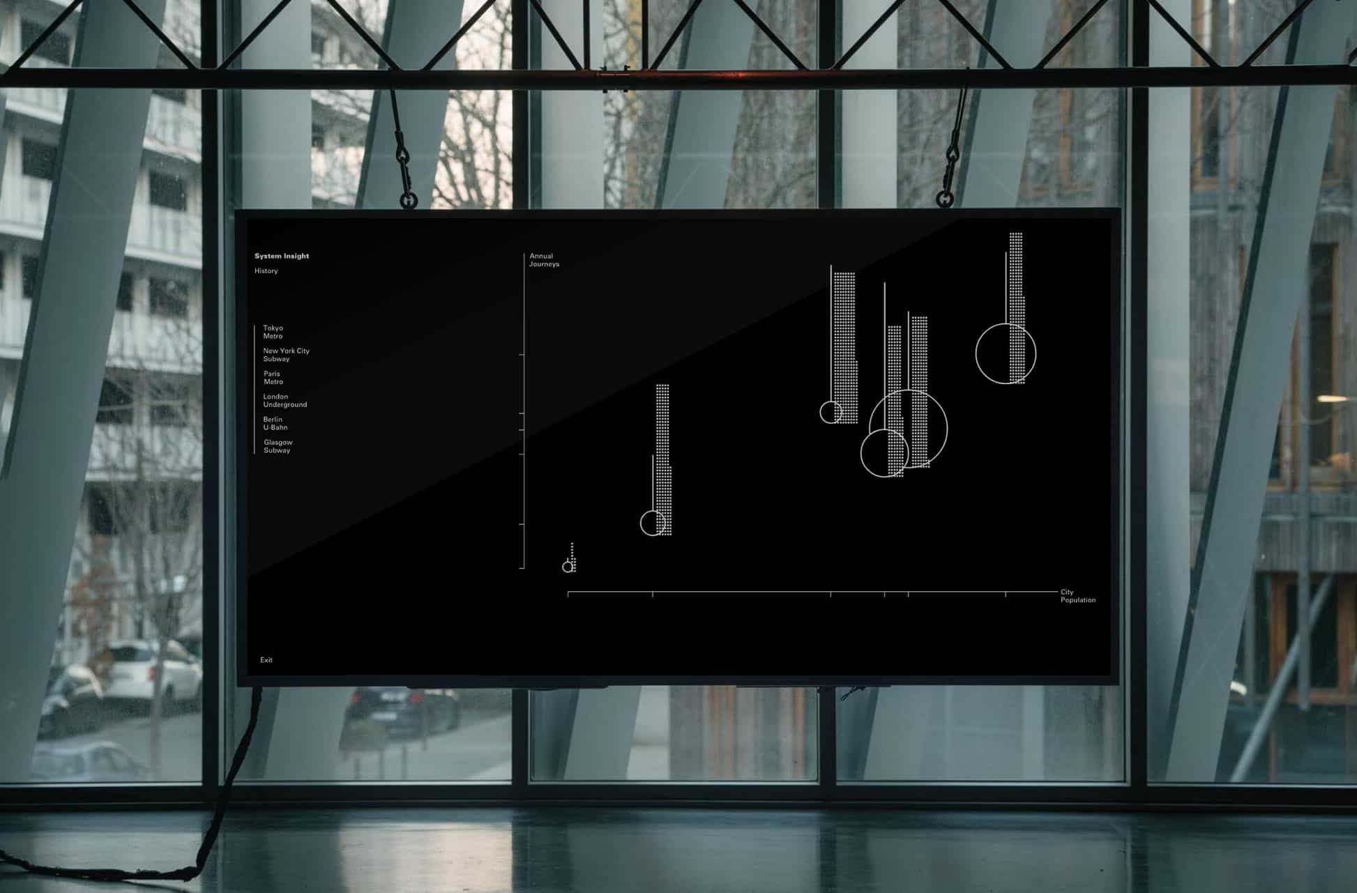
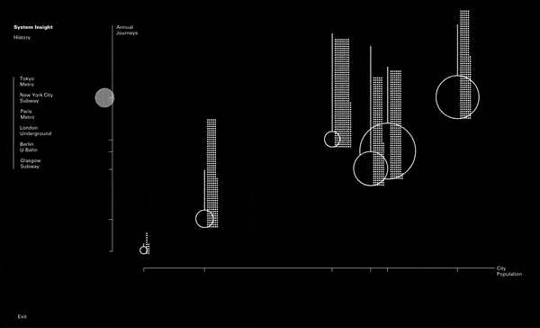
After the long and arduous process of finding what works best to display all the information, we went through about a million and one iterations (exaggeration) to discover what would present the data in the most beneficial way – we found an interactive screen-based design would work the best for this project.
Once we got it to screen we could clear up a lot of the data and place them as simple buttons for the information to be revealed upon the audience’s curiosity.
We also got rid of any unnecessary elements such as the arrows at the end of the axis and had all the names for each data point moved off to a menu margin on the left.
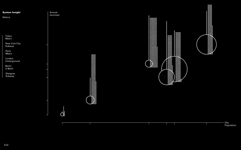
An intuitive animation that helped communicate the data was the time sliders all moving from the past and forward toward the present year.
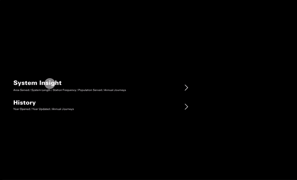
With all this interaction capability we felt it needed an intro screen to equalise each visualisation more than if you were to open it straight onto ‘System Insight’. It feels more equal this way; incorporating ‘History’ into the whole.
Working on data visualisation never fails to stretch one’s understanding of complex visual communication; leading designers to think sensitively and extensively about data sets and numbers to hopefully what is an articulate and true-to-data conclusion. And after the first couple of dips and dives into a spinning frustration of numbers and statistics (inevitable for myself), you soon find it deeply interesting how dangerously easy it is to spin data to different possible narratives or agendas.