Free-Dom Records is an independently owned record label and concert promoter based in London looking to appeal to a more edgy and discerning crowd of concertgoers and music enthusiasts. The specialist genre at this time was most of everything that was “cool” – which was quite hard to define and thus translate visually, but in the end gathered the identity would have to be objective enough to appeal to all but follow contemporary trends to appear current and exciting.
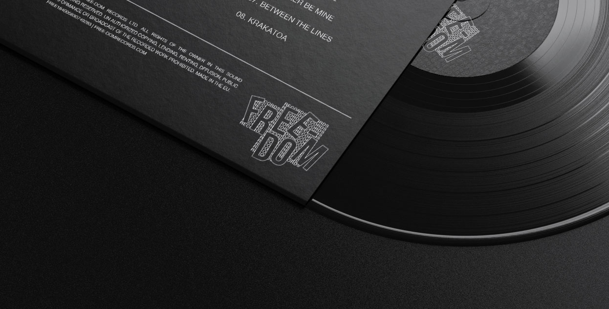
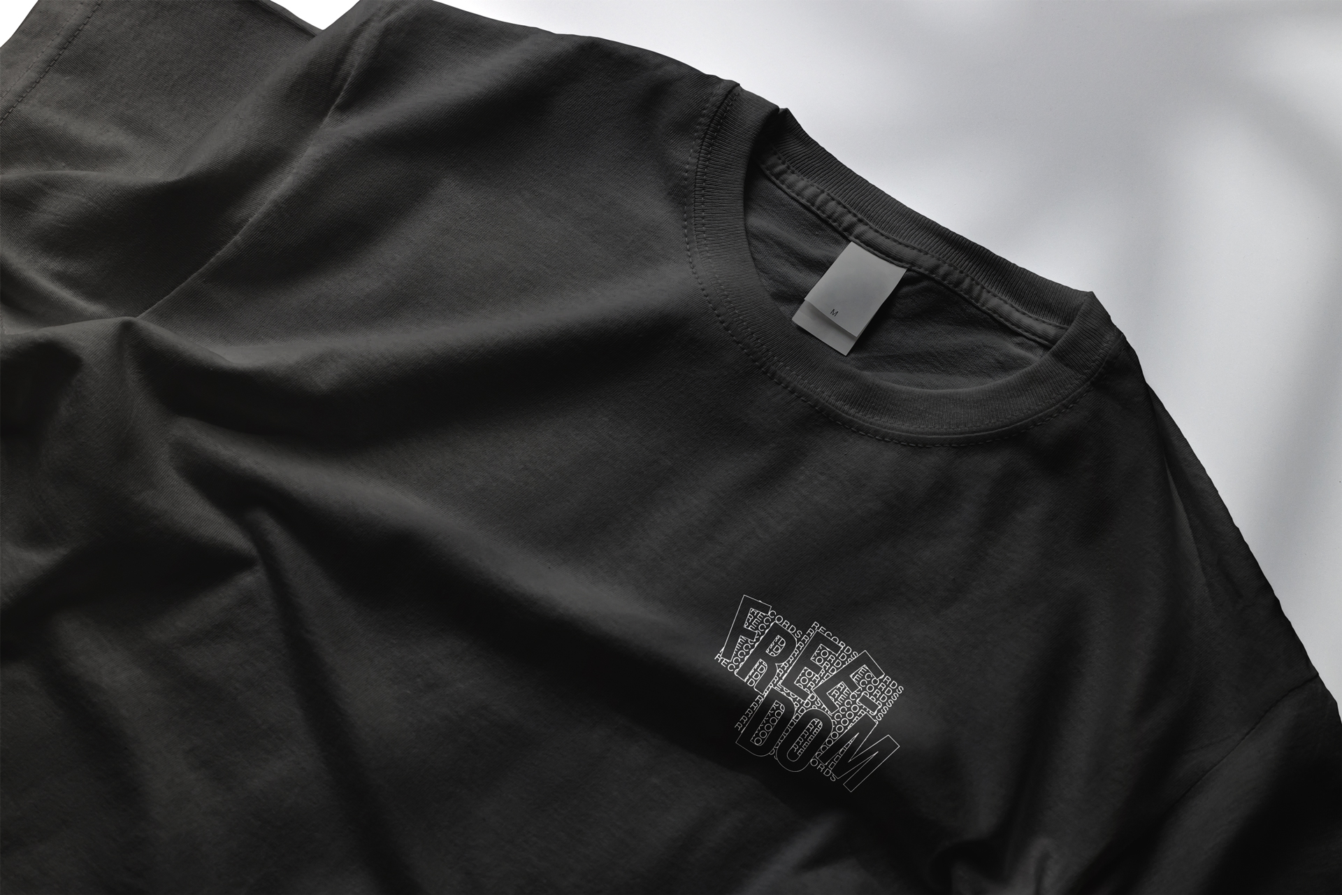
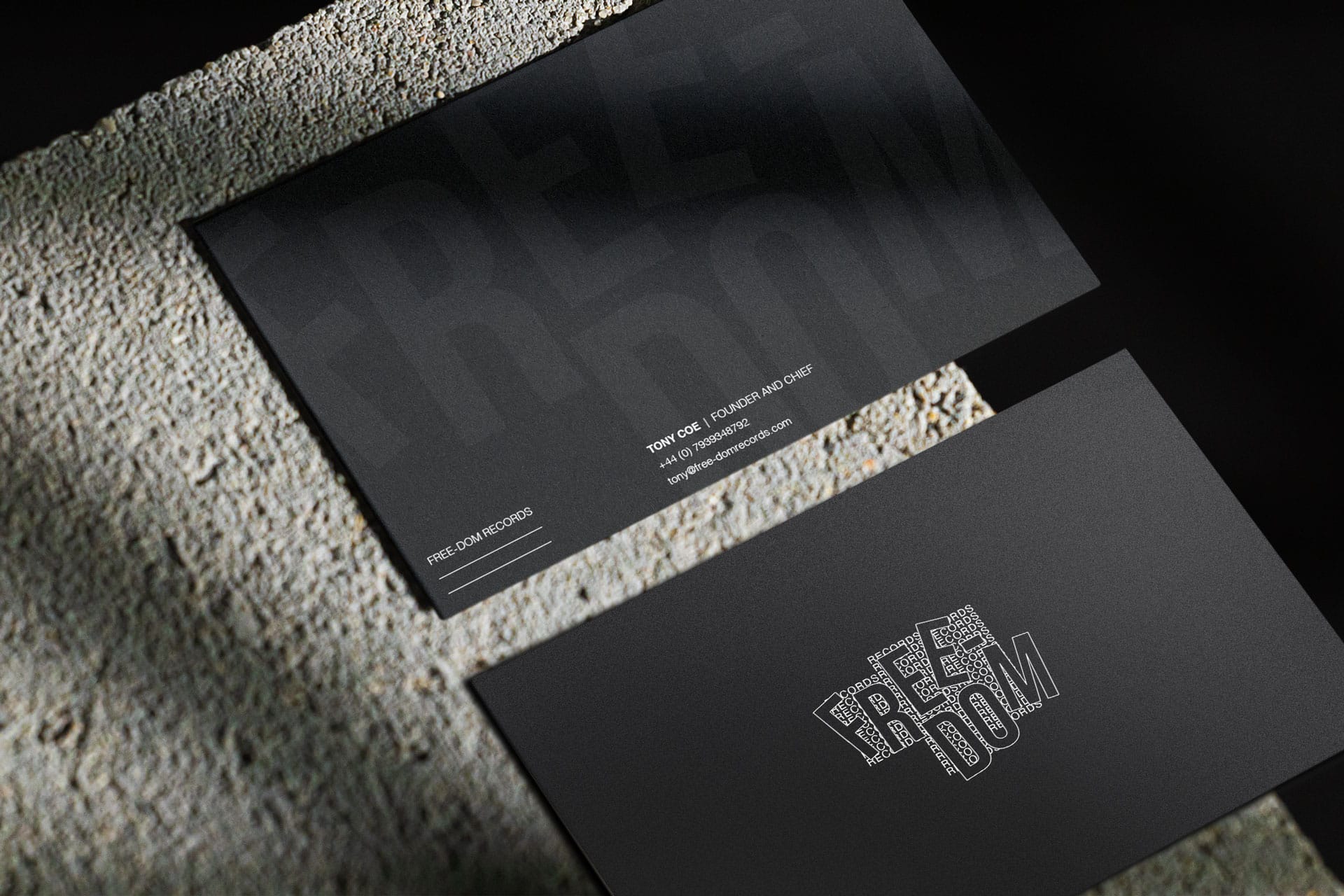
The restrictions we set up for ourselves were simple: Only black and white, and a strict use of only typography. Really quite a different way to think about typographic logos; using the generic part of the business name, ‘Records’, as a grid-like structure to encase, or rather, attempt to encase the identifying part of the name, which is a visual pun on the word itself. The identity in the end became more about repeating walls of white capitalised type on a black background which then informed all other design decisions from website work to email formats.