Website: This Website

I believe everybody should have a website. Social media sites will come and go (and have), but to have a small part of the internet where you can stick your flag and say “hey, here’s me”, is a presence which doesn’t compare with facebook or a LinkedIn profile.


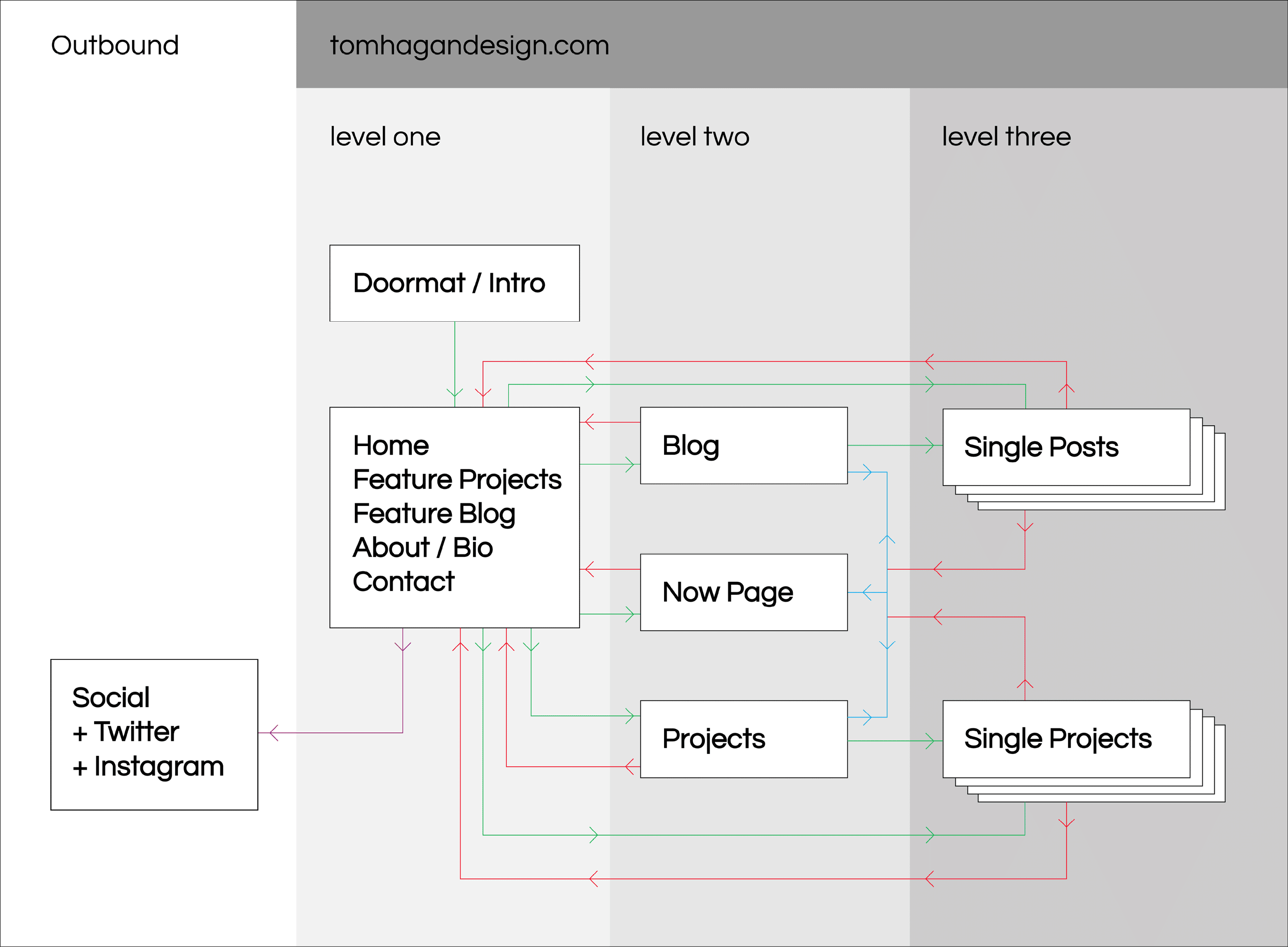
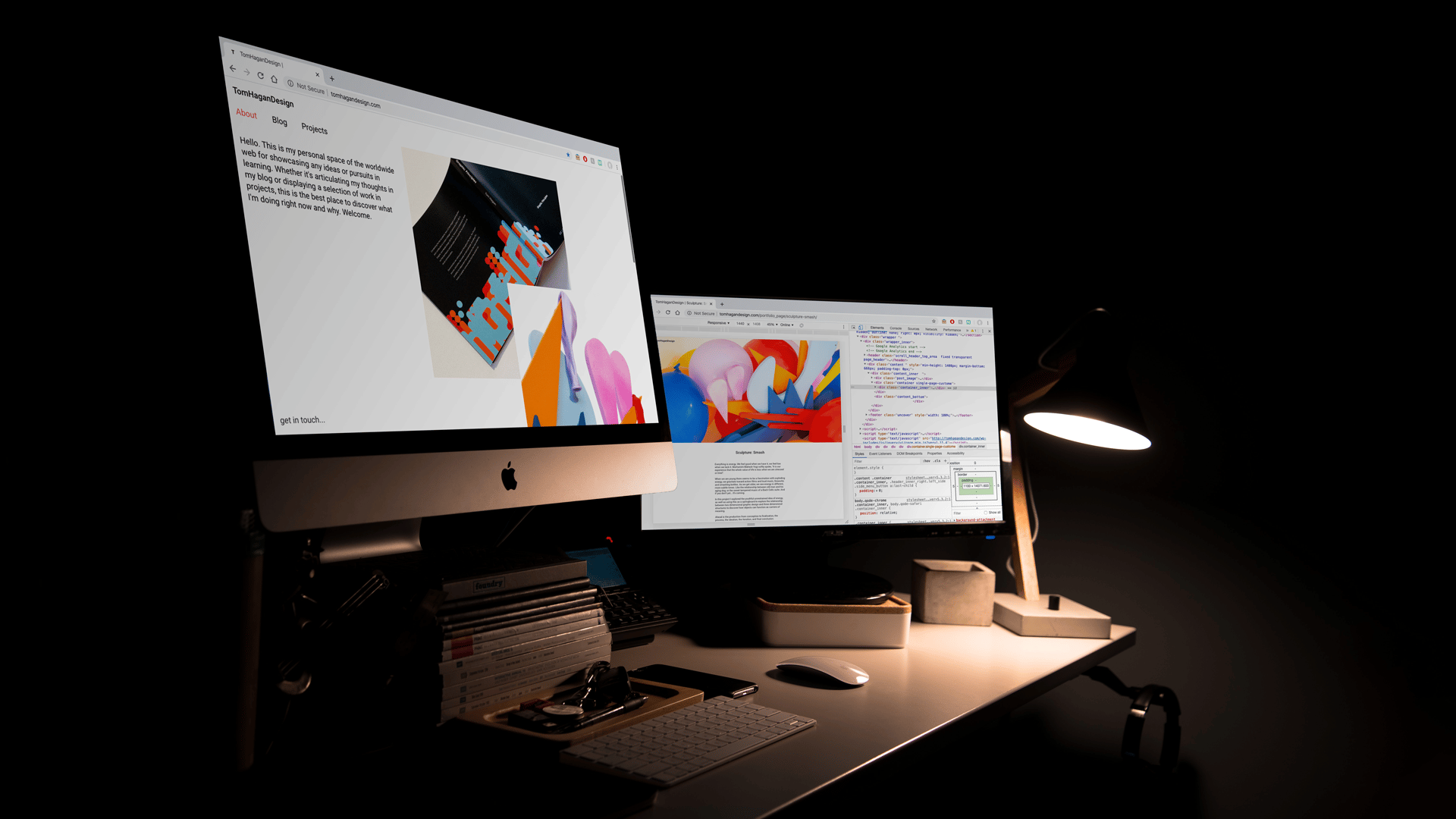
The goal for this project was to create a website that could stand the test of time. A website to extend a personal brand, acting as a digital business card which will display projects, blogs, and contact information – and that is all.


The website will generally be the second, more comprehensive touch point in an audience’s interaction with me, so as well as displaying work, it will also be an important touchstone to display critical thinking.

Mapping The Site

Initially mapping the site proves a good starting point to brainstorm how the site would flow and how the site would work.


In the process of mapping the site, questions begin to be formed: Where and how will this showcase projects? How will it integrate critical thinking? Shall contact information be on a stand-alone page or held in the footer? Etc.

Idea Development

Initially, using quick sketches, I scamped out a generation of ideas from which I picked ones with either the highest potential or the ones that seemed interesting or different.


This allowed me to think outside the box and get ideas flowing smoothly before settling down in one direction. Also noted were ideas for UX considerations and how the website should flow and feel.


I then went on to design the first prototypes on InDesign where I had easy access to a grid and could see whether the ideas could translate well on a screen display.

At first, I was thinking outside the box of how a website could function.


Seeing how most websites today have sections which are scrollable rather than clickable, I ran with this idea but from a different angle, this time using inspiration from Josef Müller-Brockmann.


Though I liked the idea and knew it had the potential for memorability, I knew this would be difficult to implement and all in all wasn’t as ’tidy’ as I’d ultimately like.

This idea was the one I continued to develop to fruition. Some thing notably changed, such as the placement of the title and menu on the home/about page and the centring of the single project pages and blog pages, however, static elements very much remained the same and the grid of blogs stayed until finalisation.

Here restricting the site to only typography, we have an about section on the home page which incorporated the project page with red highlightion.


The clarity and simplicity of this idea worked beautifully but in action would prove difficult to write the perfect amount of copy and implement effective menus for whole site navigation.

Style Guide

Web Backgrounds:

Main:


#FFFFFF

Footer Area:


#212121

Typography:

Standard Type:


#000000

Selected Type:


#FF4040

Leaving the colours to a minimum and evoking certainty, we primarily used black and white with the occasional red for indication. The black in the footer is ‘off black’ at #21212, making the site less ‘flat’ when the footer is revealed, thus, a touch more dynamic.

Body: Paragraph
18px (22px) Roboto Regular


H3: Sub Headings 2
22px (30px) Roboto Medium


H2: Sub Headings 1
24px (34px) Roboto Medium


H1: Headings
30px (38px) Roboto Medium

Understanding the sites extensive writing section in the blog and portfolio, we sought to find the optimum reading size for paragraph/body text and then work up to the display/title sizes.


18 px (22px) was most comfortable, and seven to ten words a line was read with ease. This is additionally how the margins in the layout were created and made responisve to different screen sizes.


From this discovery, we used a ratio calculator to find even ratios for more type sizes to be used for headings and subheadings, all birthed from the majority of type rather than the impact of a display title.

Working on the single blog pages, we arranged the text in a centre column, for focus for longer periods of reading. Again, all for ease of use.


The images move outside this centre column at different rates; creating rhythms and dynamism as the user scrolls downward. Additionally, the use of sliders is present so we can have the user interact differently with content.


For desktop, the columns work in a way where there are four columns and extensively wide margins. The text is spread across the two centre columns, images are laid out in a combination of the four columns as well as breaking into the margins for full width images and image slider.

Conclusion

The initial research became invaluable and as the site map changed (as I thought it would), the vision and mission outlined upon starting this project proved a guiding light to any design decisions and UX considerations during the development.


Throughout this project, constantly thinking of functionality and clean integration of a CMS, proved both negative and positive. Negative, because it may have limited the creative direction – opting for styles that we knew would integrate better into WordPress but not developing potentially exciting options which may have been beneficial to the site’s expression. However, positive in the sense that it could be seamlessly implemented and easily maintained for the future to come.