Logo Identity: Snoodhead

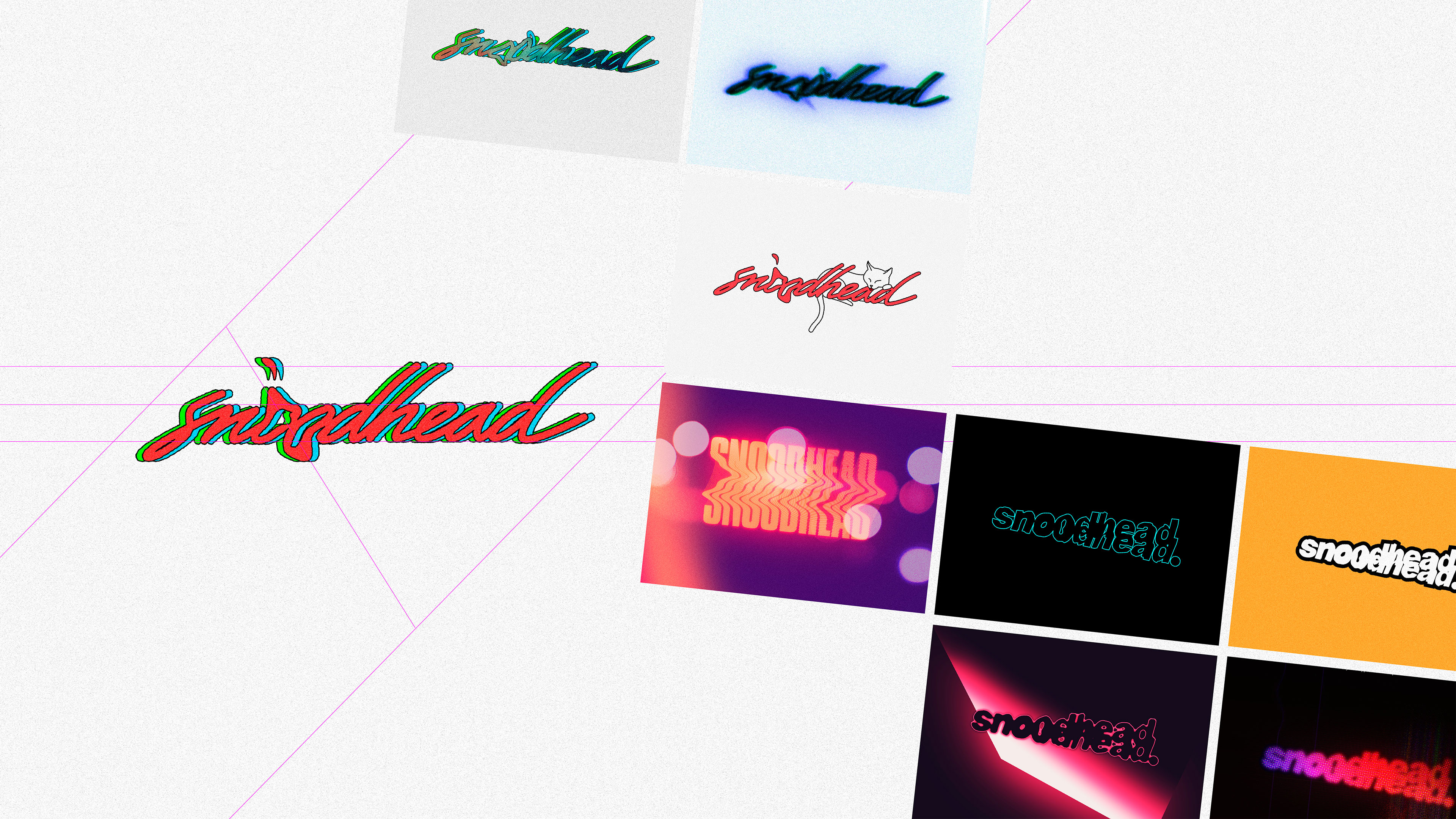
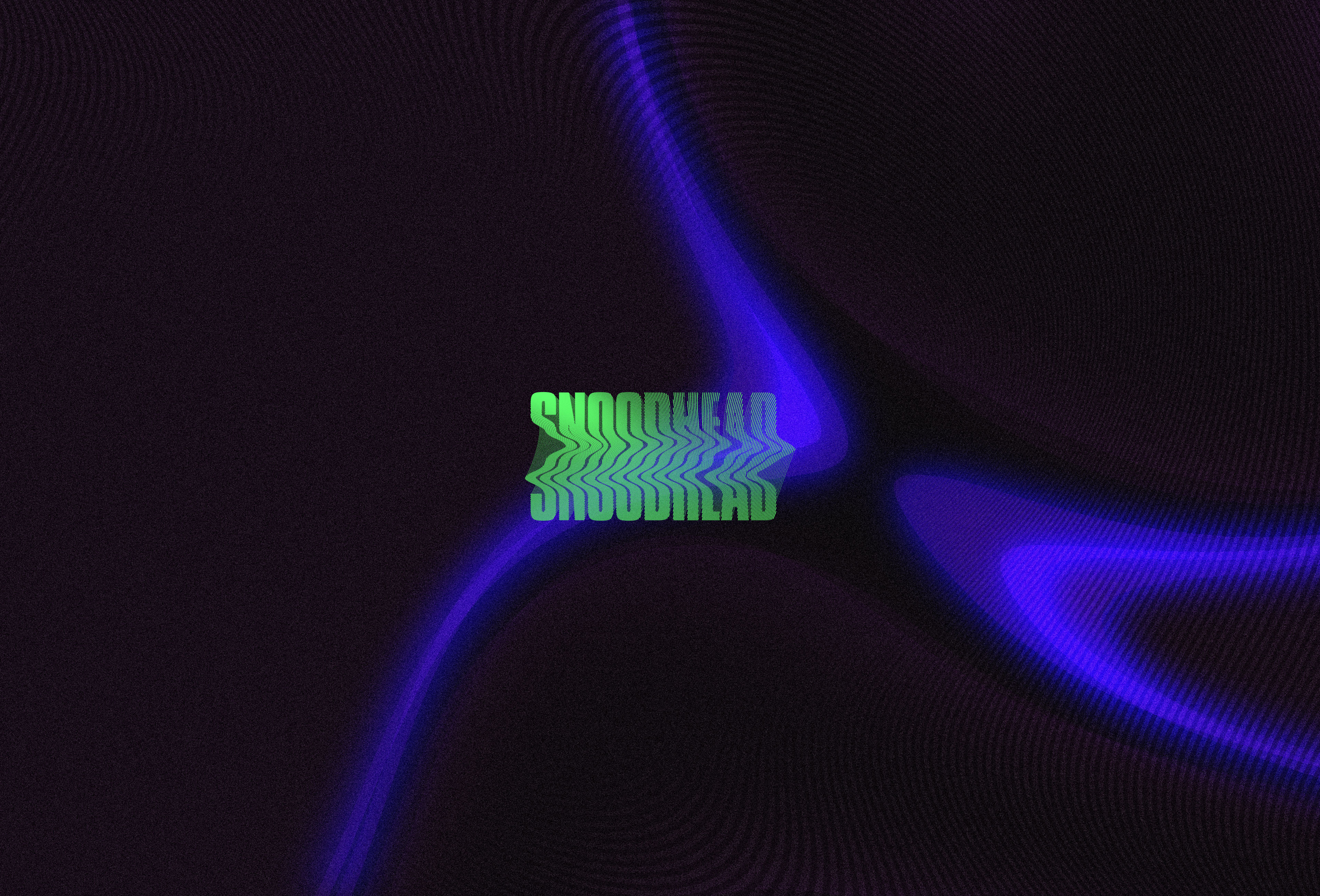
Entering this project we were tasked with completing a logo identity for a band that wasn’t quite sure what direction to go in themselves.


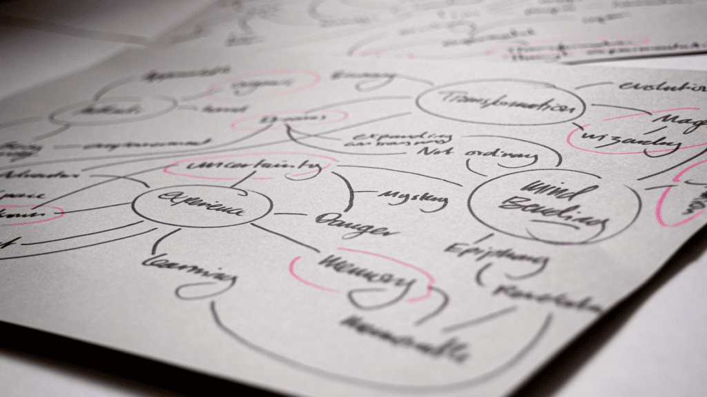
Initially, we ideated to discover a brand archetype for the group to align with; something that the group could identify with. Once there, we could better devise a path forward and together agree on a creative brief that would help harmonise their music direction with proposed visual elements.

Because of the exploratory nature of the music in question and the general direction they found they were heading, we decided to align the visual direction to the brand archetype of the wizard. Using this, we focused on the vernacular of transformation, mastery, magic, arcane darkness, etc. All that you could think of this archetype being described as is what we went forward with to explore.

Solution One

Var 01

In the end, ‘transformation’ became the aim of this identity. A classically postmodern idea, we were taking something ordinary and familiar and distorting the boundaries of this familiarity. Therefore, in its finalisation, the visual identity isn’t a transformed familiarity as such, but in constant transformation and change. It’s always moving, always evolving over a set of visual standards.

BTS / Ideation

Motion